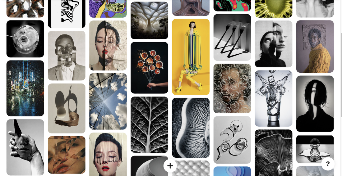
My pinterest board-
White paper test-
The Task-
This entails you to have a photoshoot varying between 20-30 photos. During the photoshoot you use one piece of A4 paper which you can fold or crumple into different shapes but you cant rip or cut the paper. You create different shapes to allow different shadows to be created when taking the pictures. You take various pictures using different objects and equipment for example coloured plastic, paper and a flashlight- this helps to enhance the paper and create different colour variations
My Response-


Edited Images-

|

|

|

|

|
WWW- I like that I made different shapes and textures with my paper which gave a nice effect with the colour.
EBI- I think I should have incorporated more colours into a photo rather than one straight colour.
EBI- I think I should have incorporated more colours into a photo rather than one straight colour.
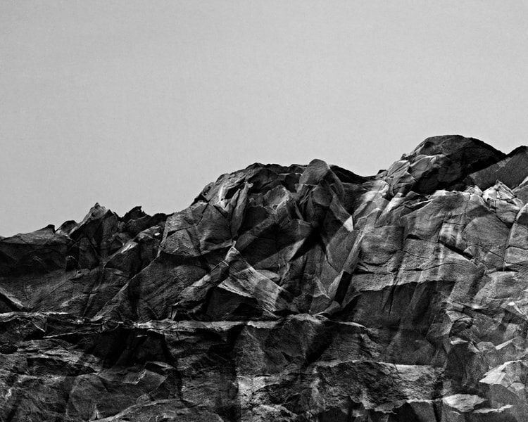
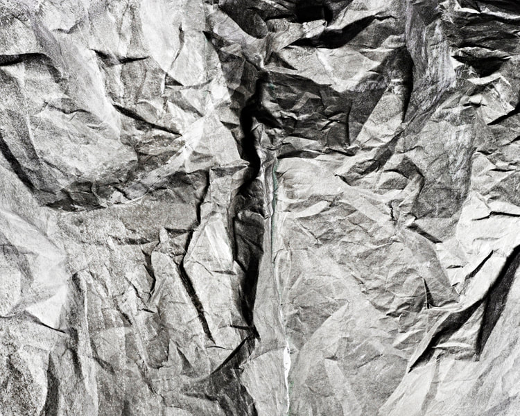
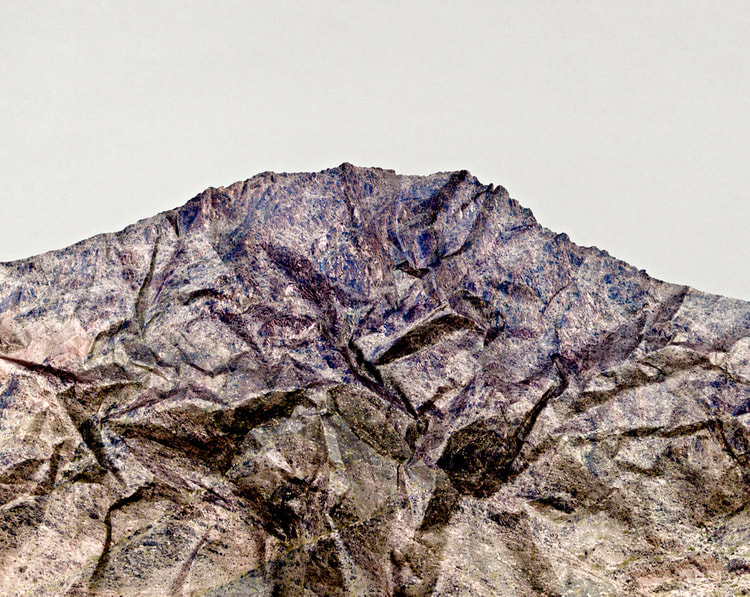
Brendan Austin-
Creates imaginary landscapes out of crumpled pieces of paper. He calls the 'paper mountains'. Austin examines what we mean by human nature and the way humans have impacted upon it. The resulting images appear as landscapes as well as give a sense of artifice- humble materials are made to carry an important message.
The Task-
Using tissue paper create landscape structures from it
Scrunch them into different shapes and patterns
Finally then using photoshop edit them black and white
Scrunch them into different shapes and patterns
Finally then using photoshop edit them black and white
|
|
|
Colour Response-


B&W response-

|

|

|
Evaluation-
I think I responded well to this artist and that my photos replicate his work well. I think that it was a good that I used different colours not only black to create different landscapes and it gives the pictures different texture.In the future I think I should use different types of materials not just tissue paper and maybe use different lightings to change the effects.
I think I responded well to this artist and that my photos replicate his work well. I think that it was a good that I used different colours not only black to create different landscapes and it gives the pictures different texture.In the future I think I should use different types of materials not just tissue paper and maybe use different lightings to change the effects.
Tamara Lorenz-
She creates various constructions which she then photographs to exploit their abstract properties. The addition of strong planes of colour provides another source of contrast in addition to those of line, shape, tone and texture. Each image seems to create its own reality.

|

|

|
My Response-


Evaluation-
In this response is used and cut out different shapes of different pieces of paper.I liked that I did different shaped and used multiple colours.
In the future I could potentially do aa digital response or use different materials to create different effects.
In this response is used and cut out different shapes of different pieces of paper.I liked that I did different shaped and used multiple colours.
In the future I could potentially do aa digital response or use different materials to create different effects.
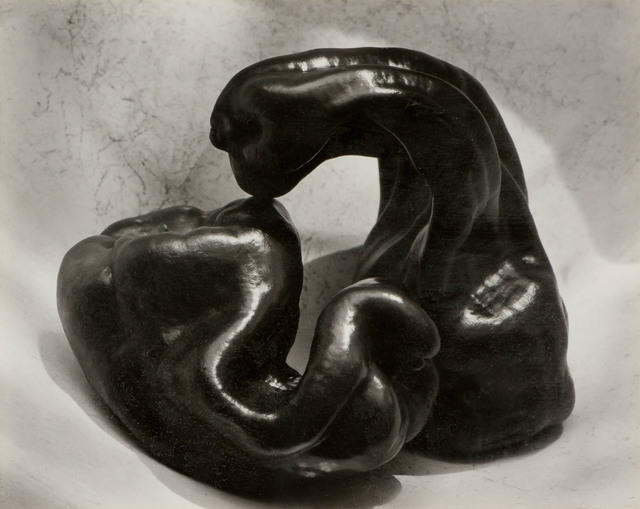
Edward Weston- Ordinary to Extraordinary
He was a 20thcentury American photographer that has been called one f the most innovative and influential American photographers and a master of photography. His career spanned 40yrs and he photographed an expansive set of subjects, including landscape, still-life, nudes, portraits and genre scenes.
Ordinary to Extraordinary was one of his most famous projects, this included taking close-ups of vegetables and fruit and he took them out of context into abstract shapes and patterns. To distort his images he also manipulated the light to create different shapes, textures and forms.
Ordinary to Extraordinary was one of his most famous projects, this included taking close-ups of vegetables and fruit and he took them out of context into abstract shapes and patterns. To distort his images he also manipulated the light to create different shapes, textures and forms.
The Task-
Firstly choose a few different pieces of fruit and veg and photograph each of them from different angles.
I used a black background to mask my images and used different apertures and depths of fields.
Take 24 photos.
I also did an extra black and white response to try and replicate the artist.
I used a black background to mask my images and used different apertures and depths of fields.
Take 24 photos.
I also did an extra black and white response to try and replicate the artist.

|
|

|
My response-


Home Response-


Black and White Response-

|

|

|

|

|

|

|

|

|

|

|

|
WWW- I like how I've done a zoom in on some images giving it distorted effects and it not looking like the original fruit or vegetables.
EBI- On my home response I should have photographed more fruits from different angles.
EBI- On my home response I should have photographed more fruits from different angles.
Abstract Comparisons:
The Task-
Take a series of images that convey natural structures, we took photos around he school and also the local woods.
Then decide what each image represents as a part of the human body.
Take photos of parts of the human body.
Finally combine the corresponding photos together.
Then decide what each image represents as a part of the human body.
Take photos of parts of the human body.
Finally combine the corresponding photos together.
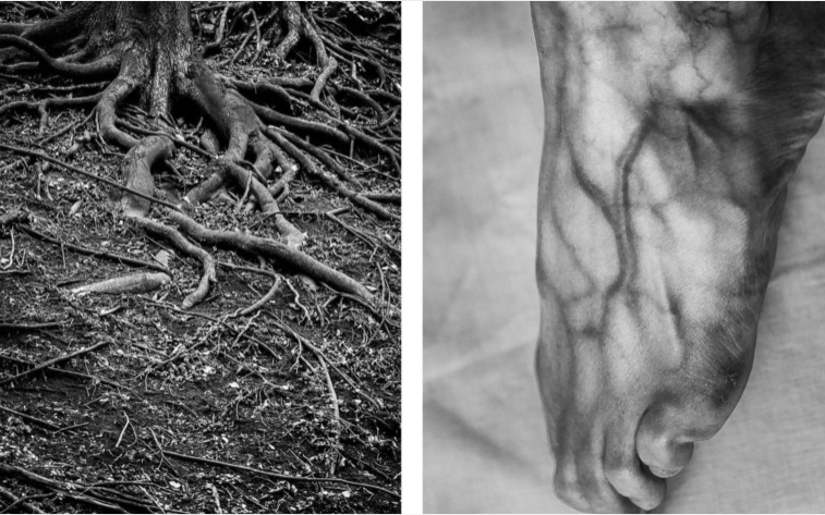
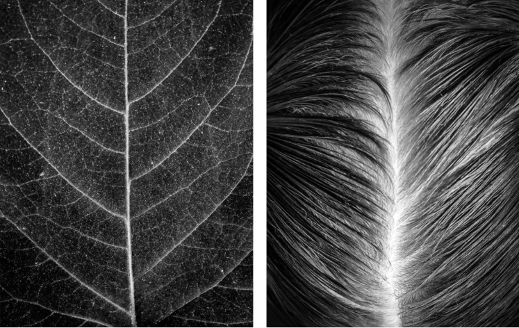
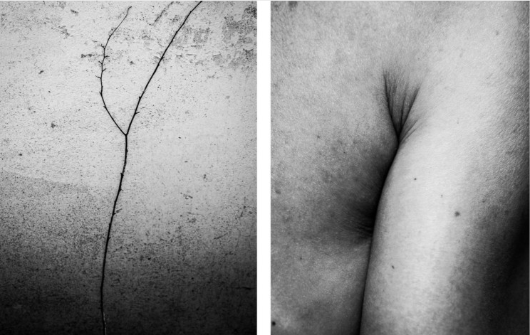
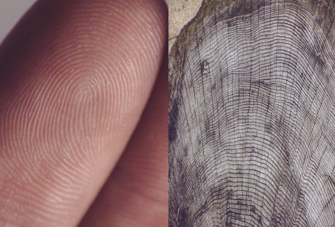
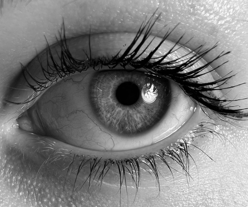
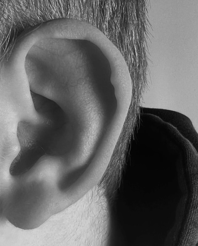
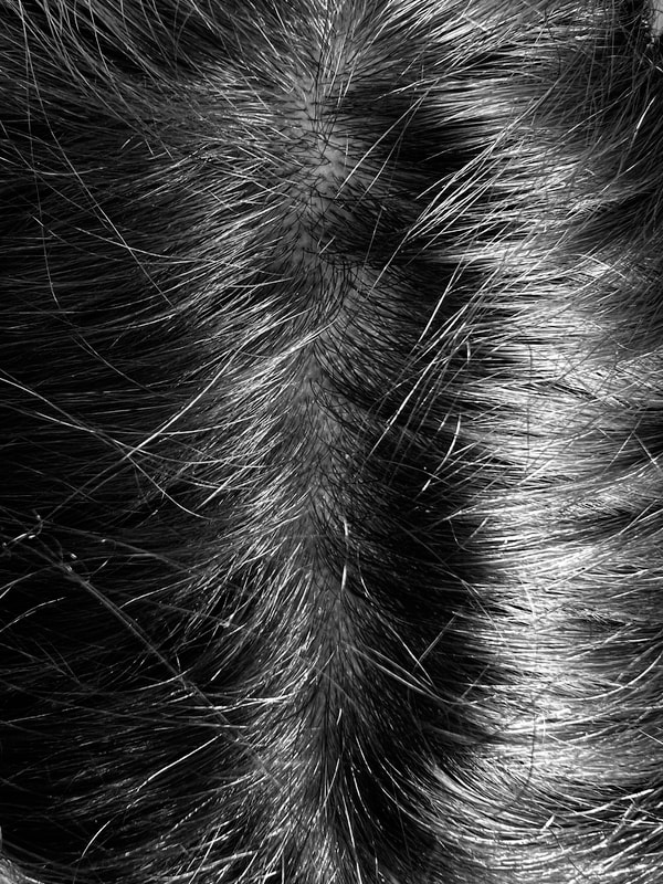
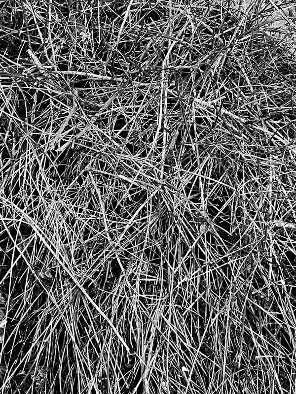
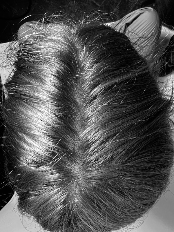
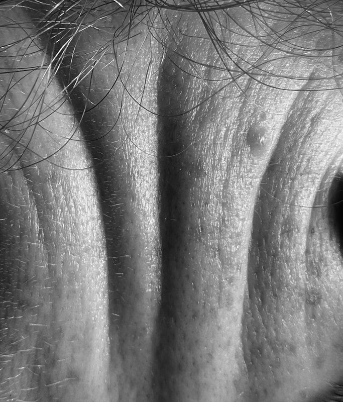
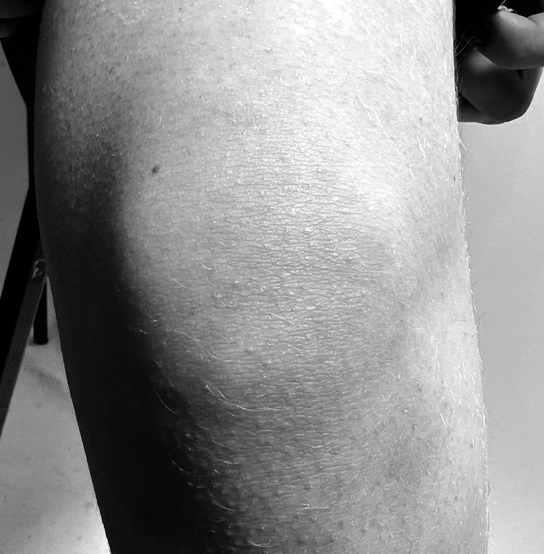
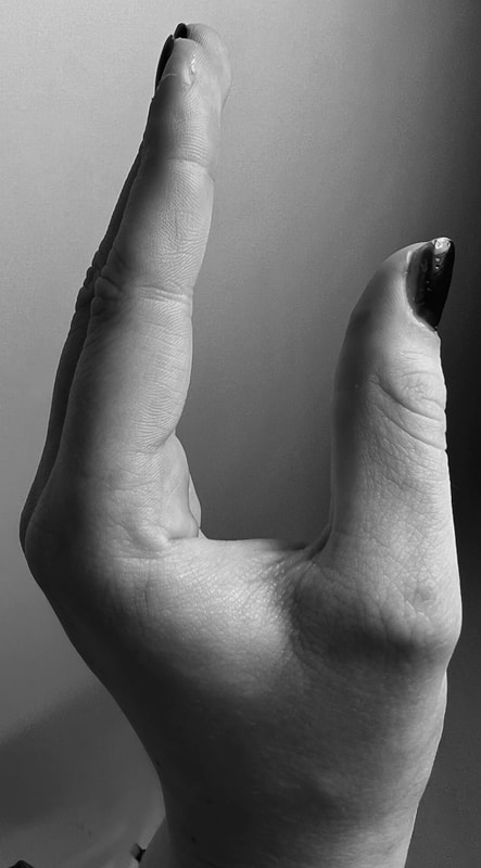
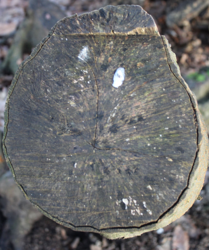
Alicja Brodowicz-Body vs Nature
Visual exercise's is her photo project, where she hunted for similarities between the human body and nature and then created diptychs of her findings. She photographs hair, skin, scars wrinkles etc. She looks for distinguishing features and irregularities. 'Imperfections are my favourite' she says.
She combines 2 images, looks for converging lines texture, similarities in layout and analogies in composition between the microcosm and macrocosm. She looks for unity between the human body and nature.
She combines 2 images, looks for converging lines texture, similarities in layout and analogies in composition between the microcosm and macrocosm. She looks for unity between the human body and nature.
|
|
|
Agnieszka Lepka- Human Vs Nature
In her ongoing series 'Human vs Nature' she works with the similarities between the human being and mother nature

|
|

|
My Response to both Artists-
|

|
|

|
|
|
|

|
|

|
|

|
|

|

|
|

|

|

|

|
Evaluation-
Overall i really enjoyed this task, i think that my images are a good comparison of human/body vs nature, especially my black and white images.I think the photos where i didn't edit the background black looked much better and had more of a closer comparison to the artist. My favorite image was the eye where i compared it to a tree trunk. In the future i would improve on the variation of the parts of the body i used and use different people of differing ages.
Overall i really enjoyed this task, i think that my images are a good comparison of human/body vs nature, especially my black and white images.I think the photos where i didn't edit the background black looked much better and had more of a closer comparison to the artist. My favorite image was the eye where i compared it to a tree trunk. In the future i would improve on the variation of the parts of the body i used and use different people of differing ages.
Erwin Blumenfeld-
Erwin is regarded as one of the most influencial photographers of the 20th century. He was an experimentor and an innovator and produced an extensive body of work throughout his 35 years including black and white portraits, nudes, celeb portraiture, advertising campaigns and his renowned fashion photography.
Born in 1897, Erwin drew early inspiration from dadaists, incorporating experimental techniques like polarisation, multiple exposures and photomontage into his dark room practice.
Born in 1897, Erwin drew early inspiration from dadaists, incorporating experimental techniques like polarisation, multiple exposures and photomontage into his dark room practice.

|

|
My Response-


Edited Response-

|

|

|

Evaluation-
Overall i really like the distortion that the glass gave the images. I liked how in some of there images showed have distortion half not. I think i could have improved by having a second response and using more color in my images either with background or clothing.I could have also not just edited my images my images to black and white but change the saturation and contrast of the colored images
Overall i really like the distortion that the glass gave the images. I liked how in some of there images showed have distortion half not. I think i could have improved by having a second response and using more color in my images either with background or clothing.I could have also not just edited my images my images to black and white but change the saturation and contrast of the colored images
Abstracting The Environment:
Saul Leiter-
He first arrived in New York in 1946. Since then Leiter has been documenting street life in black and white, intriguing the eye with his use of obstructions, blurred movement and half-concealed details. In 1992, his work came to the attention of the curator Jane Livingston, who included him in her “New York School.
Leiter was also a pioneer of colour photography, he developed a distinctive, dreamy style that played with shallow depths of field and a vibrant palette.
Leiter was also a pioneer of colour photography, he developed a distinctive, dreamy style that played with shallow depths of field and a vibrant palette.
|
|
|
My Response-


Edited Response-

|

|

|
WWW: I like how the edited images and more warm tones to them
EBI:If I did a second response at night or when there was different weather, possibly picturing cars and busses more.
EBI:If I did a second response at night or when there was different weather, possibly picturing cars and busses more.
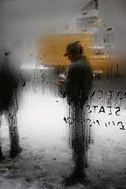
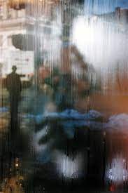
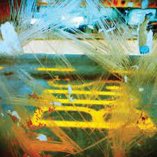
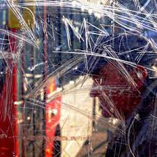
Stephen Calcutt-
Stephens unique form of street photography is a consequence of frequenting bus stops and shelters around the City of Birmingham. Graffiti can be great art, however he feels the graffiti scratched into the plexiglass windows of the bus stop feels like a violation. He has yet to see any of these etchings that look great in their own right. The graffiti etched and scrawled in the bus stop windows seem to be expressions of frustration, anger, love or hate. However, unlike its cousin the more colourful graffiti that is emblazoned across the walls of buildings and is often seen as art, it is very mundane.
He feels a windows full potential as a clear barrier between yourself and the elements are compromised when the view beyond is obscured, distorted and blurred by the scratches. Stephen uses the graffiti etched windows as a lens. he merges the graffiti and the view beyond, focusing his camera on the etched lines putting the view beyond out of focus. The graffiti and view to merge into a single plane. He creates a new perspective that retains and emphasises the energy of the graffiti.
He feels a windows full potential as a clear barrier between yourself and the elements are compromised when the view beyond is obscured, distorted and blurred by the scratches. Stephen uses the graffiti etched windows as a lens. he merges the graffiti and the view beyond, focusing his camera on the etched lines putting the view beyond out of focus. The graffiti and view to merge into a single plane. He creates a new perspective that retains and emphasises the energy of the graffiti.
|
|

|


Evaluation-
I like my images especially the ones that I too thought the cellphone box which has a mixture of graffiti and general wear and tear. In the future I could do a second response and edit the images by changing the contrast and the saturation of the Images.
I like my images especially the ones that I too thought the cellphone box which has a mixture of graffiti and general wear and tear. In the future I could do a second response and edit the images by changing the contrast and the saturation of the Images.
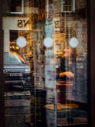
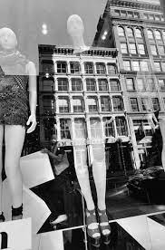
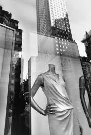
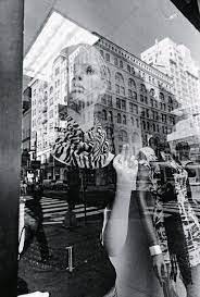
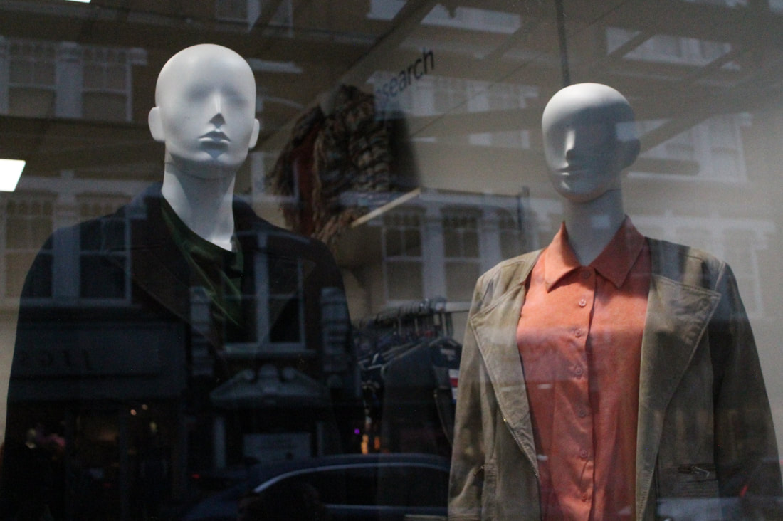
Lee Friedlander-
Lee Friedlander is an American photographer and artist. In the 1960s and 1970s, Friedlander evolved an influential and often imitated visual language of urban "social landscape," with many of his photographs including fragments of store-front reflections, structures framed by fences, posters and street signs.
|
|
|


Edited Responses-
|

|

|

|

|

|

|

|

|

|

|

|

|

|

|
Evaluation-
My favourite images were my black and white mannequin responses which has the mannequins with the reflection of the background in it covering the face.
In a second response I could possibly make the reflection more visible or take photos with different backgrounds of different buildings.
My favourite images were my black and white mannequin responses which has the mannequins with the reflection of the background in it covering the face.
In a second response I could possibly make the reflection more visible or take photos with different backgrounds of different buildings.
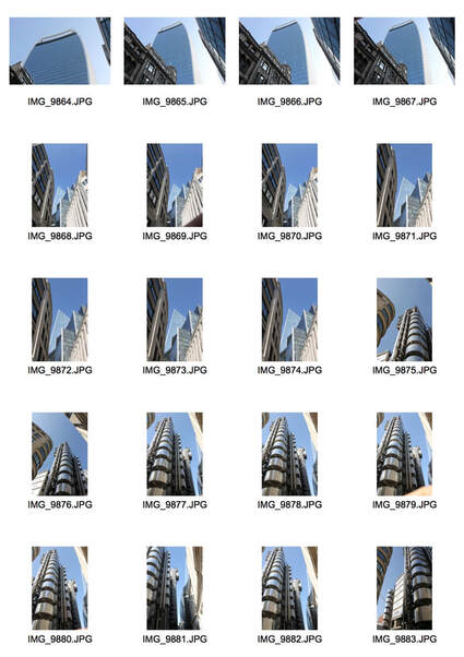
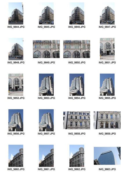
Independent Abstraction Task-
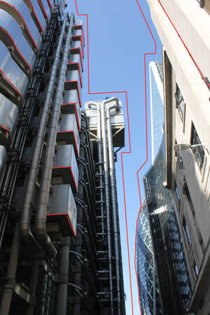
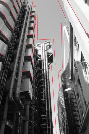
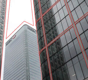
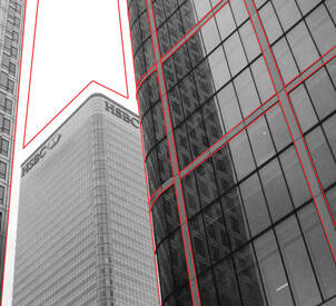
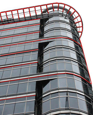
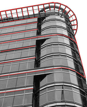
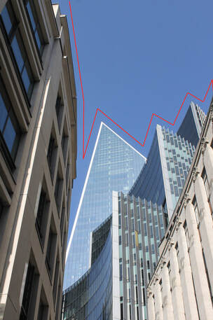
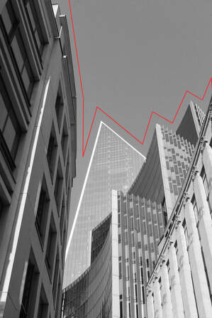
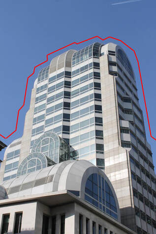
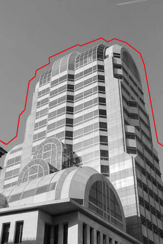
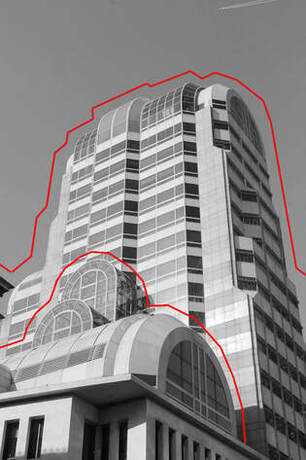
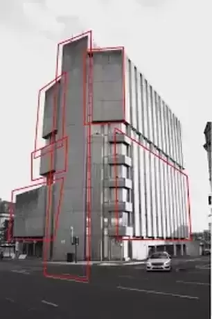
Strand 1- Alexey Bogolepov
Alexey Bogolepov is a 29 year old Russian who is an architect and a photographer.It gives the sense of a bubble or a layer surrounding buildings trapping people.He uses his architectural visions to emphasise buildings.
I took pictures of buildings around London and frame them using red lines. The effect i wanted to create was to emphasise the shape of the buildings with the red lines.To get the correct composition i wanted to photograph buildings with good perspectives and show geometric shapes.
I wanted the red lines around them to create a sense of safety and a barrier protecting the buildings.The buildings are quite run down but it is still conveying a sense of protection no matter how old a building is.

|

|

|
Photographs I took-

|

|
My Response-
|
|
|
|
|
|
|
|
|
|
|
|
|
Artists VS Mine-
|

|

|

|
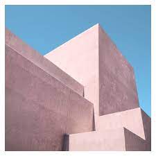
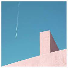
Strand 2- Jonny Kerr
Johnny Kerr is an American artist,best known for his abstract photographic arrays that reveal the colourful poetry hidden amid a seemingly mundane Arizona metropolis. Self-taught in the craft of photography, Johnny cites his lifelong study of art, his graphic design experience, and his appreciation for minimalism as having the largest influences on his work. Johnny’s imagery often explores the abstract qualities of his subjects, placing them, to varying degrees, outside of their literal context. His use of space reflects his affinity for quietude, while his continued evolution of style and subject matter represent an authentic pursuit of curiosity.
Kerr spent hours photographing, waiting and observing how the lines' shapes and forms changed as the sun moved from morning to late afternoon, revealing new relationships of harmony or tension.
The ambiguous forms,shapes and textures of the almost featureless stucco exterior intrigued Kerr as a designer.By observing how the structural lines intersected from various vantage points, Kerr was often able to confuse the visual perception of foreground and background. The pastel colour palette is inspired by the building’s southwest geography and was a challenging visual departure from my previous monochromatic approach to abstract architecture.
The simplism and minimalism of the block pastel colours creates a simple yet effective image with no distractions and making it hard to find the foreground and the background of the image.

|
|
|


|
|
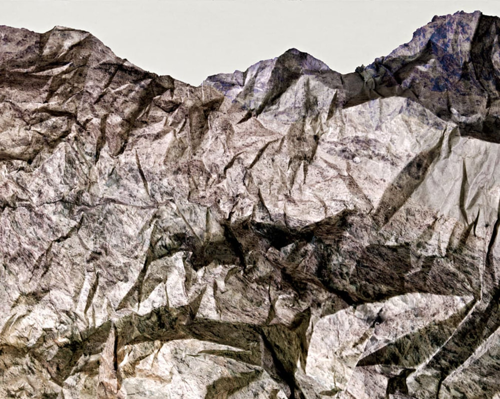
Strand 3- Brendan Austin
Brendan Austin creates imaginary landscapes out of crumpled pieces of paper. He calls the 'paper mountains'. Austin examines what we mean by human nature and the way humans have impacted upon it.The resulting images appear as landscapes as well as give a sense of artifice- humble materials are made to carry an important message.
|

|

|


B&W Response-

|

|

|

|

|

|

|

|

|

|
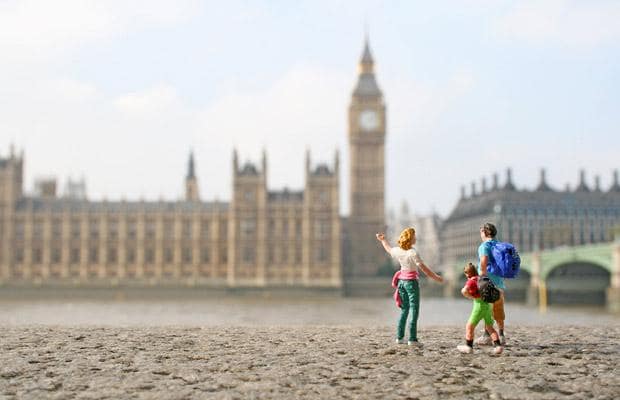
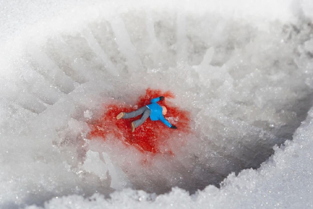
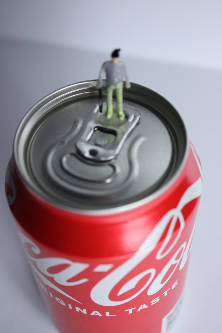
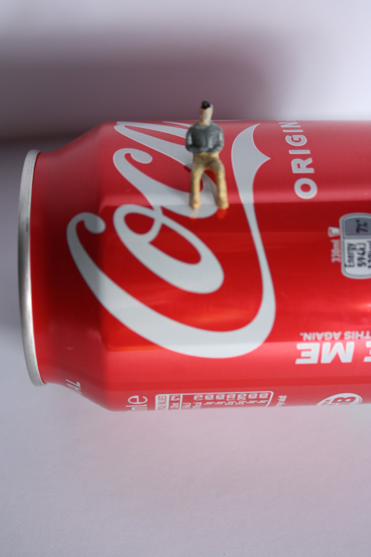
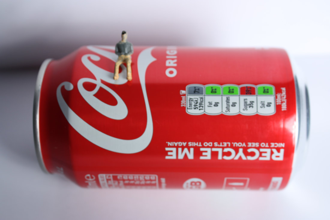
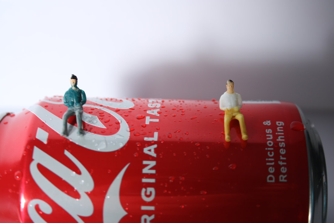
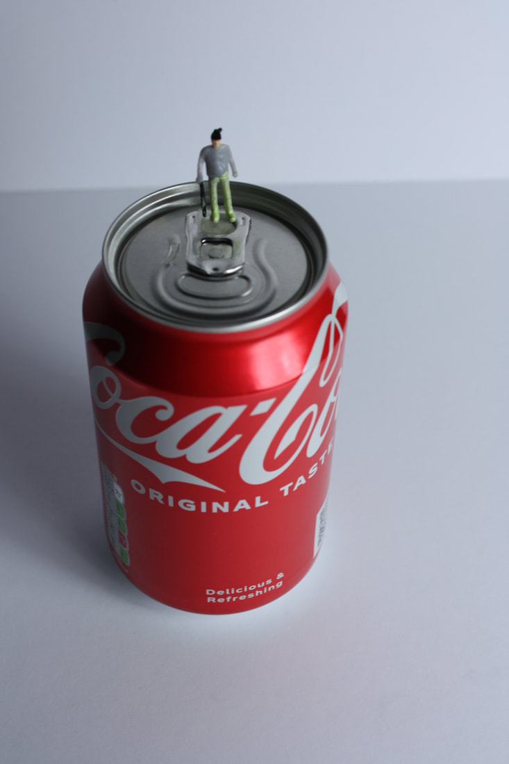
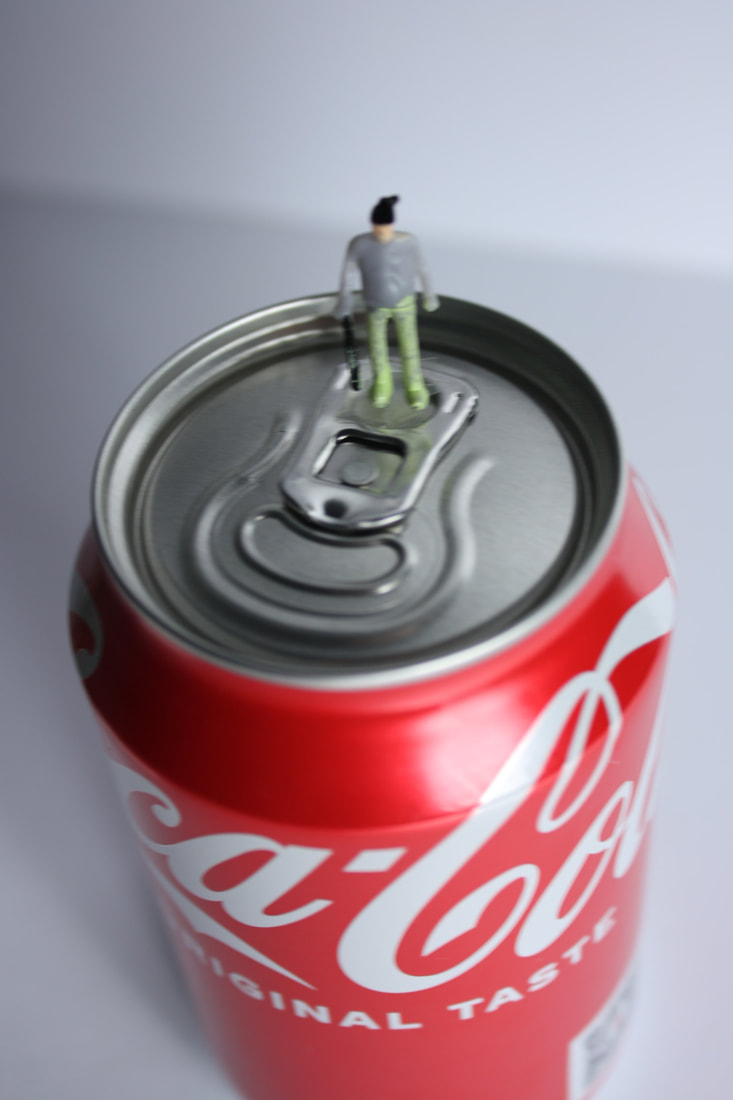
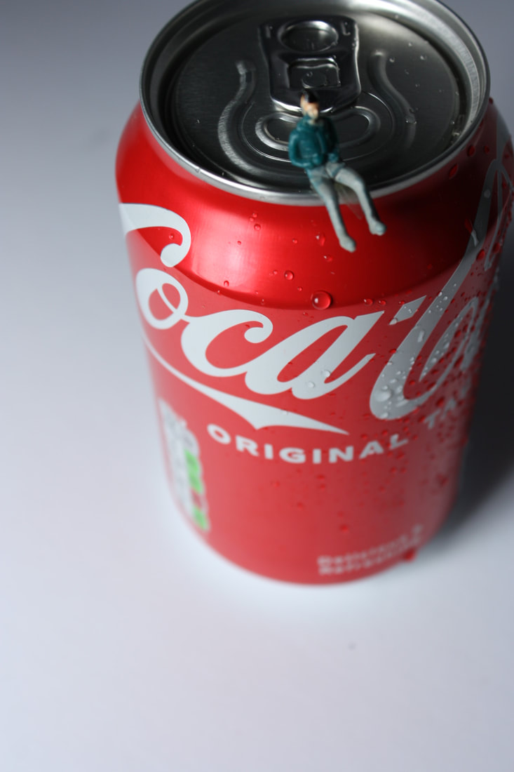
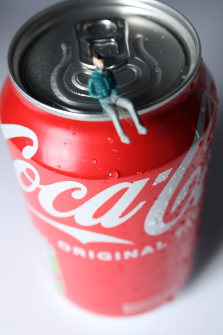
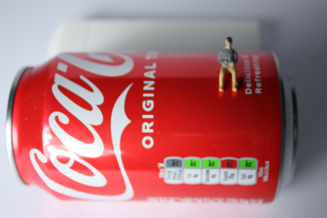
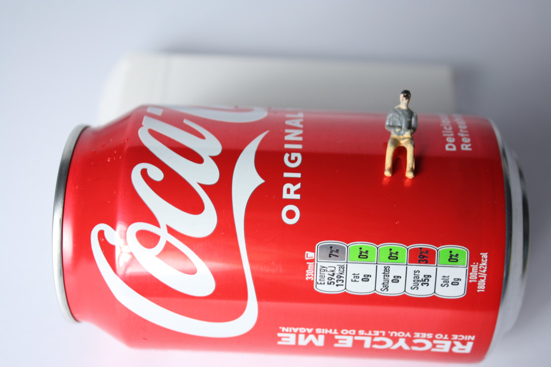
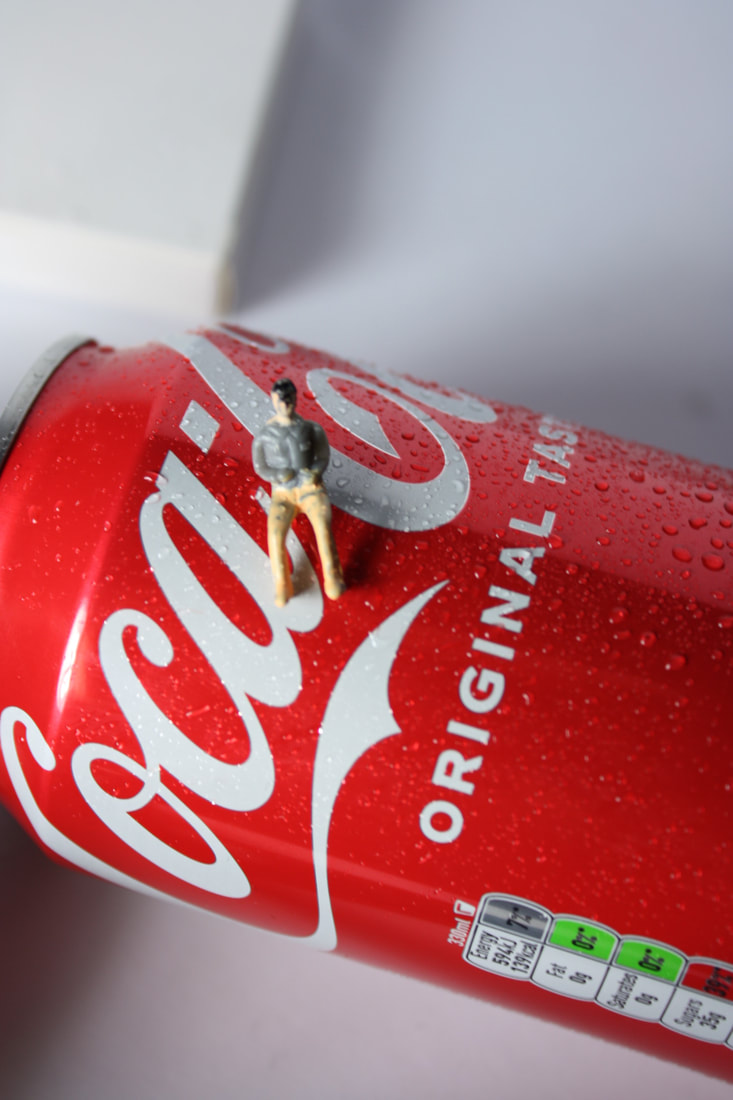
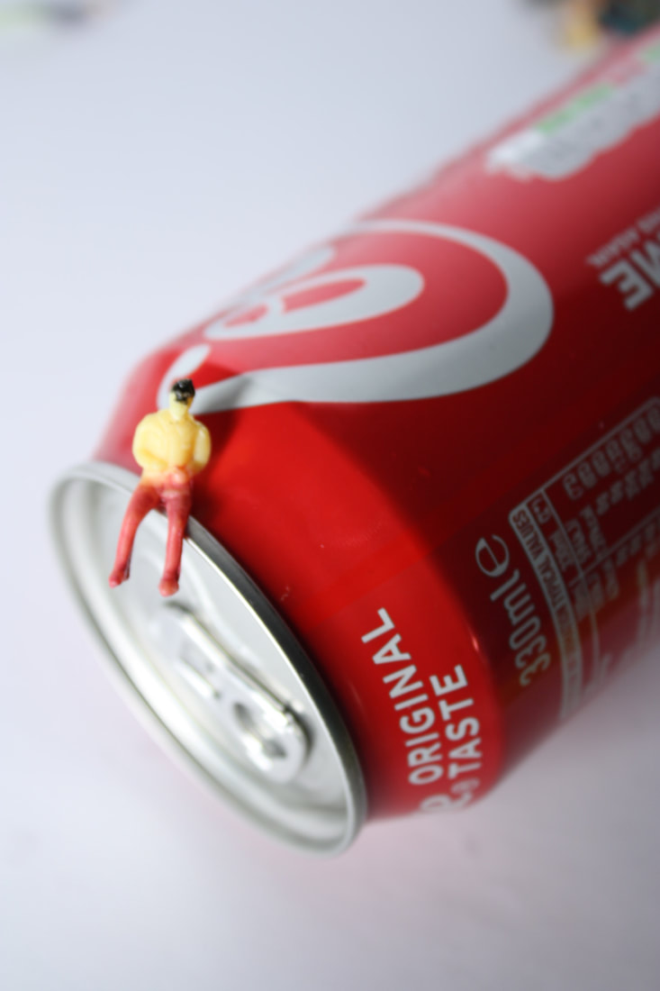
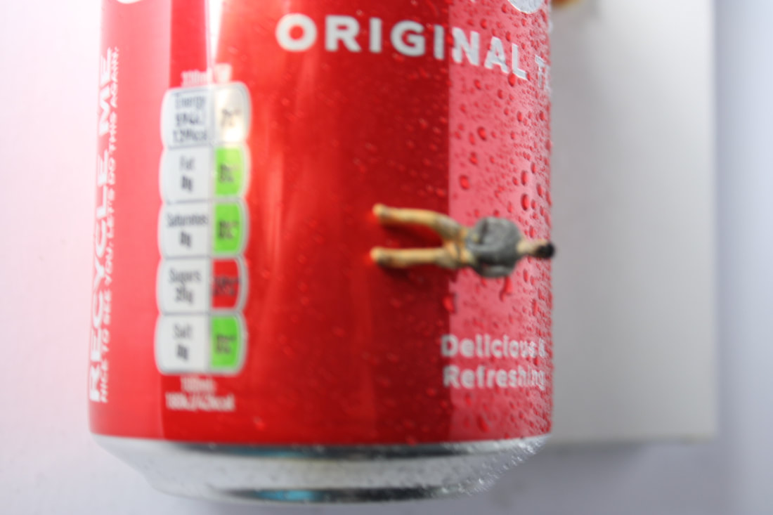
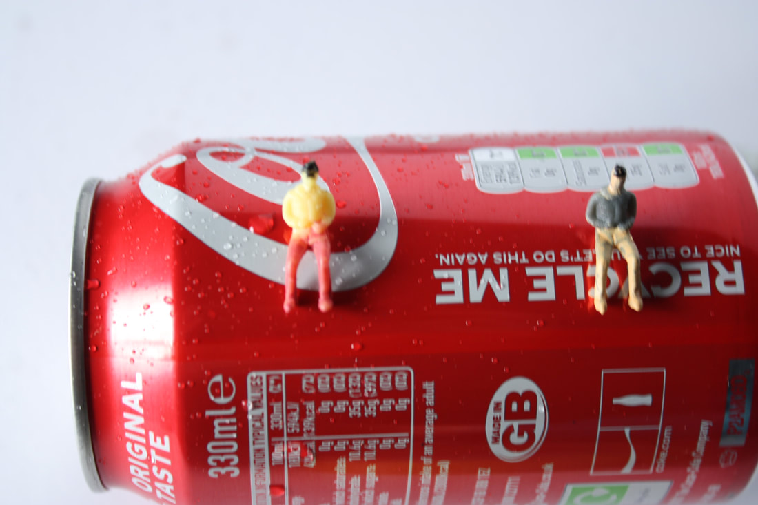
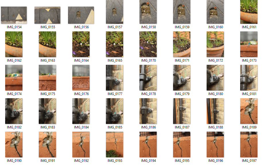
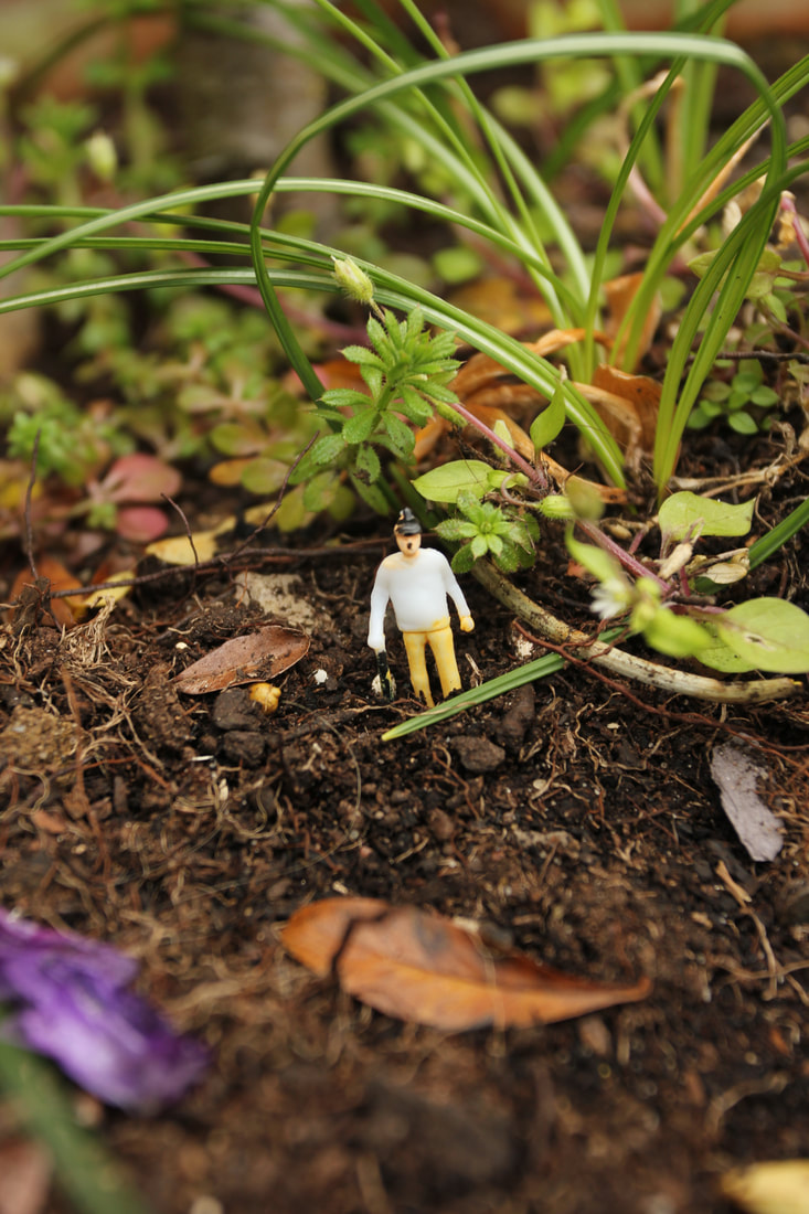
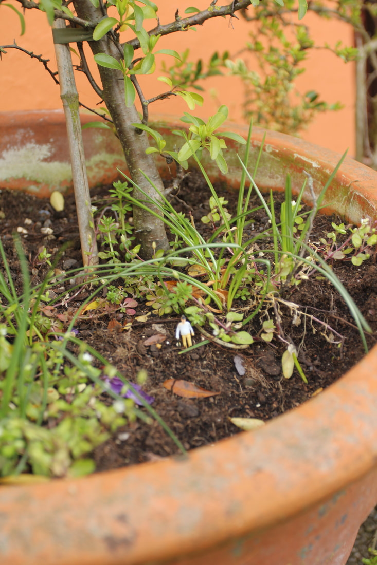
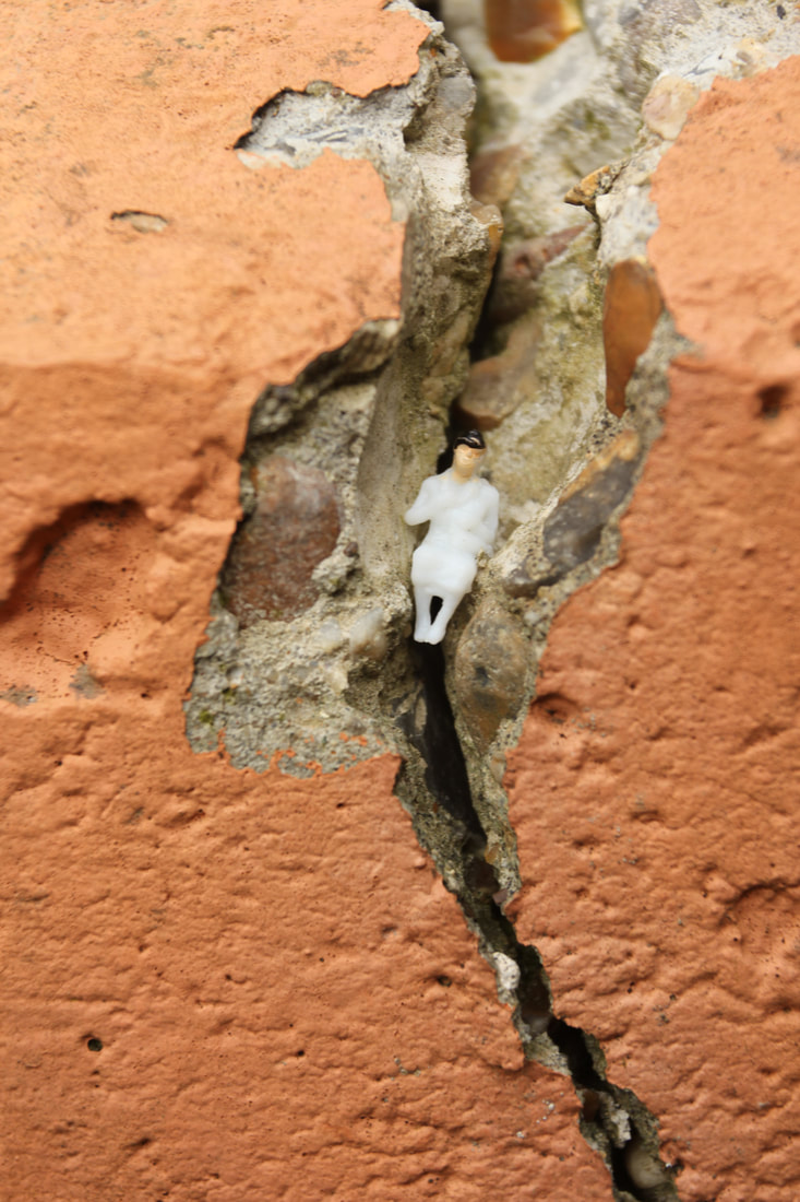
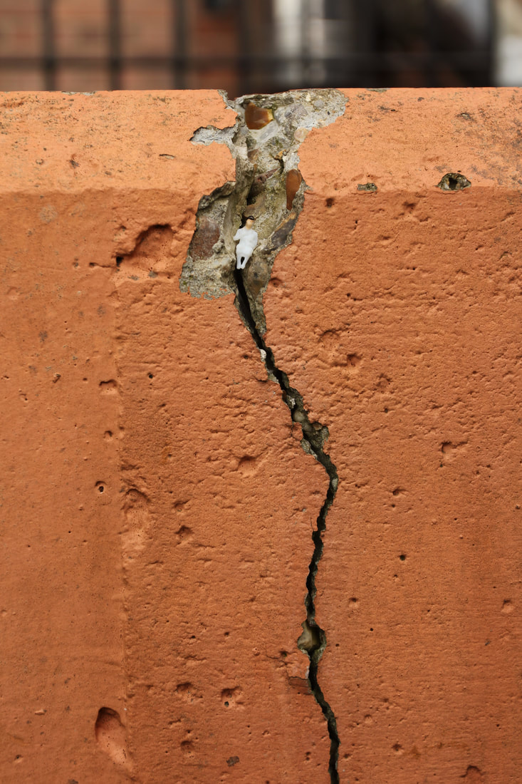
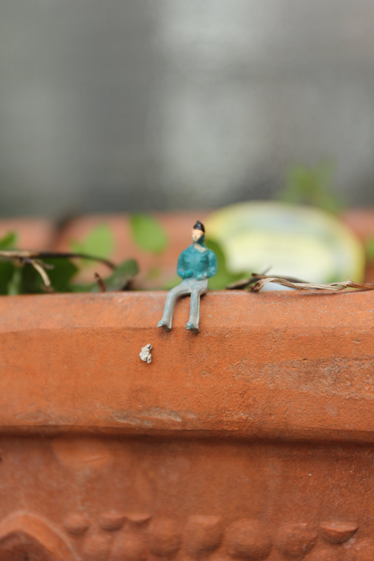
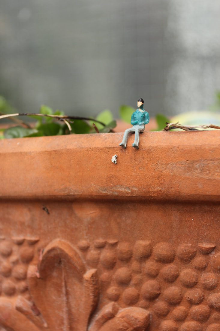
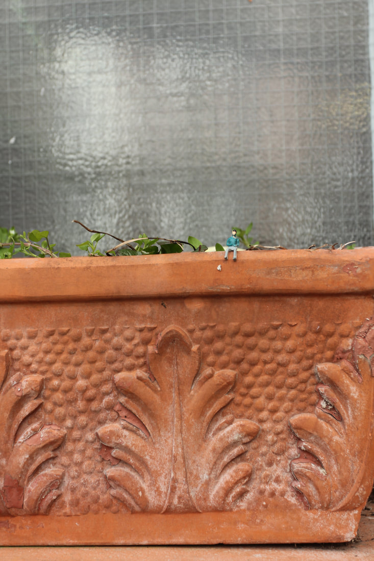
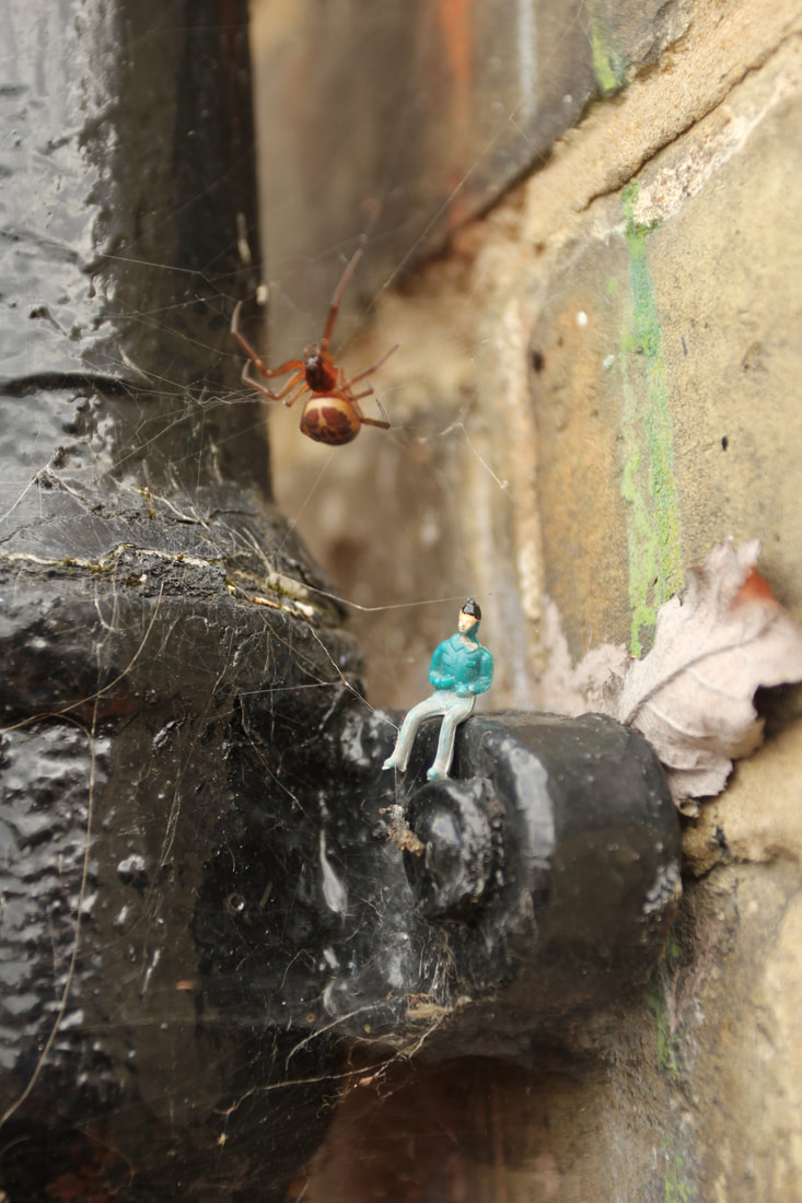
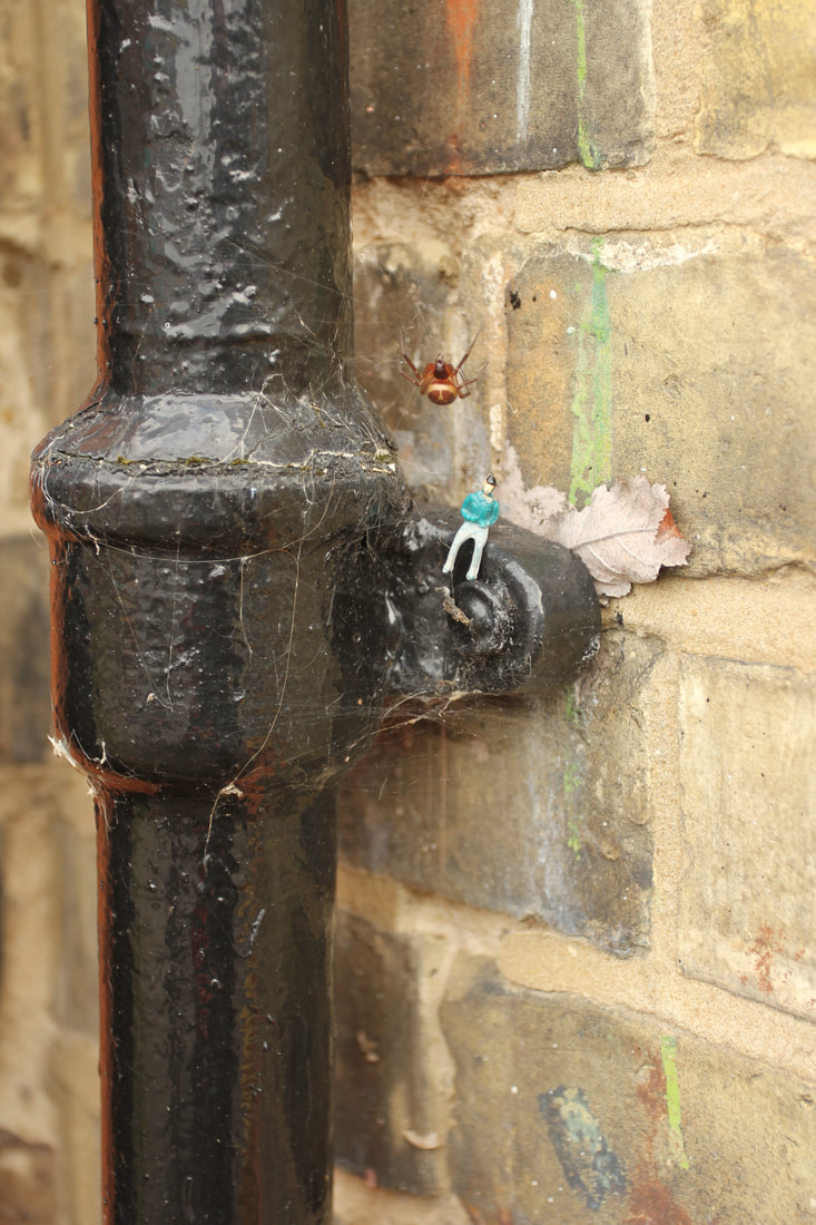
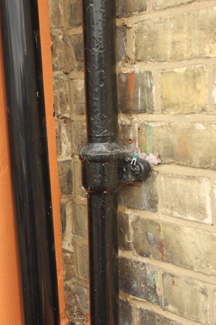
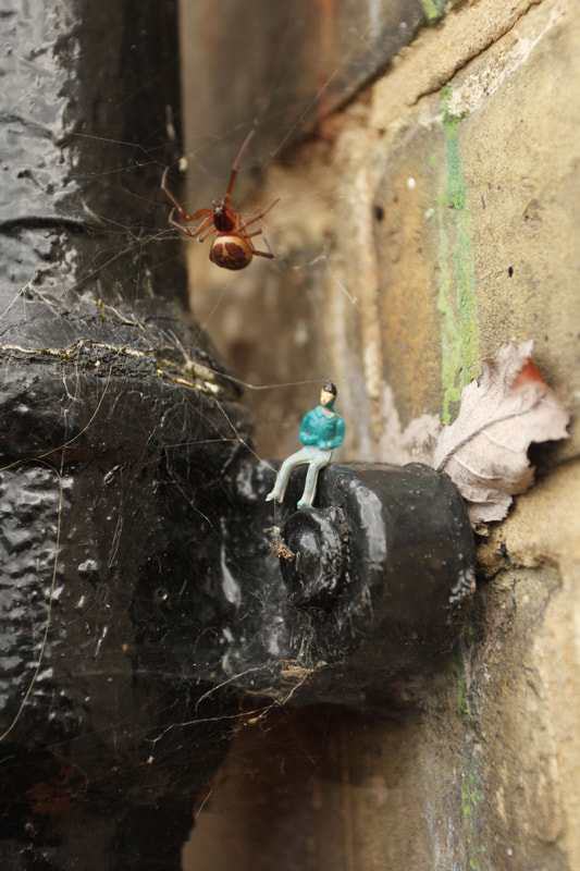
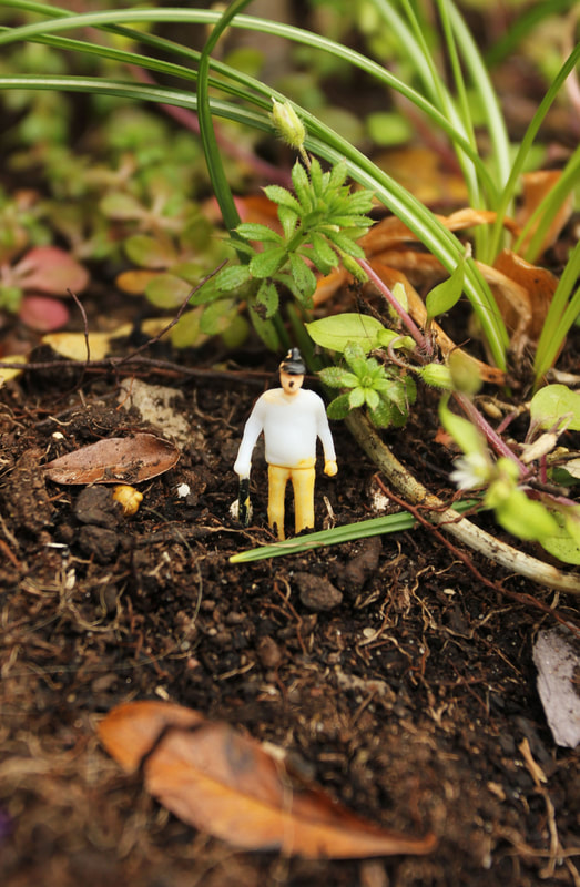
Slinkachu-Miniature figures
Slikachu is a London-based artist uses tiny model people whose minuscule size creates humorous and thought-provoking scenarios. Slinkachu often comments on current events and social dynamics in his work. He also uses a lot of found materials, such as litter and insects in his pictures to create a sense of these figures in a normal world.

|
|
|
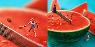
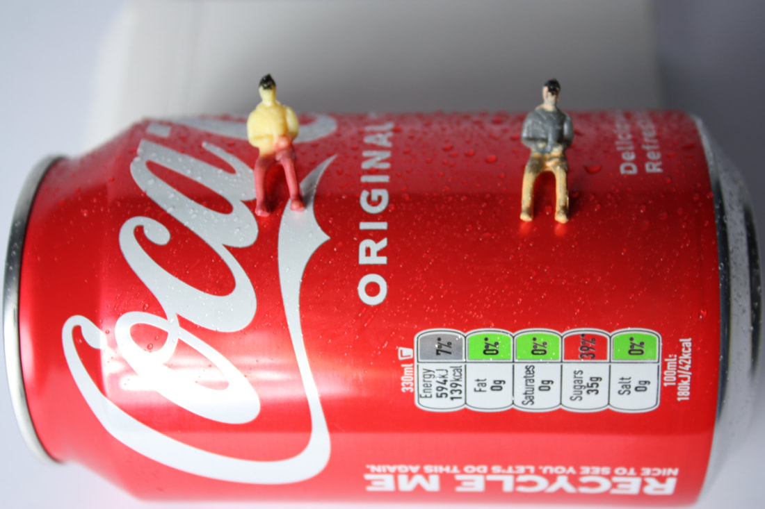
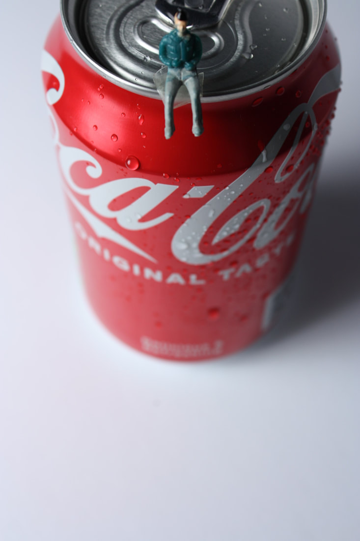
Minimiam (Akiko Ida & Pierre Javelle)
Akiko Ida is a Japanese photographer who's based in Paris where she met her husband Pierre Javelle. They both later worked on this project called Minimiam. Akiko and Pierre have created a miniature world of gourmandise, the minimiam. The aim of this work was to relive childhood emotions, smell and taste the photographic adventures that come alive on your plate.They came up with a concept of using miniature train figures to illustrate stories of food. These as shown below are shown in diptych format (two images).
They show close ups and then zoom out which shows the general scene allowing the viewer to discover the meaning and to continue the adventure according to his or her own reference. I really like this Idea as I like how creative it is but also how fun it would be to create. This relates to contrast as it shows the contrast in size, the miniature people in comparison to the size of the food.
They show close ups and then zoom out which shows the general scene allowing the viewer to discover the meaning and to continue the adventure according to his or her own reference. I really like this Idea as I like how creative it is but also how fun it would be to create. This relates to contrast as it shows the contrast in size, the miniature people in comparison to the size of the food.
|
|
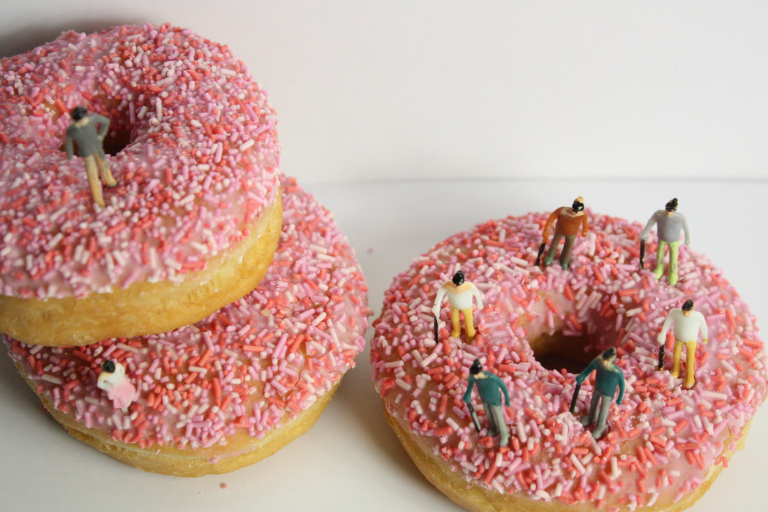
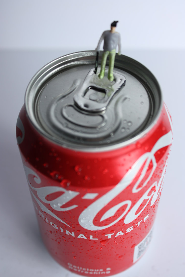
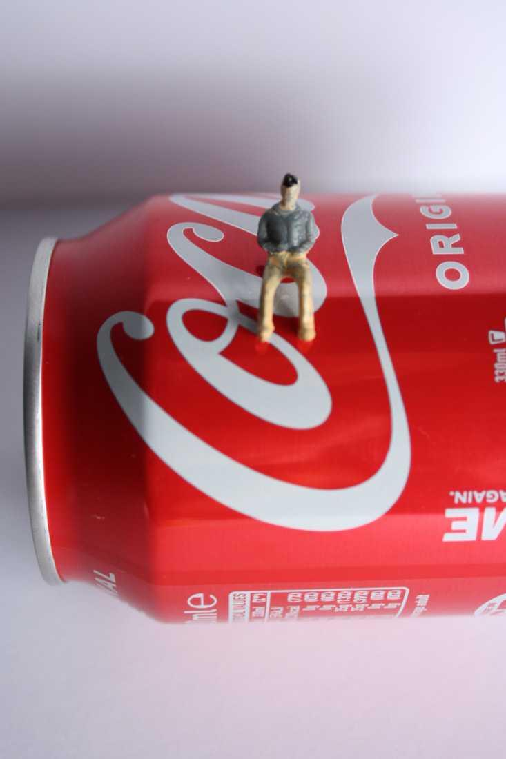
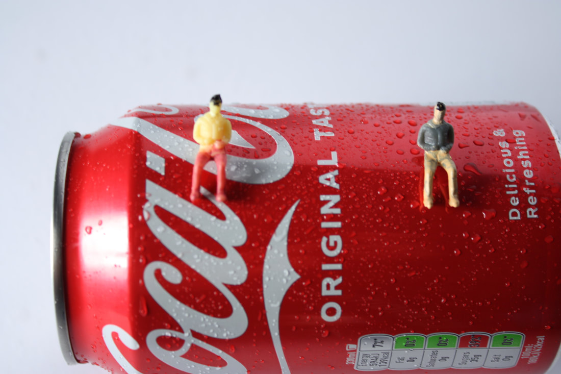
My Response-


Edited Images-
|

|

|

|
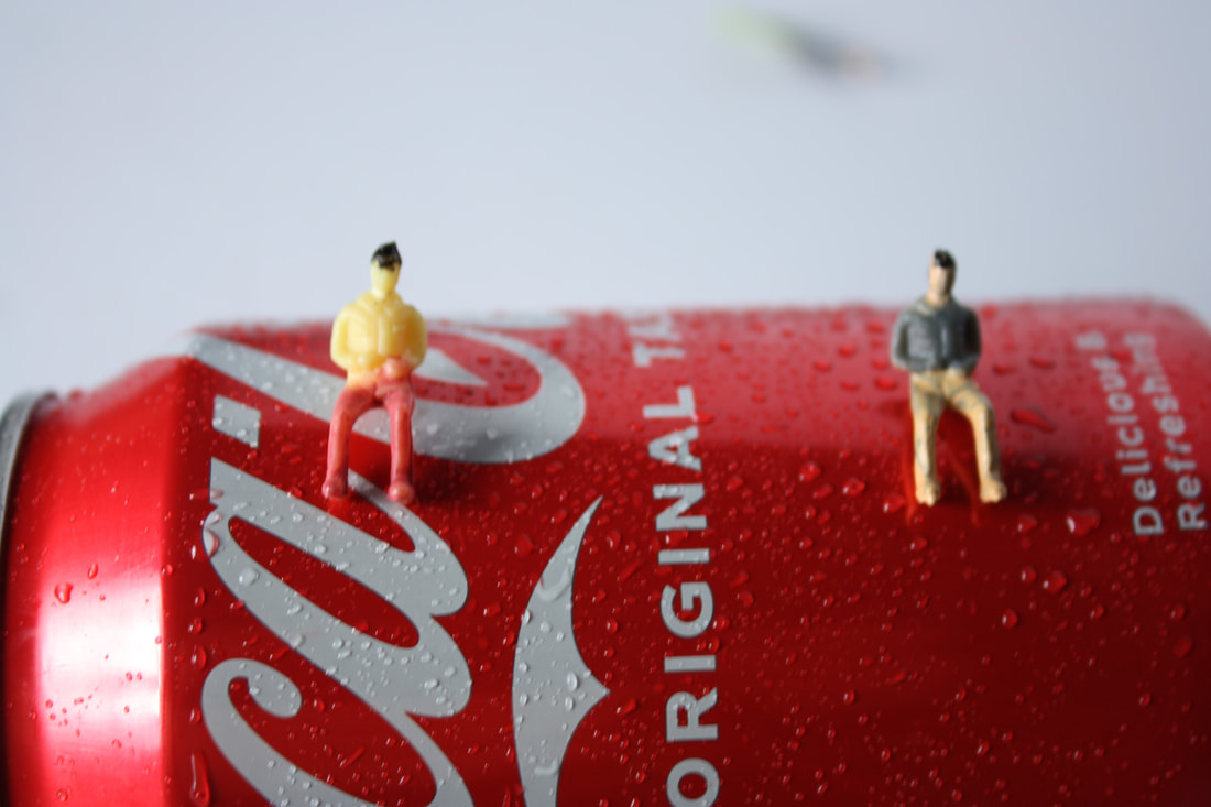
2nd Response-
|
|
|
|
|
|
|
|
|
|

|
|

|
|
|
|
|
|
|
|
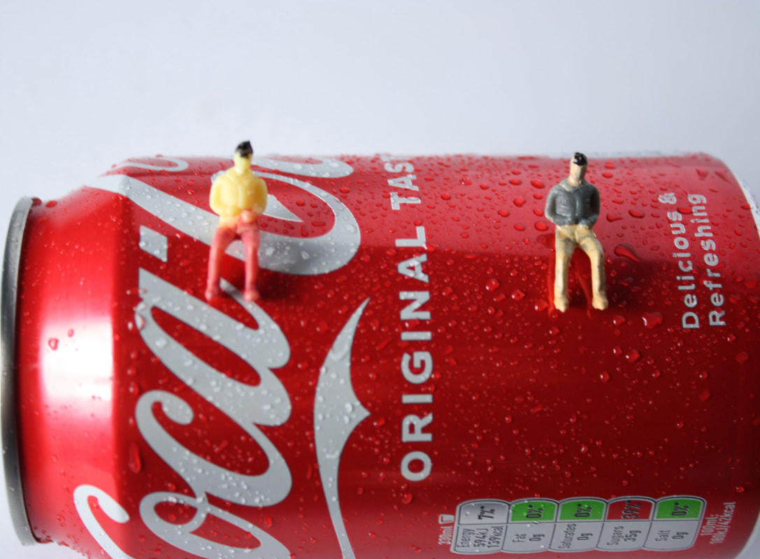
Edited Response-

|

|
|
3rd Response-

|

|

|
|
|
|
|
|
|
|
|
|
|
|
|
Edited Images-
|
|
