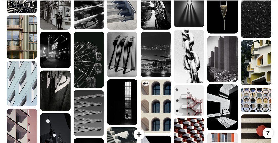
Word Theme-
My Words-
Brutalism
Isolation
Distortion
Black and white
Bleakness
Post WW
Poverty
New vs Old
Past
Displacement
Neglect
Corruption
Diversity and Unity
Contrast
Landscapes
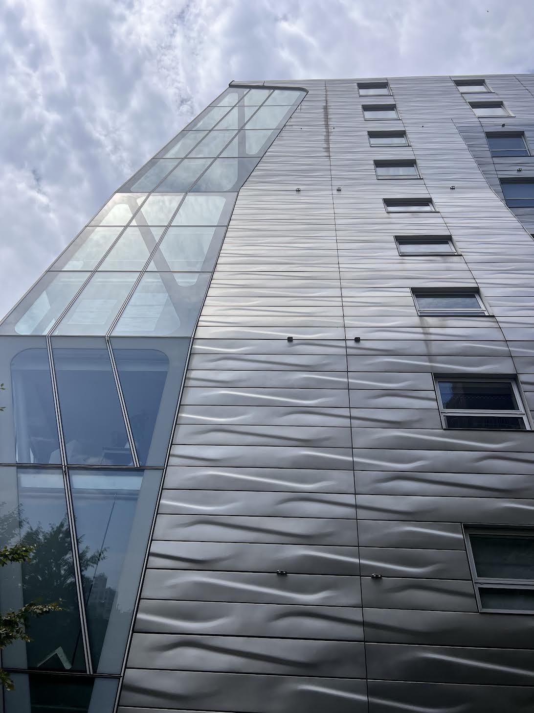
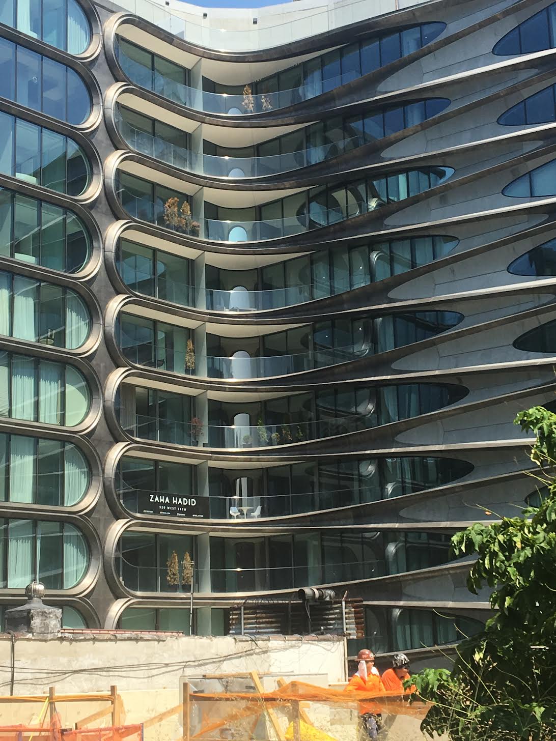
Architecture
Silhouettes
Fractured images
Nature
Blur
Light photography
Layered photography
Cities structure
Isolation
Distortion
Black and white
Bleakness
Post WW
Poverty
New vs Old
Past
Displacement
Neglect
Corruption
Diversity and Unity
Contrast
Landscapes
Architecture
Silhouettes
Fractured images
Nature
Blur
Light photography
Layered photography
Cities structure
Contrast

Contrast-Contrast is the contradiction in luminance or colour that makes an object distinguishable. In visual perception of the real world, contrast is determined by the difference in the colour and brightness of the object and other objects within the same field of view.
I chose this as one of my words as I believe it can be interpreted in many different ways which allows creative freedom.
I chose this as one of my words as I believe it can be interpreted in many different ways which allows creative freedom.
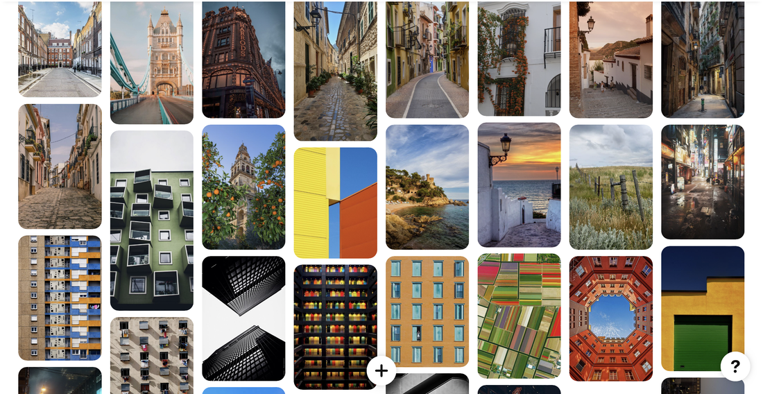
Contrast in Spain-


Analysis of my work- In these images above I went round a local village in spain in the daytime and took photos of the buildings and surrounding area. I felt like these images showed contrast as they used many different colours on the buildings. I also like the vibrancy of the colours in these images. I like how I did close up pictures but I also think the photos would have been more successful if I had a mixture of close up and further away images capturing the whole building. However this is quite hard to do as the roads in spain are narrow therefore not enabling you to picture the building from further back
I also went around another local village in spain and took photos of the market at night. My aim was to have the bright light as the focus and it to have a dark surrounding. I am going to edit some of these images in photoshop to emphasise the focus of the bright light and make the background much darker. I like these photographs because although they are actually taken in a busy market it makes the stalls look isolated and that they're the only thing there.
I also went around another local village in spain and took photos of the market at night. My aim was to have the bright light as the focus and it to have a dark surrounding. I am going to edit some of these images in photoshop to emphasise the focus of the bright light and make the background much darker. I like these photographs because although they are actually taken in a busy market it makes the stalls look isolated and that they're the only thing there.
Best Edits-

|

|
Process- I uploaded the photos to photoshop and then used the crop tool to make the photo equal on each sides, to straighten the image and to allow the ticket machine to be the centre of attention,
I then used the paint tool to. colour the background black, I changed the transparency and hardness of the brush depending how far or close I was to the building. Photograph Analysis- I like how darkening the image increases the effect of the dark and light contrast. It also gives the sense of loneliness and that the image is stand alone in the middle of know where. It allows the ticket box to be the sole focus of the picture with no distracting factors in the background. |

|

|
Process- I uploaded the photo to photoshop and then used the crop tool to make the market stall centre of attention and to make sure it was central.
Then I used the brush tool to darken the background so there weren't any distractions. Photo Analysis- Darkening the background allows the market stall to be the sole focus of the image, it also gives the effect like the market is floating. I like the contrast of the dark and the light |
Landscapes

Landscape- A landscape is the visible features of an area of land, its landforms, and how they integrate with natural or man-made features, often considered in terms of their aesthetic appeal.
My Response-


Analysis of my work-These images show the landscape of a small village in NY called Ellicottville. They show the different landscapes in the village and the different buildings. I like these photos, especially the images of the houses as they are very interesting and different to the houses in London. I didn't like that in front of some of the photos of houses there was black wires, so I will use photoshop to get rid of them.
Also these images at night show lights at night next to the sea. I experimented with different focuses, apertures and shutter speeds to change the style of the photographs. I didn't think that they were very successful as they are not very innovative and they are very similar similar to each other.
Also these images at night show lights at night next to the sea. I experimented with different focuses, apertures and shutter speeds to change the style of the photographs. I didn't think that they were very successful as they are not very innovative and they are very similar similar to each other.
Best Edits-

|

|
Architecture

Architecture- Architecture is the art and technique of designing and building, as distinguished from the skills associated with construction. It is both the process and the product of sketching, conceiving, planning, designing, and constructing buildings or other structures.
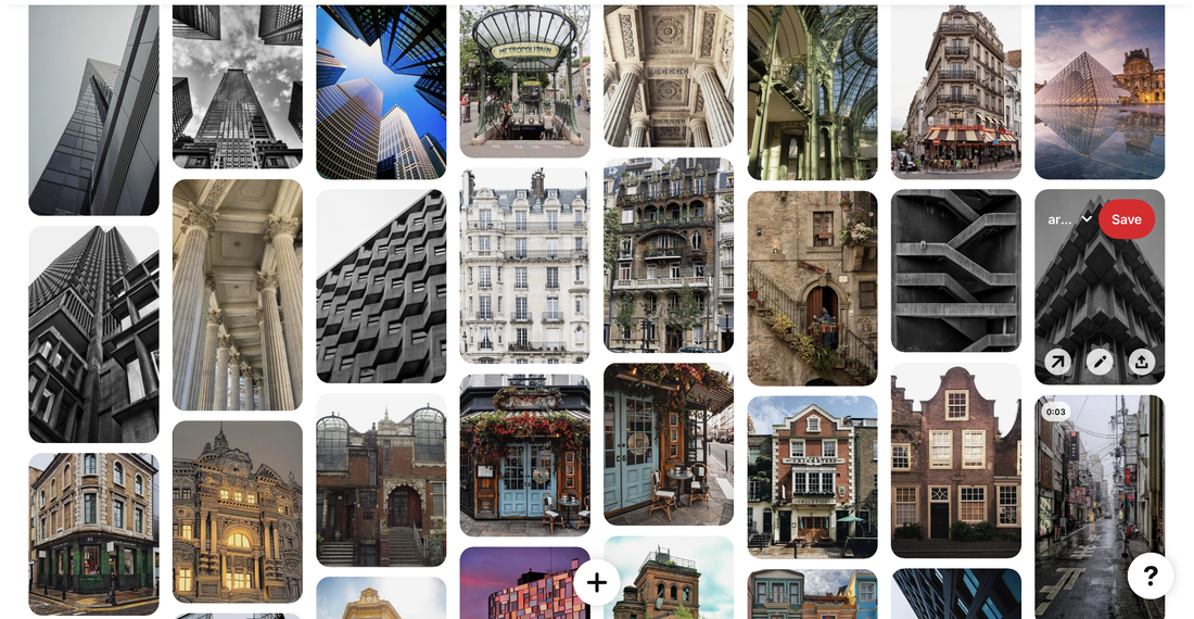
Inspired by-
Allen Klosowski
Allen Klosowski's art is centred on structures like buildings and architecture and how their design dominates the environment. Instead of just photographing huge structures, he will pay attention to reflections, measurements, patterns, and other minute elements that we typically overlook. His work also has a connection to the environment because it is made up of structural constructions. His goal is to demonstrate how each spectator sees a building in their own unique way. We can view the image in numerous ways since some buildings are mirrored, some are taken from below the building, others are taken from above, and some are straight ahead.

|

|
My Response-


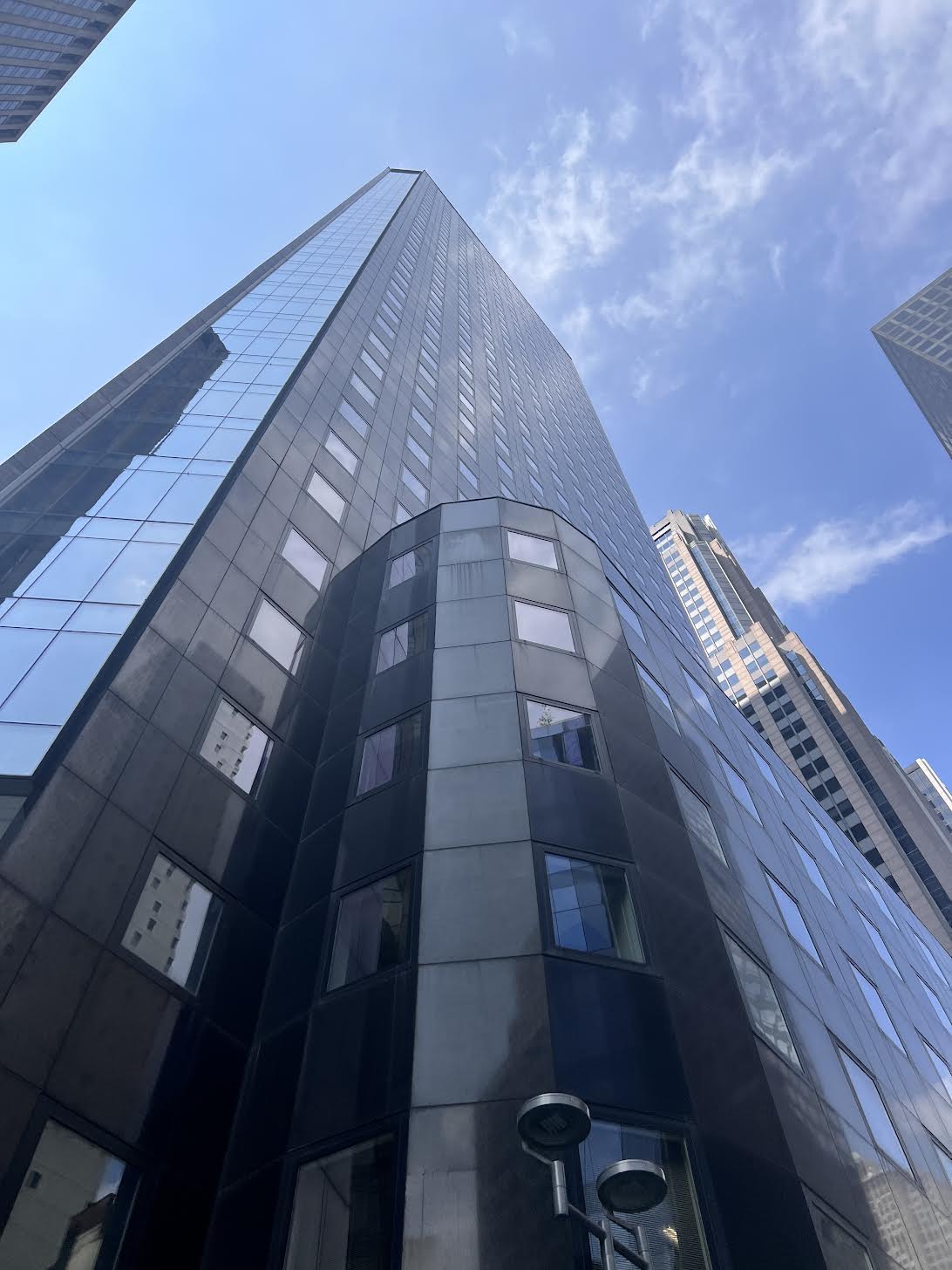


Analysis of my work-I photographed the architecture of NYC. I focused on "looking up" photography where I photographed different angles from below skyscrapers to create different effects.I loved photographing big landmarks especially the Empire State building. My favourite images was where I was looking directly up to the sky and there were buildings all around in a circle.
I also went on the high line which is a walk above the streets of Manhattan which allowed me to photograph some buildings from a front facing angle. I enjoyed taking photos from these angles as well but I believe that they are less effective.
I also went on the high line which is a walk above the streets of Manhattan which allowed me to photograph some buildings from a front facing angle. I enjoyed taking photos from these angles as well but I believe that they are less effective.
Best Edits-

|

|
Contrast
Over the summer I took photos which I thought represented the words I chose. I now have chosen Contrast as my selected word. I have now chosen 3 strands to continue my response for the word contrast. My 3 strands are:
New V Old
Man V Nature
Day V Night
New V Old
Man V Nature
Day V Night
1st Strand
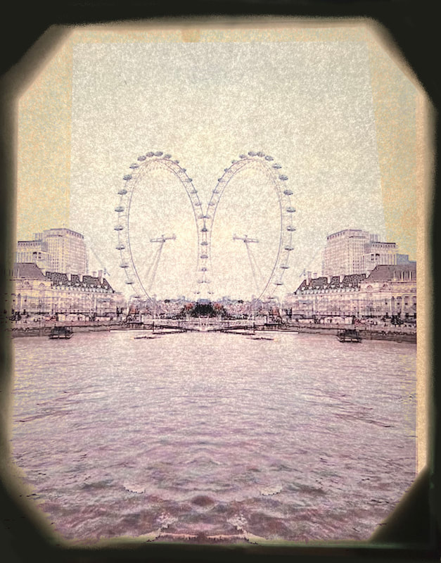
In my first strand my project is New V Old where I am going to incorporate old photos in my photography.
I am going to take photos of places around London now and superimpose them with photos of how they looked in the past. This is to show the contact between the present day and the past and to show how much things change in a relatively short amount of time.
I am going to take photos of places around London now and superimpose them with photos of how they looked in the past. This is to show the contact between the present day and the past and to show how much things change in a relatively short amount of time.
Pinterest Inspiration-
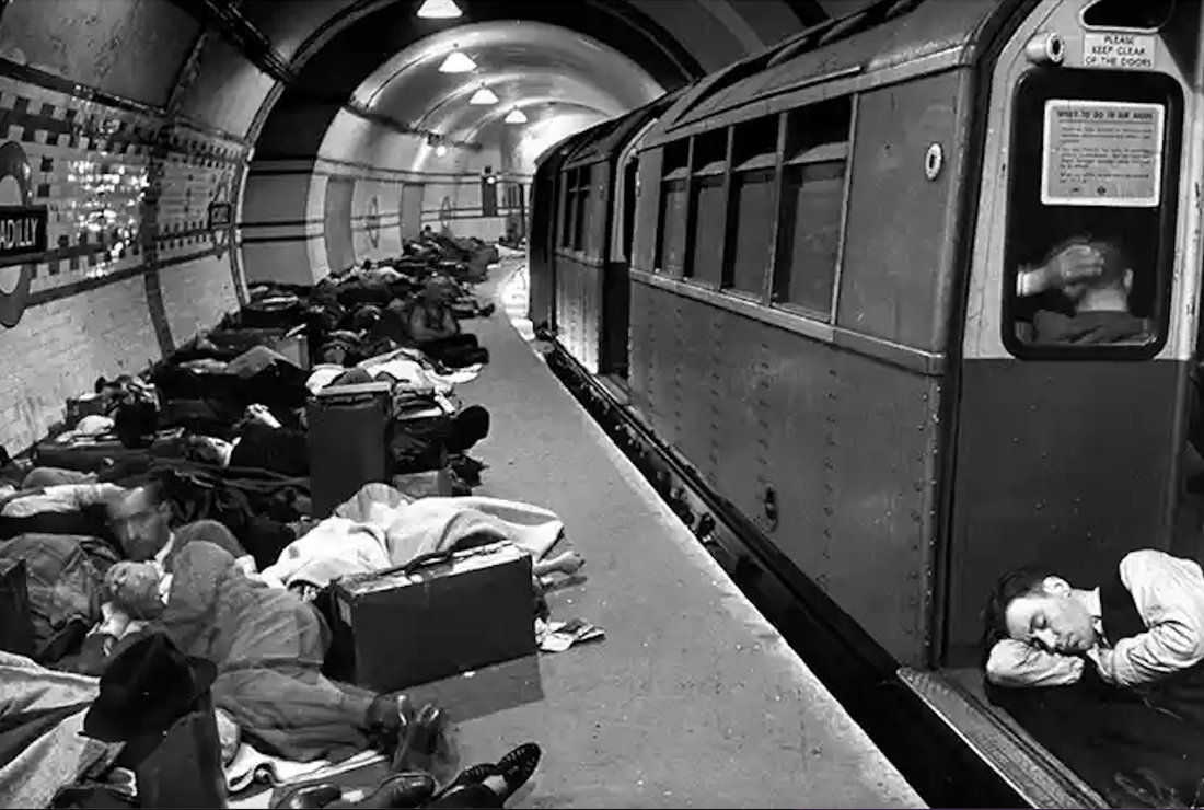
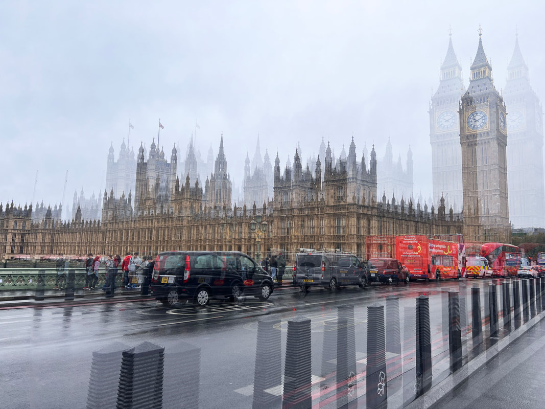
Here is a photograph of Londoners sleeping in the underground train station Piccadilly for protection during the German Bombing raids in 1941.
It was photographed by Hans Wild a British photographer who worked for life magazine from 1938-1946. |

Here is a photograph of Soldiers returning home on the tube after the end of WW2 in 1945.
The Photograph was taken by Keystone. |

A mock-up at the 'Victoria line' exhibition at the Design Centre, London, of the interior of a new type of carriage that would be used on the new Victoria line, 20 August 1968. The new carriages feature lengthways seating to allow more room for standing passengers, two-level arm rests, which can be shared by adjacent passengers, and internal speakers for driver announcements.
It was photographed by Ron Case |
Above is 2 photographs of the overground line to Chesunt.
Overground trains were first introduced in 2007 as a commuter route for those who live in the suburban areas of London. In comparison to for example the northern line this train is ,much cleaner and more spacious for passengers, similar to how they described the Victoria line back in 1968. |


2nd Strand
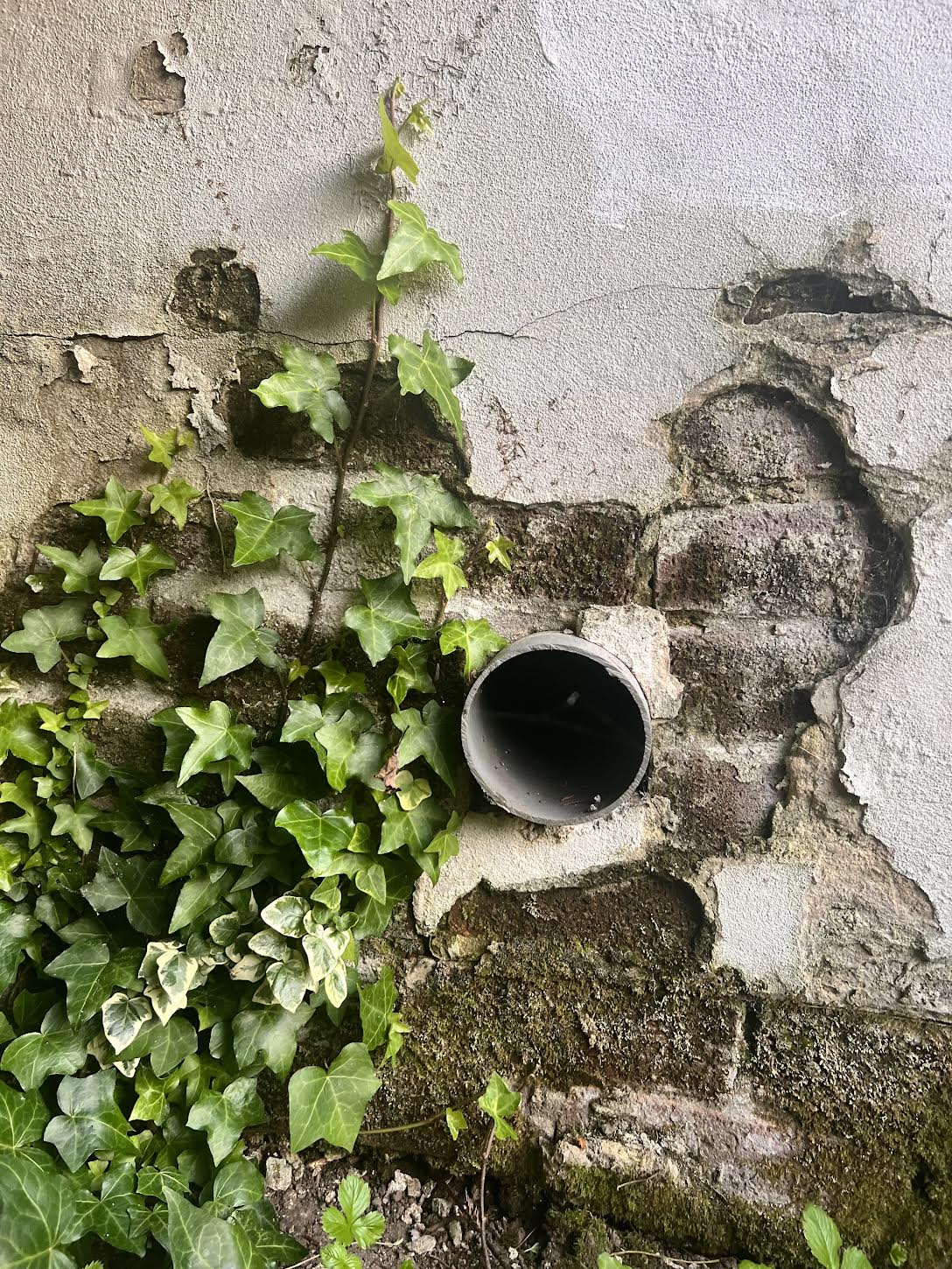
My second strand project is Man V Nature.
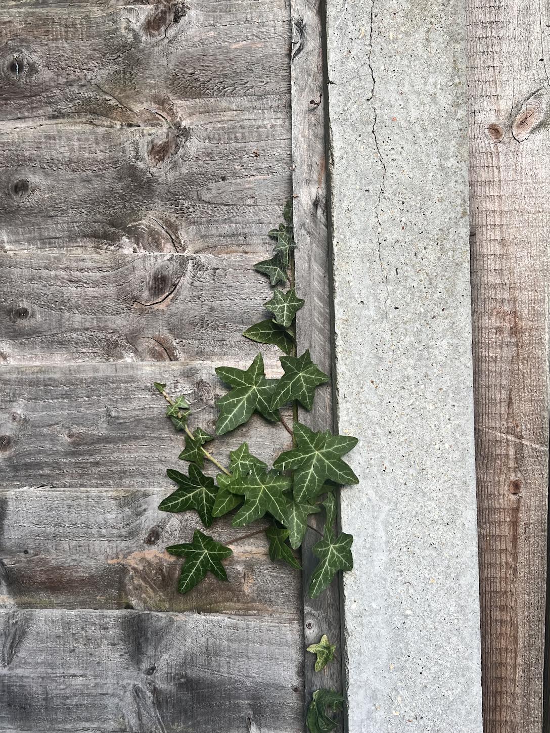
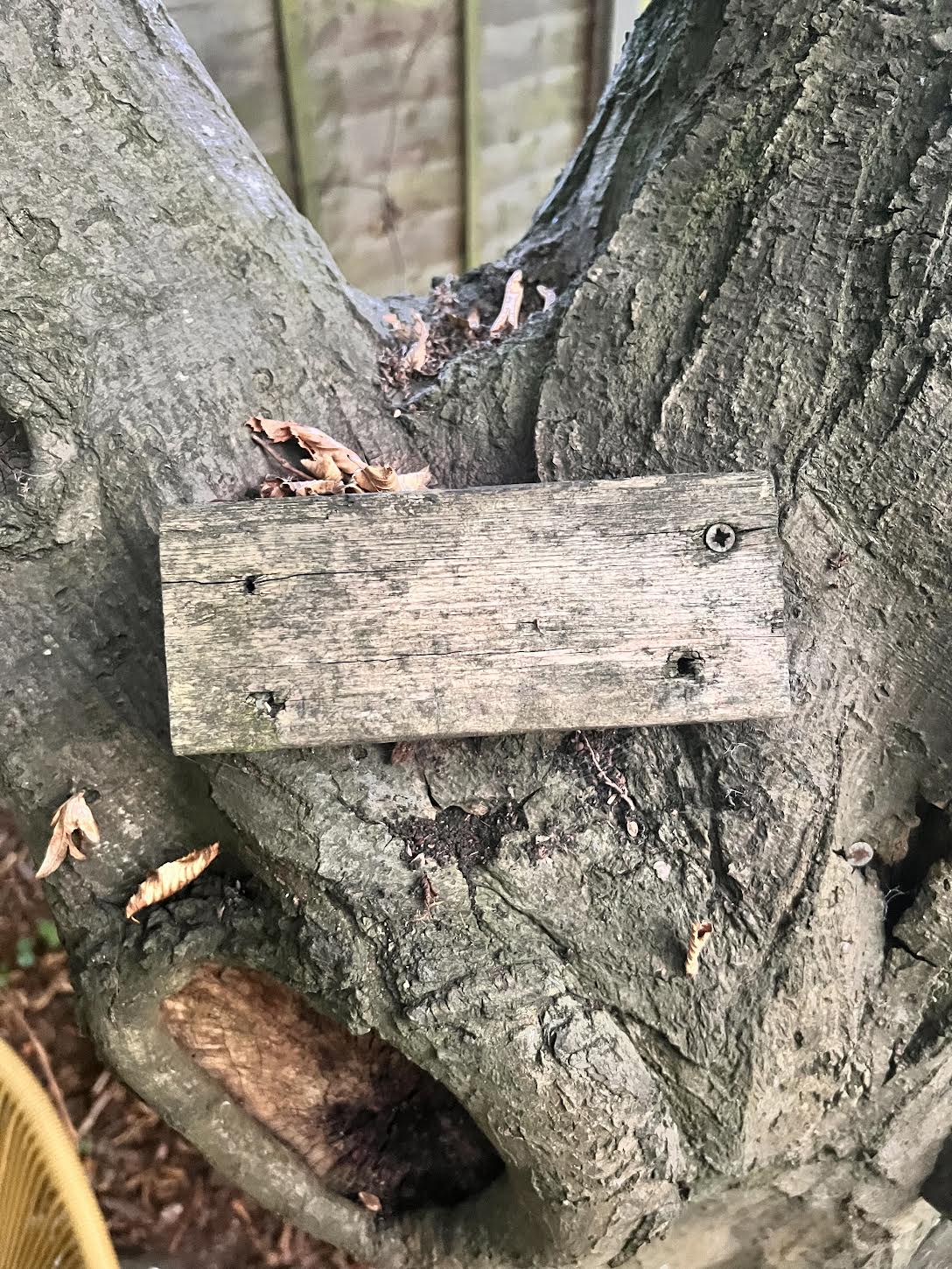
I am going to go around my local environment eg Coldfall Woods where I am going to show where nature has started to intertwine with man made objects. Showing that nature s accepting these man made objects into the environment and showing that they are helping them to grow and also its nature claiming back their environment.
I am going to go around my local environment eg Coldfall Woods where I am going to show where nature has started to intertwine with man made objects. Showing that nature s accepting these man made objects into the environment and showing that they are helping them to grow and also its nature claiming back their environment.
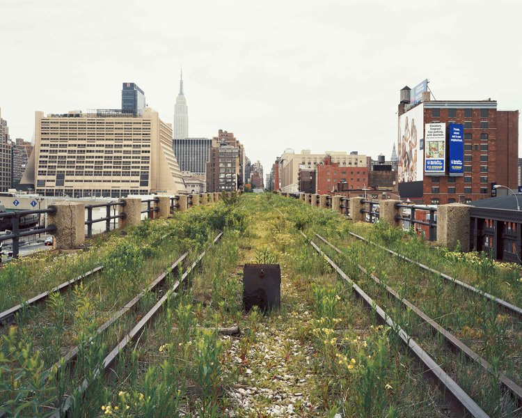
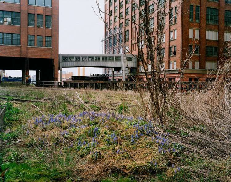
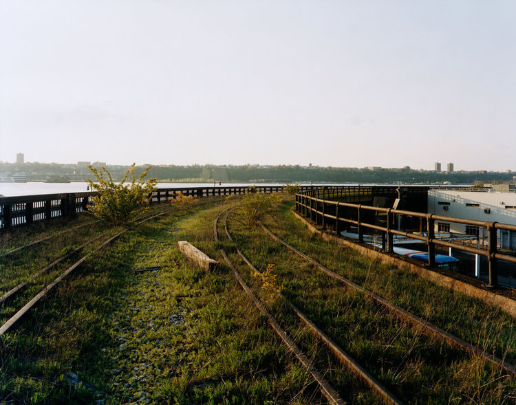
Joel Sternfeld-
Joel Sternfeld is a renowned American photographer known for his landscape and documentary photography. He gained significant recognition for his project titled "Walking the High Line," which documented the transformation of the High Line in New York City from an abandoned railway track to a vibrant urban park.
He documented the overgrown and wild state of the railway before it was converted into a public park. His images showcase the juxtaposition of nature reclaiming the space amidst an urban environment.
He documented the overgrown and wild state of the railway before it was converted into a public park. His images showcase the juxtaposition of nature reclaiming the space amidst an urban environment.
|
|
|
My Response-


Best Edits-
|
|
|
Above are my best edits from my first response to Man V Nature. My favourite edit was the middle one as I like how the ivy intertwines and is coming through the wooden fence. It almost shows how the wooden fence is helping the poison ivy to grow and support it. Next time I am going to photograph these images closer up to show how and the process of the ivy growing.
Analysis of my work-In this project "Man v Nature," I aimed to capture the often conflicting relationship between man made products and the natural world. Through a series of intriguing images, I sought to emphasise the impact of human made products and the effect of them on our environment. The project successfully showcased the stark contrast between man-made structures and the beauty of nature reclaiming the space back. It also shows the consequences of our actions on the planet.
However, to further improve this project, I could explore more diverse settings and contexts, incorporating different perspectives and places and how man-nature relationships could be perceived ed as positive or I could have incorporated photographs of more interesting places.
Additionally, experimenting with different photographic techniques and styles could add depth and variety to the visual narrative of the project.
3rd Strand
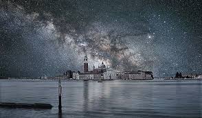
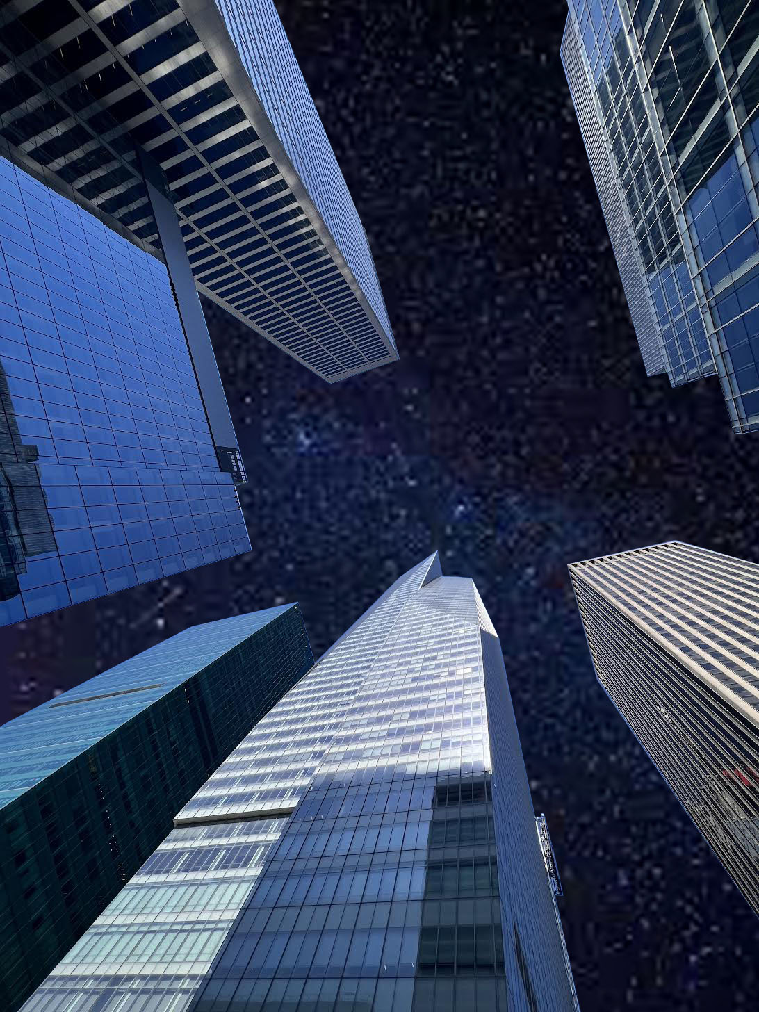
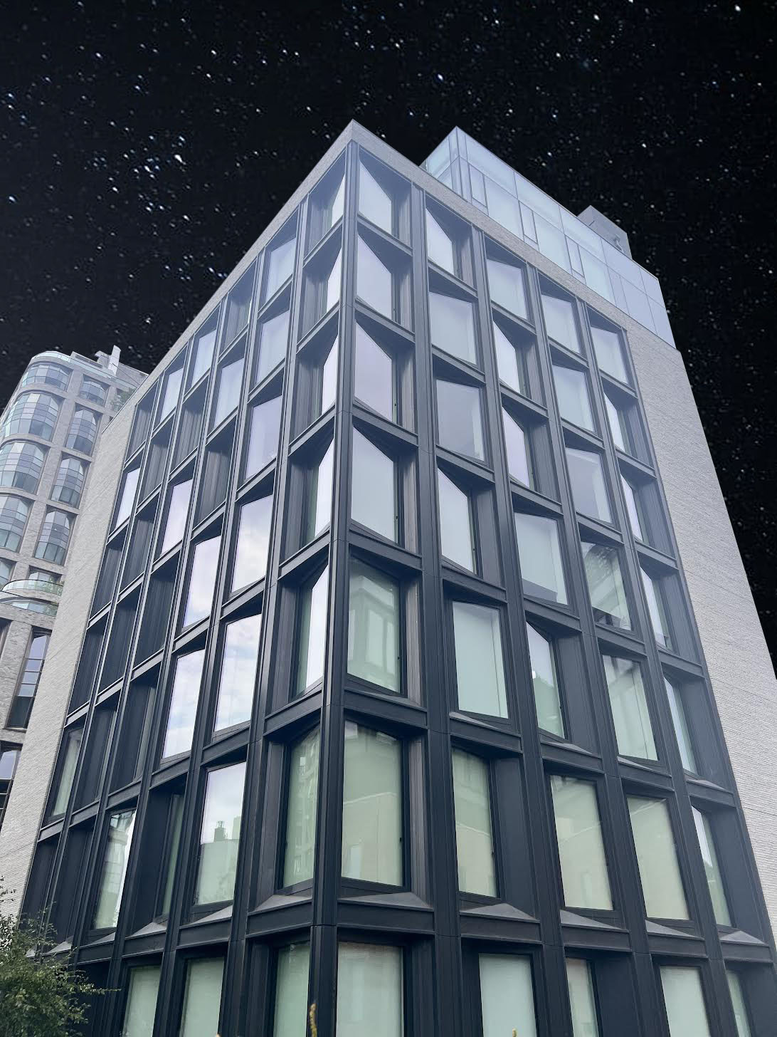
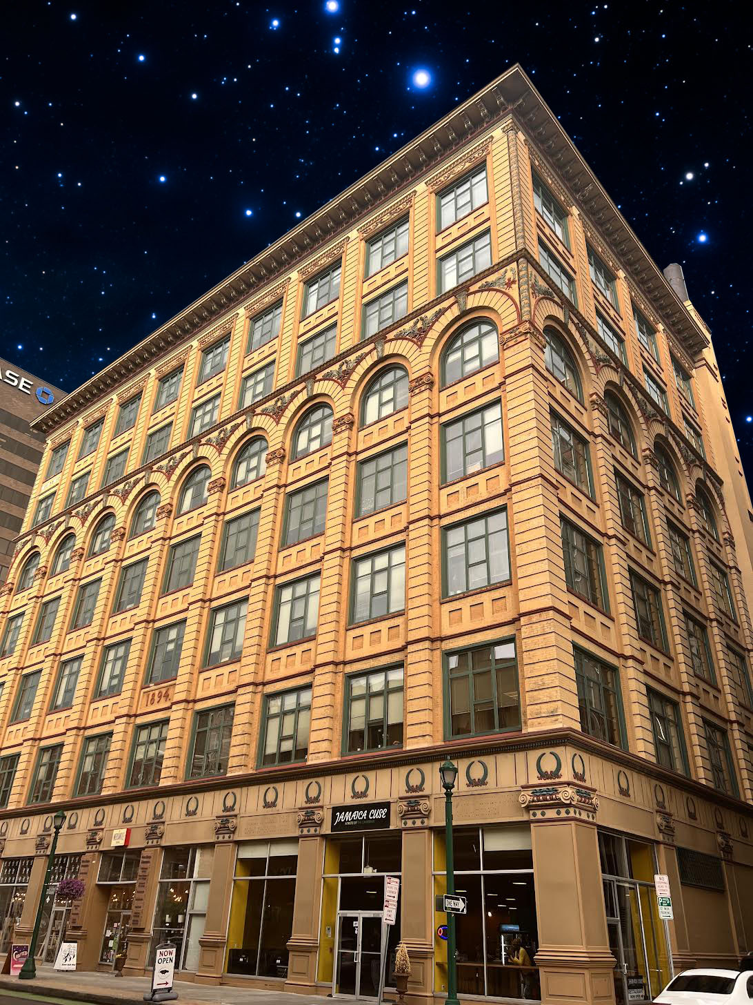
My third strand is Night V Day.
I am going to go around London and take photos of the architecture in the day time and then photoshop a star like background inspired by the artist Thierry Cohen.
I am going to go around London and take photos of the architecture in the day time and then photoshop a star like background inspired by the artist Thierry Cohen.
Pinterest Inspiration-
Thierry Cohen-
Thierry Cohen is a French photographer known for his unique and thought-provoking work that combines elements of astronomy, landscape photography, and environmental awareness. His photography often focuses on capturing urban landscapes and natural scenes in a way that highlights the night sky with an absence of light pollution, revealing a stunning view of stars.
Through his work, he raises awareness about the problem of light pollution, which obscures our view of the night sky in many urban areas. He juxtaposes illuminated urban scenes with their natural, unlit counterparts to emphasize the stark contrast between the two.
Thierry Cohen's photography has made a significant impact in both the art and environmental communities, drawing attention to the need for responsible lighting practices and the importance of reconnecting with the natural night sky.
|
|
|
|
|
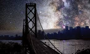
1st Response-

|

|

|
|
|
|
Analysis of my work-In this response I used close up photos of architecture around London and changed the blue sky to a dark stary sky which is what it should look like at night If there was no pollution.
My favourite image is the first one as I like how it gives the imagery of looking up at the stars at night and reminds me of when I was younger and used to do the same.I think in my second response I will defiantly take pictures of more vast landscapes rather that just particular buildings as I believe then the stary sky will have a greater impact.
My favourite image is the first one as I like how it gives the imagery of looking up at the stars at night and reminds me of when I was younger and used to do the same.I think in my second response I will defiantly take pictures of more vast landscapes rather that just particular buildings as I believe then the stary sky will have a greater impact.
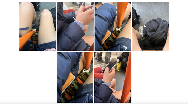
Wolfgang Tillmanns-
Wolfgang Tillmans is a renowned German photographer known for his innovative and diverse body of work. While he is not primarily associated with "tube photography," he has experimented with various photographic techniques and styles throughout his career.
Tillmans is known for his candid and intimate style of photography, capturing everyday life, portraits, and abstract images. His work often blurs the line between documentary and fine art photography.
Tillmans is known for his candid and intimate style of photography, capturing everyday life, portraits, and abstract images. His work often blurs the line between documentary and fine art photography.
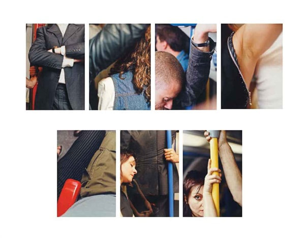
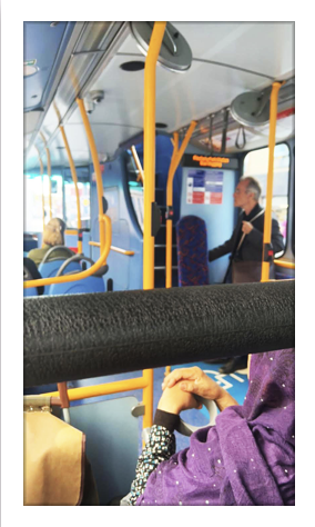
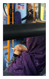
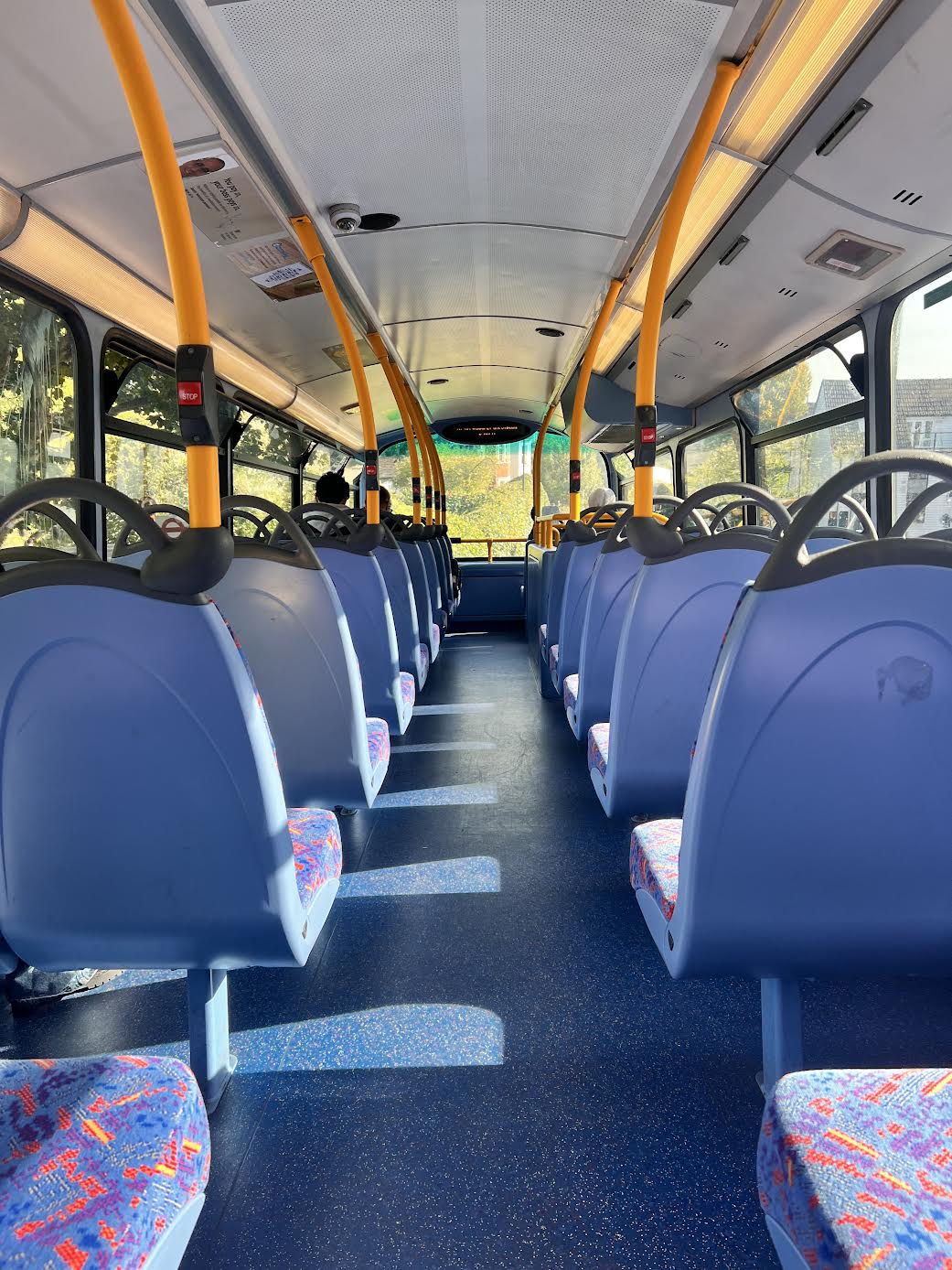
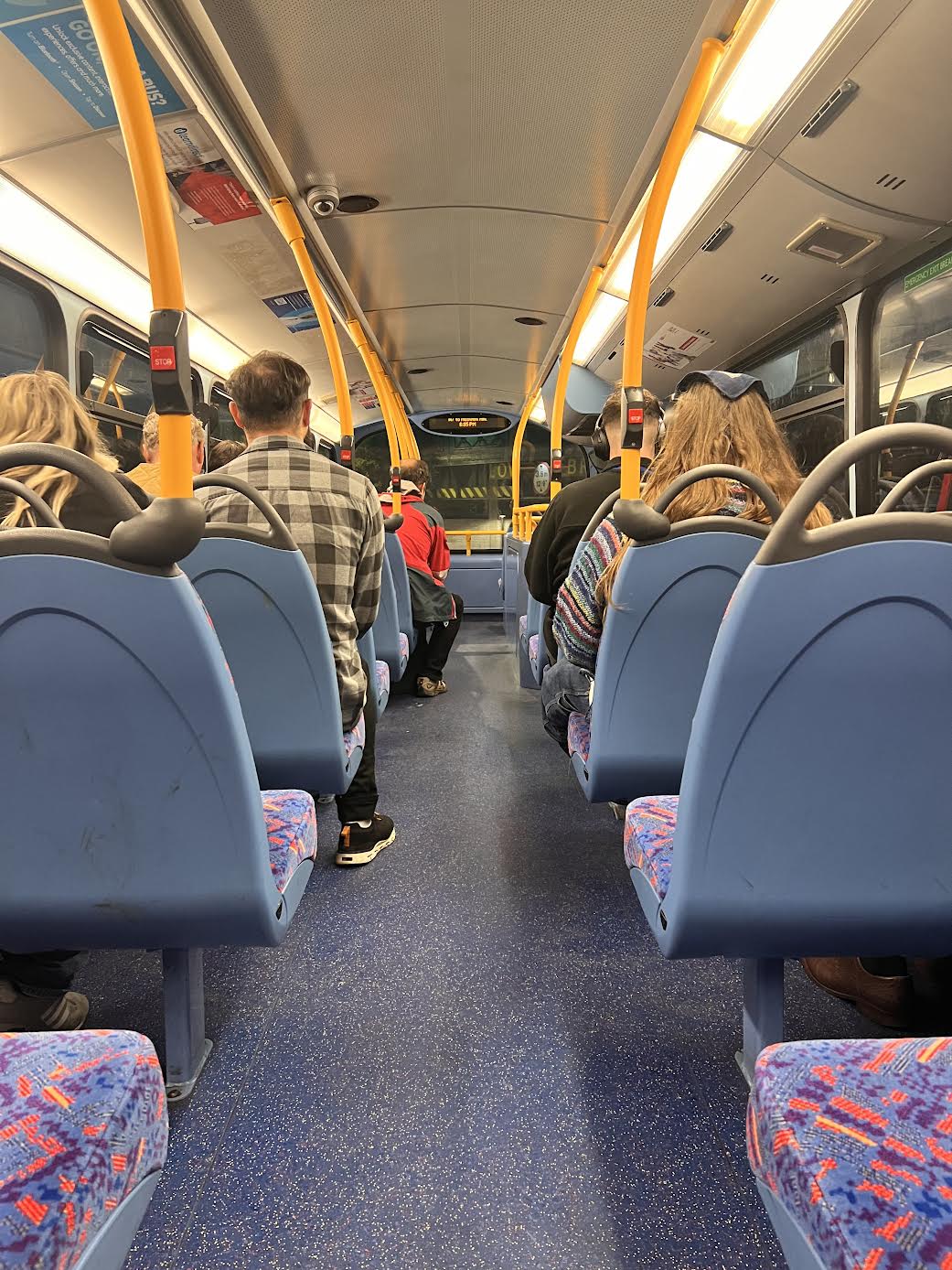
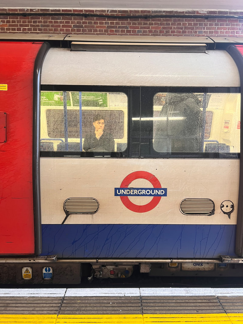
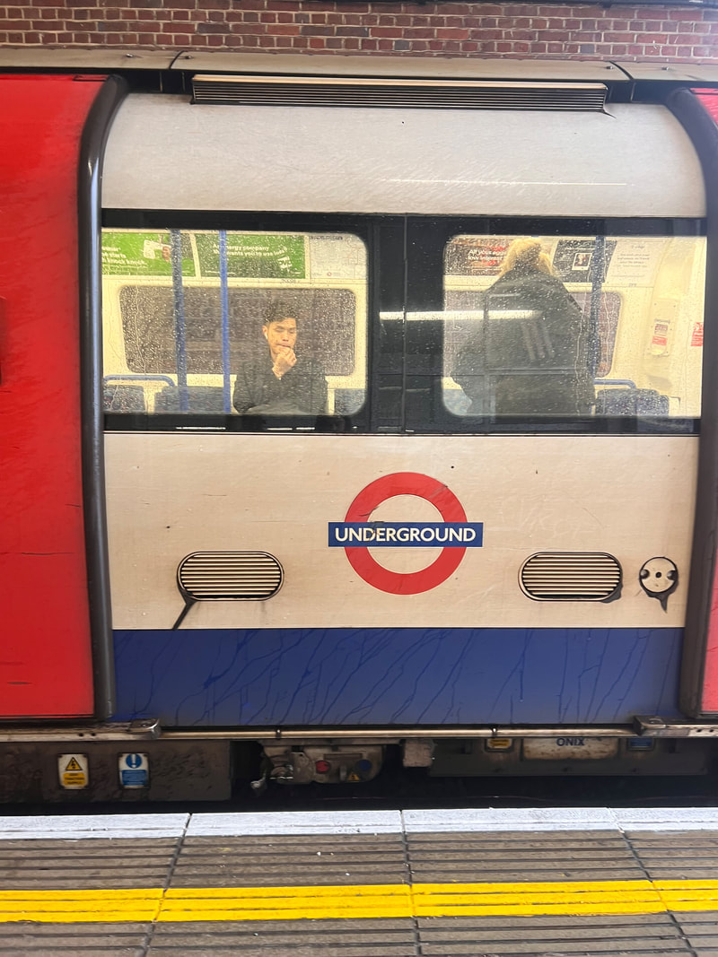
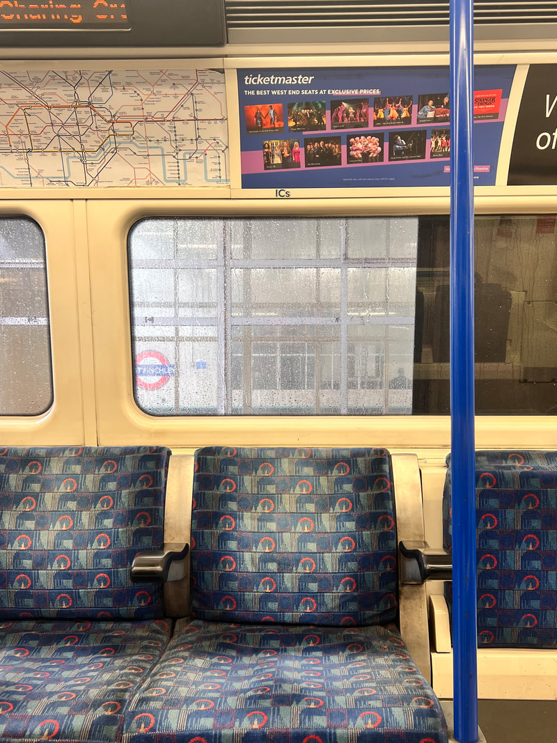
First Response(Tube)-
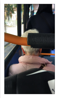
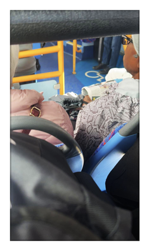
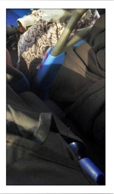
Second Response (Bus) (unedited)-
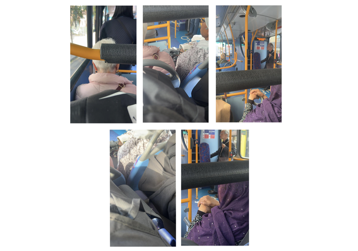
Edited Response-
|
|
|
|
|
Analysis of my work- In my recent photography project, which drew inspiration from the innovative works of Wolfgang Tillmans, I aimed to explore the nature of busy environments on public transport. Much like Tillmans, I sought to capture the essence of everyday life, emphasising the subtle details and nuances that often go unnoticed. Through candid shots of random people on the London Transport Systems, I attempted to convey a sense of intimacy and vulnerability which comes with it.
I do believe I successfully chaneled Tillmans effects of candid photos however one area I could improve is to increase the number of photos I take and also in the future take them at different times in the day when the transport is more or less busy.
I do believe that my Tube photos were much more successful than my bus photos.I preferred the contrast and saturation in the tube photos therefore I edited my Bus photos in photoshop and increased the contrast on the photographs on photoshop. I needed to do this due to the natural light coming through the bus windows making the photos more dull. This made the photographs brighter, less dull and look aesthetically more pleasing.
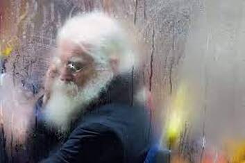
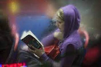
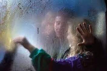
Nick Turpin-
Nick Turpin is a British photographer known for his series of photographs titled "Night Bus." This series captures candid moments of passengers on London's night buses. Turpin's work often focuses on street photography and urban life, and "Night Bus" is a notable example of his exploration of the interactions, emotions, and experiences of people in public spaces.
The "Night Bus" series typically features black-and-white or color images that convey a sense of intimacy and vulnerability among the passengers. The photographs are taken without the subjects' awareness, providing an unfiltered glimpse into their late-night journeys. Turpin's use of available light and composition helps create a cinematic and atmospheric quality in his work.
The "Night Bus" series typically features black-and-white or color images that convey a sense of intimacy and vulnerability among the passengers. The photographs are taken without the subjects' awareness, providing an unfiltered glimpse into their late-night journeys. Turpin's use of available light and composition helps create a cinematic and atmospheric quality in his work.
|
|
|
First Response-

|

|

|
|
|
|
|
|
Second Response-


Development
Development 1
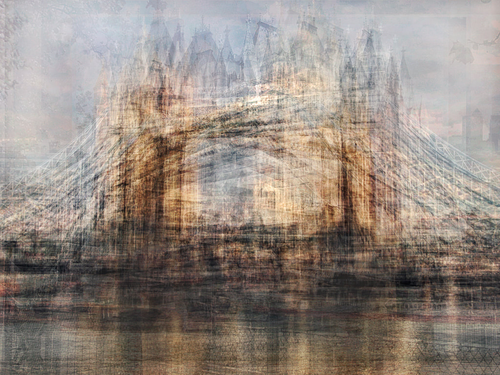
Dan Marker-Moore-
A Time Slice is an image built from the photos of a timelapse. Each slice is a photograph taken at a different point in time, usually a few minutes after the previous slice. All the Time Slice images are unique, made from a different number of images, over a different amount of time.
Dan Marker-Moore is a Los Angeles-based photographer and visual artist known for his innovative and mesmerizing "time slice" photography. Time slice photography is a technique that involves capturing multiple moments in time and then combining them into a single image to create a sense of motion and the passage of time.
In Marker-Moore's time slice photography, he typically captures a sequence of images over a period of time, often hours or even an entire day. These images are then stacked or arranged side by side in a single composition, creating a visual representation of time passing. The result is a striking and surreal image that reveals subtle changes in light, movement, and the environment over time.

|

|

|
1st Response-
These time slices were taken out of my loft window and photographs a view of Coldfall woods. This was mainly a practice shoot to gage the timeframe it would take and what settings on the camera to have. Overall it took me around 1.5 hours and I took a photo every 3 minutes while the sun was setting, from 6.30- 8 o' clock.
I have decided to take the photos on the manual setting on the camera.
I have decided to take the photos on the manual setting on the camera.
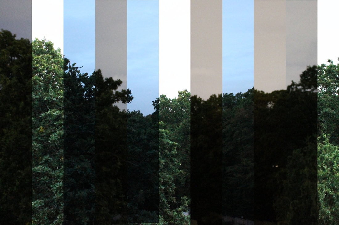
Analysis of my work-Although this shoot was a test run I didn't think it was very successful. I had the camera settings on automatic depth with meant that it never allowed my camera to fully capture the photos at night. This compromised the quality of my photographs at night due to this they are more blurry than the images when they were light.
However, I do believe that it did capture the essence of what I was attempting to recreate. It showed the comparison of day vs night from photographs simply of trees in my back garden.
In my next response, I would like to go into central London and set up my camera and tripod there for 1.5 hours. I will also photograph with my manual setting so that I can adjust the aperture and shutter speed. I feel as though this would be more interesting to look at. Also in London there are more external factors to take into account for example people or the night light coming from office buildings. This therefore will make my Time-Slice more interesting.
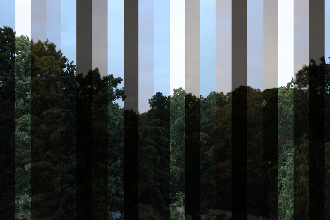
2nd Response-
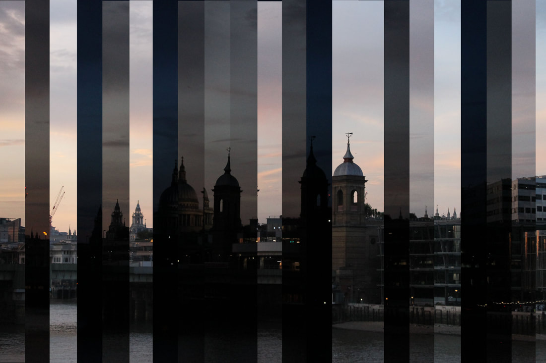
Analysis of my work-In this response I went to London Bridge to take my time slice photos. In total I spent 1.5 hours there taking 18 photos, which was 1 photo every 5 minutes.
I took my photos when it was sunset around 6.30 to show the biggest contrast of light vs dark.
My favourite part of the time slice is the contrast between the pink sky at sunset vs the dark blue night sky.
This response wasn't as seamless as my previous trees response, this was due to external factors such as people causing the angle of my camera to change. This stopped the images from being the exact same, which caused this response to lack fluidity unlike my artist Dan- Marker-Moore.
Development 2
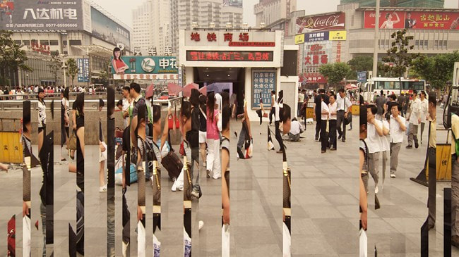
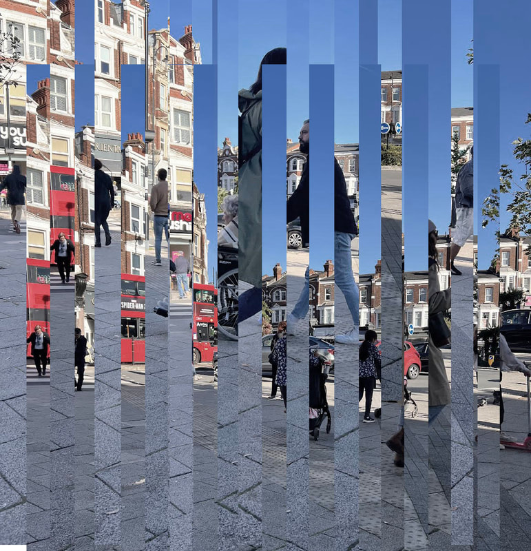
Daniel Crooks-
Daniel Crooks is an Australian contemporary artist known for his innovative and visually captivating photography and video art. He was born in 1973 in Hastings, New Zealand, and later moved to Melbourne, Australia, where he established his career as an artist. Crooks's work primarily explores themes related to time, space, and the perception of reality through the use of digital and cinematic techniques.
One of Crooks' signature techniques involves time-slicing or time-slicing photography. In this process, he captures a series of images or video frames over a span of time and then digitally stitches them together to create mesmerizing and distorted depictions of reality. These works often appear as if time and space are folding or warping, creating a surreal and dreamlike experience for the viewer. This technique allows him to represent the passage of time and the complex relationship between objects and their surroundings.
One of Crooks' signature techniques involves time-slicing or time-slicing photography. In this process, he captures a series of images or video frames over a span of time and then digitally stitches them together to create mesmerizing and distorted depictions of reality. These works often appear as if time and space are folding or warping, creating a surreal and dreamlike experience for the viewer. This technique allows him to represent the passage of time and the complex relationship between objects and their surroundings.

|

|
|

|
|
I took these photos in my local area, muswell hill, to get these photos I sat In the same spot for 30 mins with my camera. The photos show the process of change and show the different people that walk past the same place.
|
1st Response-
|
2nd Response-
|
3rd Response-
|
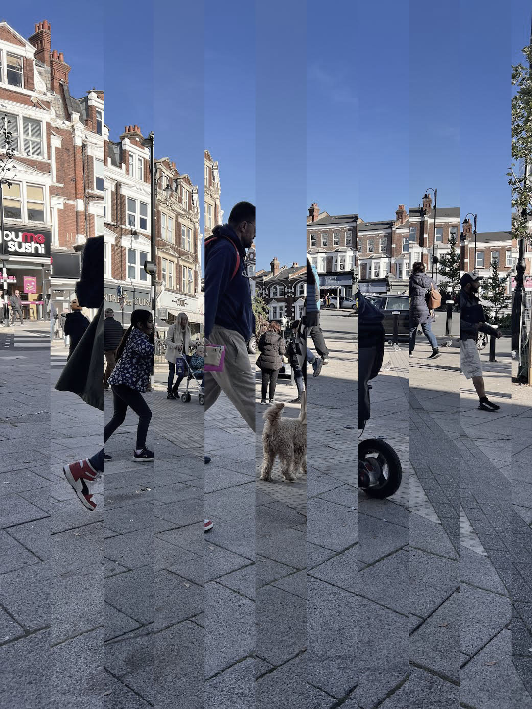
Analysis of my work-In this response I used photoshop to combine my images which were taken a different times from the same position. This is a response to Time Slices however instead of using architecture like my first development, I used people .
I edited my images in photoshop before combining them, I used hue and saturation to decrease the saturation of them image to reduce the vibrancy. This allowed my photos to look more similar to Daniel Crooks and look like they're taken on a film camera almost. In my next response I would like to have smaller slices of my images. |

Analysis of my work-In this response, I made the slices of my images thinner which increased the amount of images I could incorporate. I think this allowed the time slice to be more effective and incorporate more contrasting images.
In my next response, I would like to move my time slices at different heights to see the different effects I can create. Moving around the different slices will distort the images so that you can't fully tell what the object in the images are, especially when they're moving. In further responses I would also like. to change locations to areas with a higher concentration of people for example Oxford street. I believe that this will have a greater effect as the images will be more full, interesting and there will be more variation. |
Analysis of my work-In this response, I used photoshop to move different layers to give a distorted effect to the photo and like the different slices were moving.
I thought these photos were pretty effective, I think I could have stayed in the same place fro bit longer but maybe in the evening when not only the people are moving around but also the sky is changing from day to night. In further responses I would also like. to change locations to areas with a higher concentration of people for example Oxford street. I believe that this will have a greater effect as the images will be more full, interesting and there will be more variation. |
Development 3
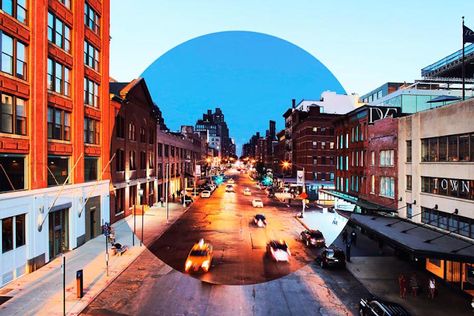
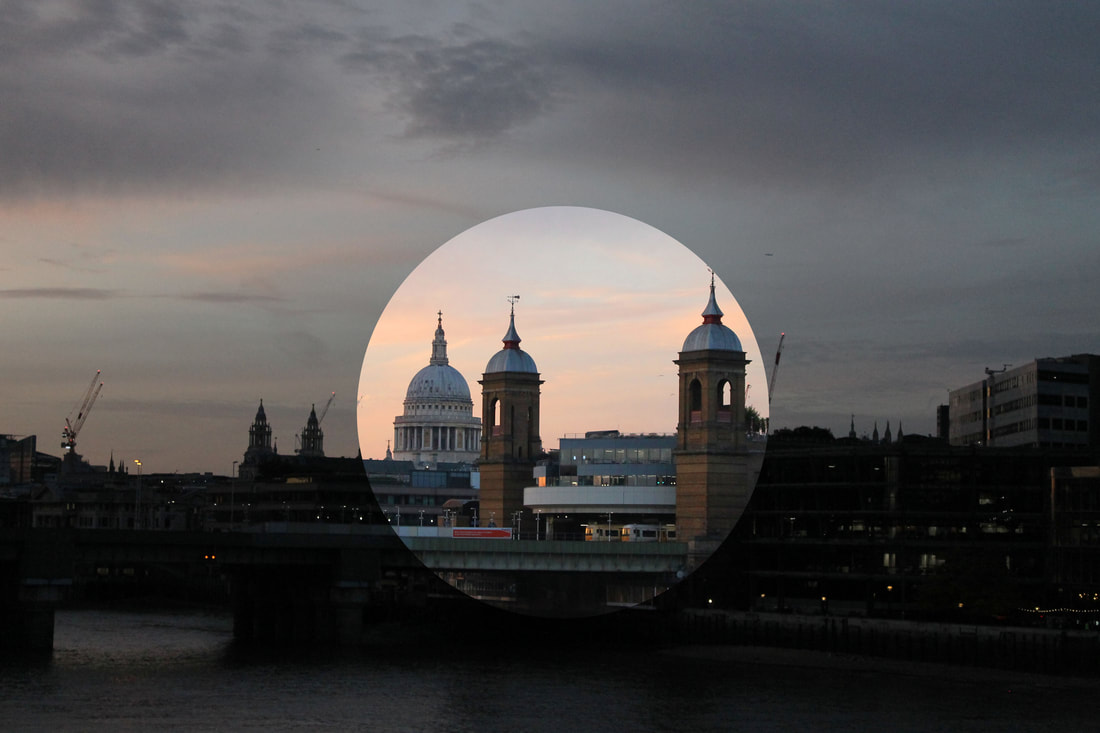
Carl Antonyn-
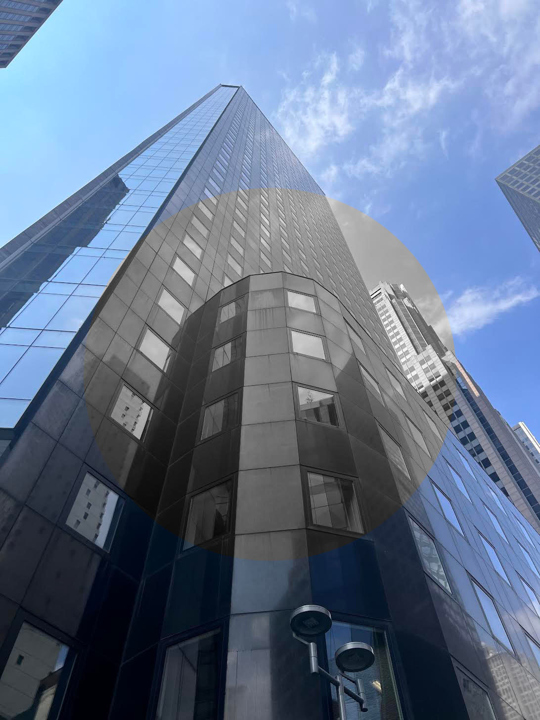
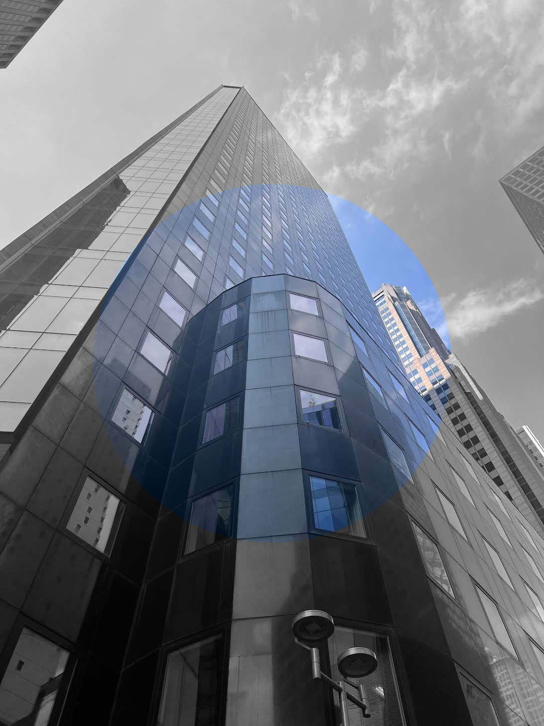
To further develop the idea of combining night time and daytime images together I will use the techniques of contemporary Canadian Photographer, Carl Antonyn Dufault.
He produced a series of photographs called 'Jour Nuit' (Day Night) where he shot the same cityscape scene at different times of the day. However, unlike Marker Moore and Fong Qi Wei, who use multiple images, he chooses to use just two pictures, one in sunshine - often at brightest time of the day, the other in the evening. Blending the two together with a bold circle contrasting the two scenes. He tries to illustrate how much the urban space can change in a few hours only. These are often exhibited as a pair, not only to show the differences in colours that change during the day, but the human perceptions of the city at different hours. He tries to destabilise the viewer by asking, "would you like to visit here, and if so when, during the day or at night? Do you prefer to be in the centre or on the periphery, which do you find more appealing?" Like Qi Wei and Moore using the composite pictures really does encourage focus on specific areas because there is so much detail often in the shadows.
"Through his photographs, he proposes his reflexion on the importance of context, time and the impact of citizens on the shape and form they give to their cities. His work suggests contrasts, offering new perspectives on the built environment around us."

|
|

|
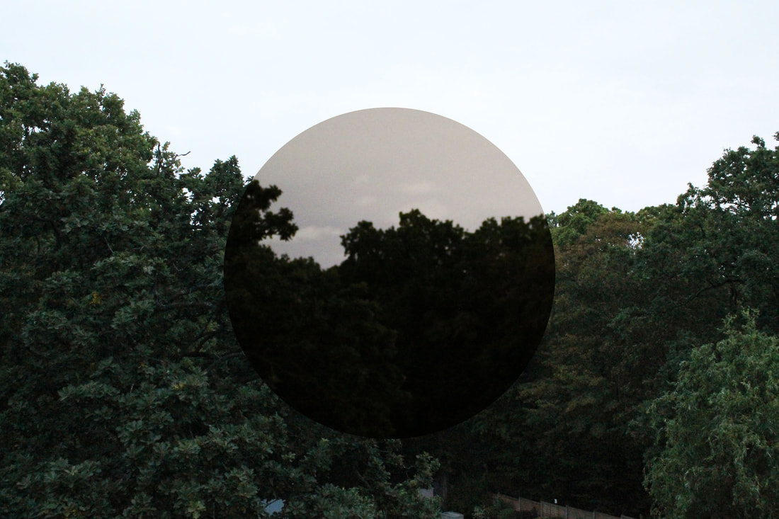
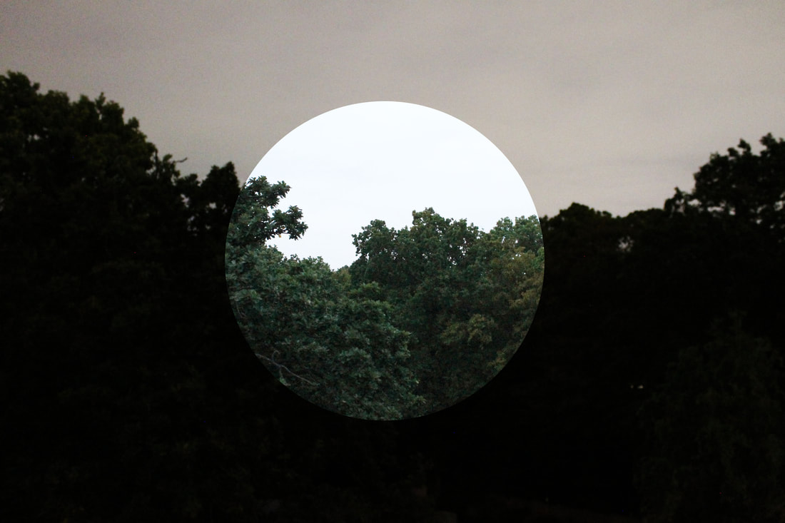
1st Response-
|
|
Analysis of my work- In this response I used my images from my time slice of trees in my back garden. After reflecting on this, I should have used photoshop to edit the night photo to make it clearer and more crisp. This would have allowed the trees to have greater definition rather than just being dark blobs. I could have also experimented with different shapes rather than just circles. However a positive is that the day v night images match up perfectly, this is due to my use of a tripod to get the photos to be in the same place
2nd Response-
|
|
Process-
|
|
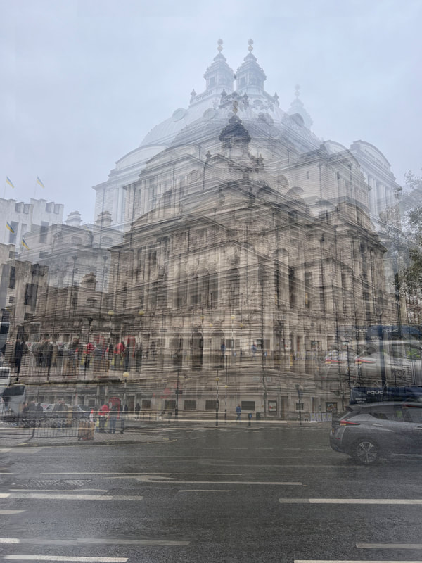
Analysis of my work- I like the first image especially as the dark middle gives off a brutalist effect and has a great contrast to the bright blue surroundings. I like how the building I selected has a blue tinge due to the sky reflecting of the building. I prefer these images to my previous response as the imahs are better quality and the black and white image is more crisp. However to improve this I should have changed then different brightnesses and contrasts of the black and white image as the current photo gives more of a grayscale effect.
3rd Response-
|
|
Analysis of my work- Out of all 3 of my responses this Is my favourite. This is due to the sunset and that is was a landscape image that incorporated multiple buildings rather than just focusing on one specific one. I would have liked the buildings to be brighter in the dark as I believe they are a bit too dark and it effects the quality of the photograph. If I photographed an area with more lighting when it got dark this could have combated my problem. I also believe these images would be more effective if I incorporated different shapes or multiple circle shapes rather than just 1, this would have made the photographs more interesting and more complex.
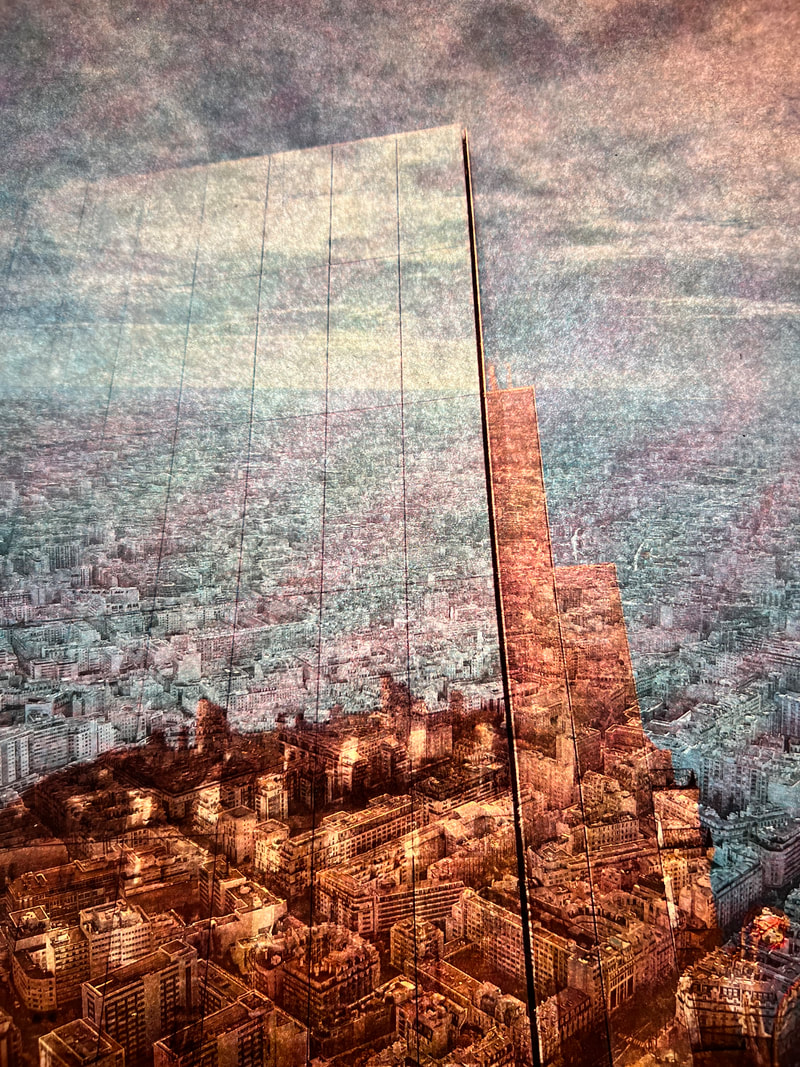
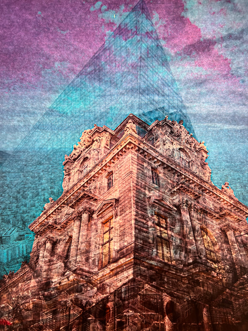
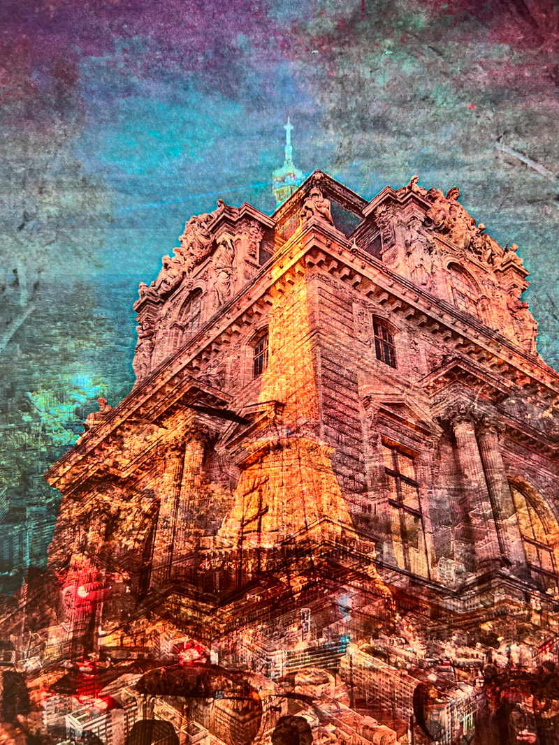
Development 4
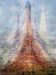
Idris Kahn-
Idris Khan is a British contemporary artist known for his unique and evocative approach to art, which often involves layering and blending various elements to create complex and visually stunning works.
Khan's work uses the mediums of photography, sculpture, and painting, and he is best known for his photographic and mixed-media pieces which is what i'm responding to. One of his most famous series is his photographic works, which involve layering and superimposing numerous images to create a single, multi-layered composition. This technique gives his works a sense of depth, timelessness, and complexity.
Khan's work uses the mediums of photography, sculpture, and painting, and he is best known for his photographic and mixed-media pieces which is what i'm responding to. One of his most famous series is his photographic works, which involve layering and superimposing numerous images to create a single, multi-layered composition. This technique gives his works a sense of depth, timelessness, and complexity.

|

|

|
Pep Ventosa-
Pep Ventosa is a contemporary Spanish photographer known for his innovative photographic technique called "ventosa," which is a Spanish word that translates to "suction cup." Ventosa photography is a unique and creative approach to image-making that involves taking multiple photographs of a subject from various angles and then combining them to create a composite image.
The process typically begins with Ventosa photographing a stationary subject, often focusing on scenes that involve architecture, landscapes, or cityscapes. He takes numerous pictures of the subject by moving around it and capturing it from different vantage points. These photographs are later digitally manipulated and blended together to create a single, multifaceted image that offers a distinctive and surreal perspective.
The process typically begins with Ventosa photographing a stationary subject, often focusing on scenes that involve architecture, landscapes, or cityscapes. He takes numerous pictures of the subject by moving around it and capturing it from different vantage points. These photographs are later digitally manipulated and blended together to create a single, multifaceted image that offers a distinctive and surreal perspective.
|

|
|
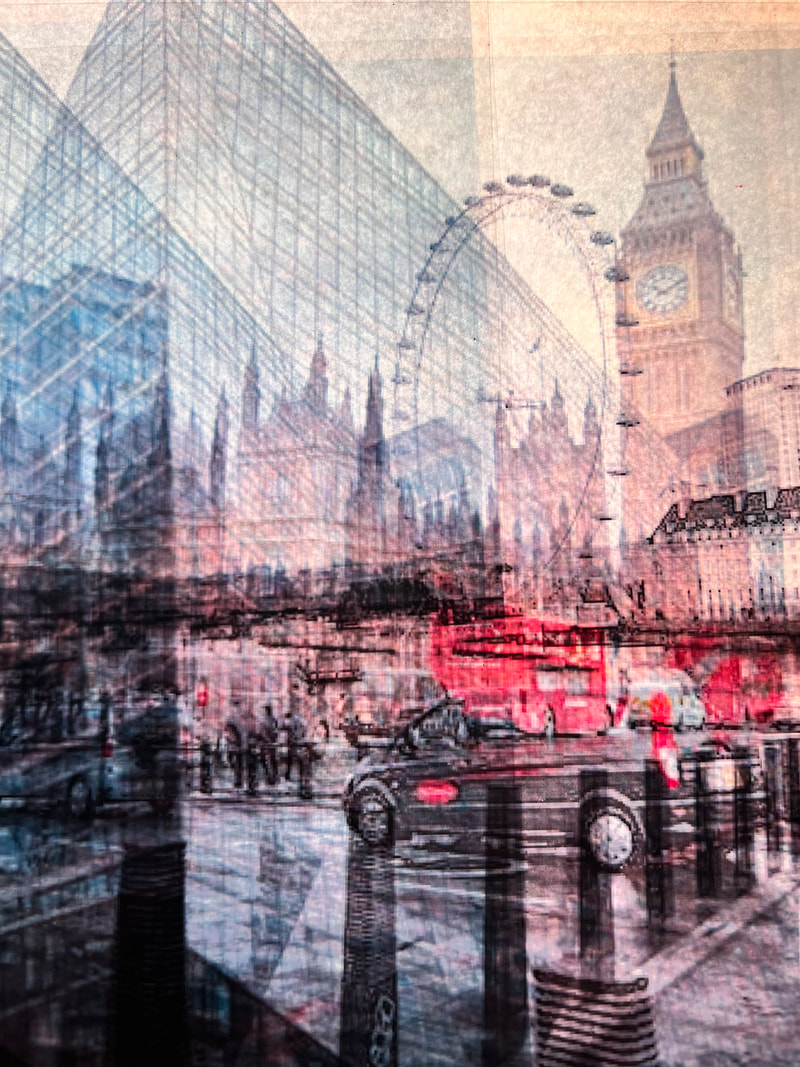
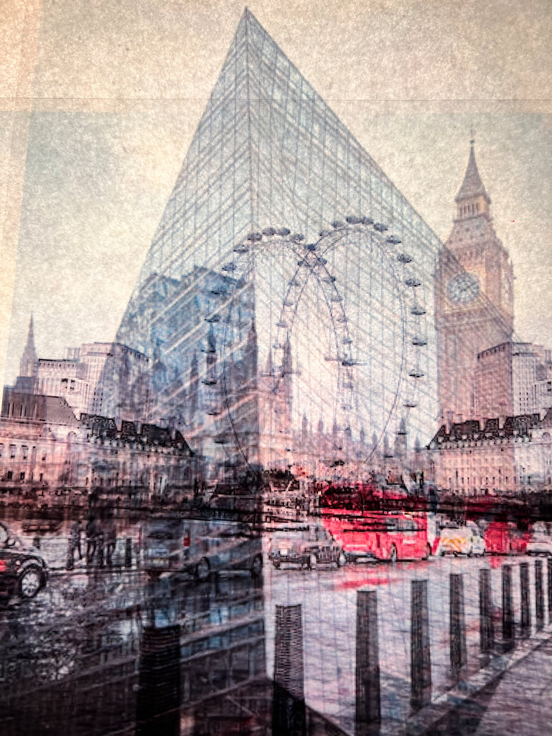
In my response I will respond to both artists- Pep Ventosa and Idris Kahn.
I want to go around London and take photos of Londons architecture in the day and use photoshop to create shadows and Darken the images.
I will then use photoshop to layer my London photographs and experiment using different opacity's and enlarge my images.
To further respond to pep Ventosa, I will go around different specific places in London for example convent Garden. I will take photos in the night and in the day and layer the images in photoshop. When taking the photos in London I will purposefully blur some images or change the shutter speed to allow for shorter or longer exposures to change the effects of the photographs.
First Shoot-
|
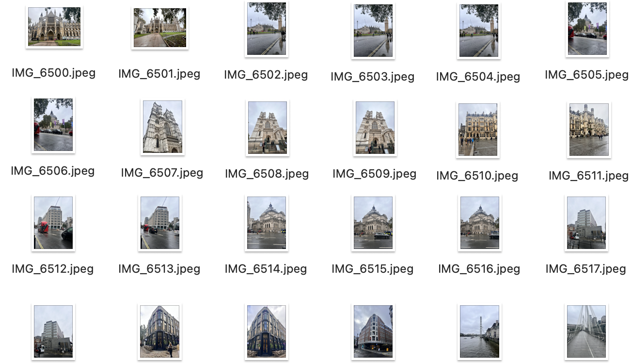
|
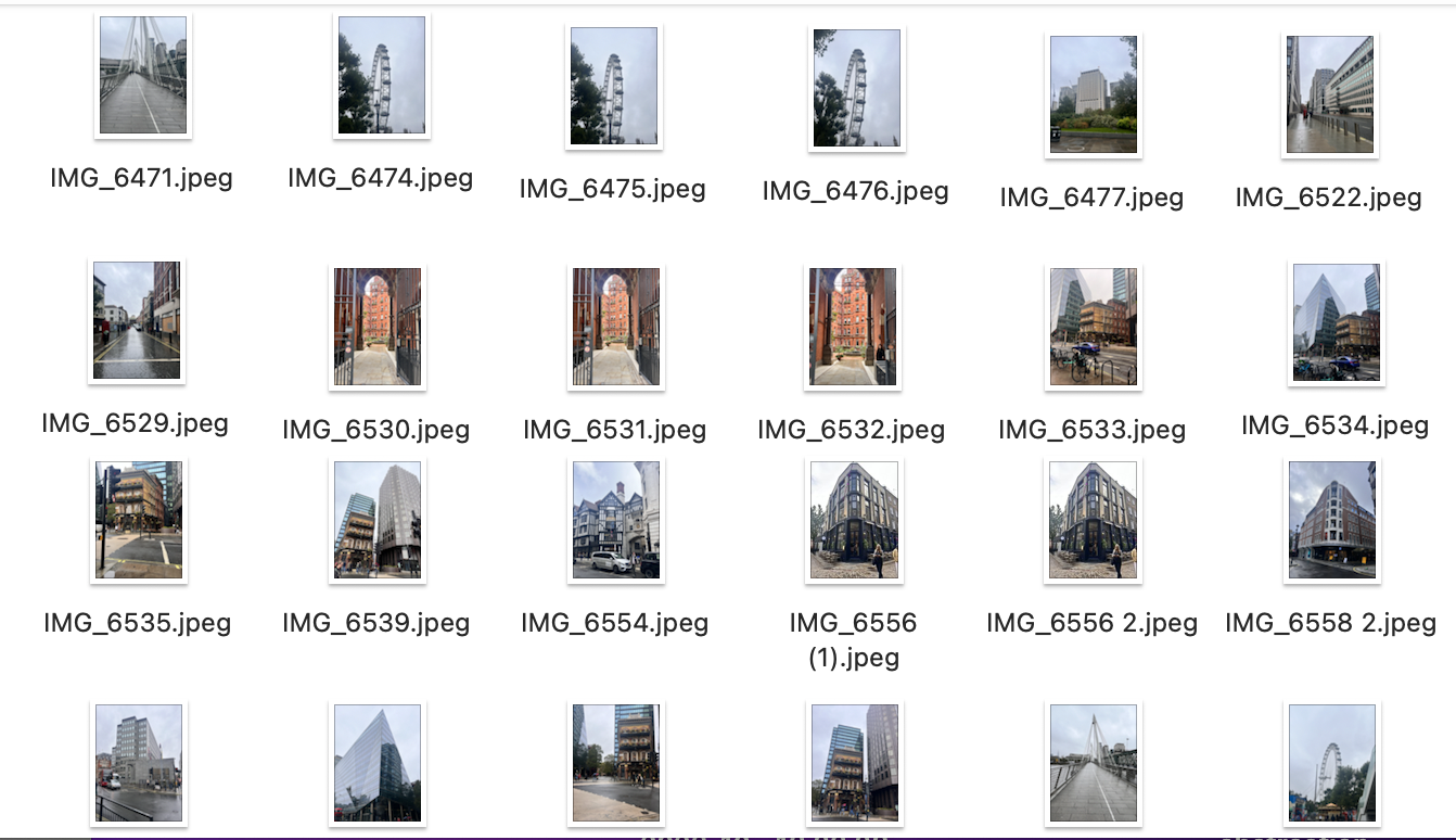
|
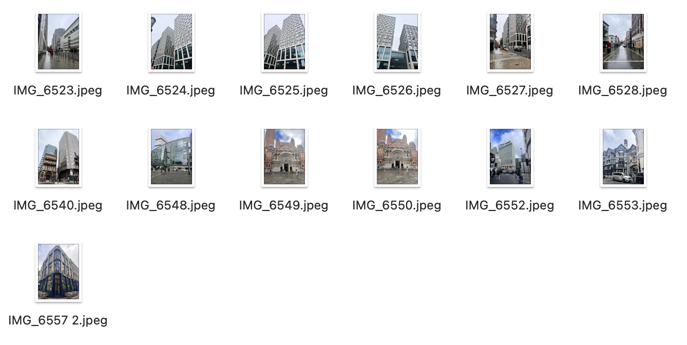
|
First Edit-
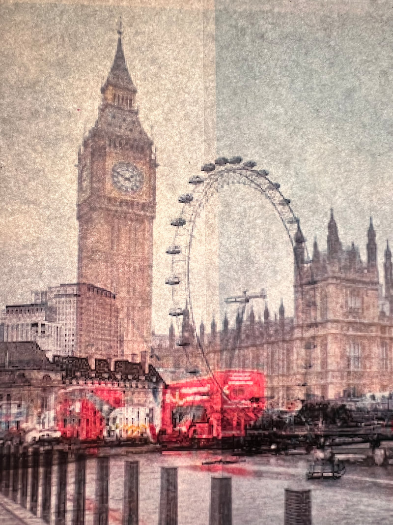
Analysis of my work-In this response I upload an image to photoshop and duplicated it 3 times. This then enables me to change the positioning and opacity of each of the 3 photos. Changes the placement and the opacity's of the images enabled me to give the effect that the buildings are moving and are almost blurred. I also used the brightness and contrast tool to make the red buses pop more in the picture. I also used the smudge tool to blend the edges of the images that I layered.
I think if I layered more images it would have given me a better blurred effect and distorted the image better.
In my next response I would like to layer more than 3 images.
I think if I layered more images it would have given me a better blurred effect and distorted the image better.
In my next response I would like to layer more than 3 images.
|
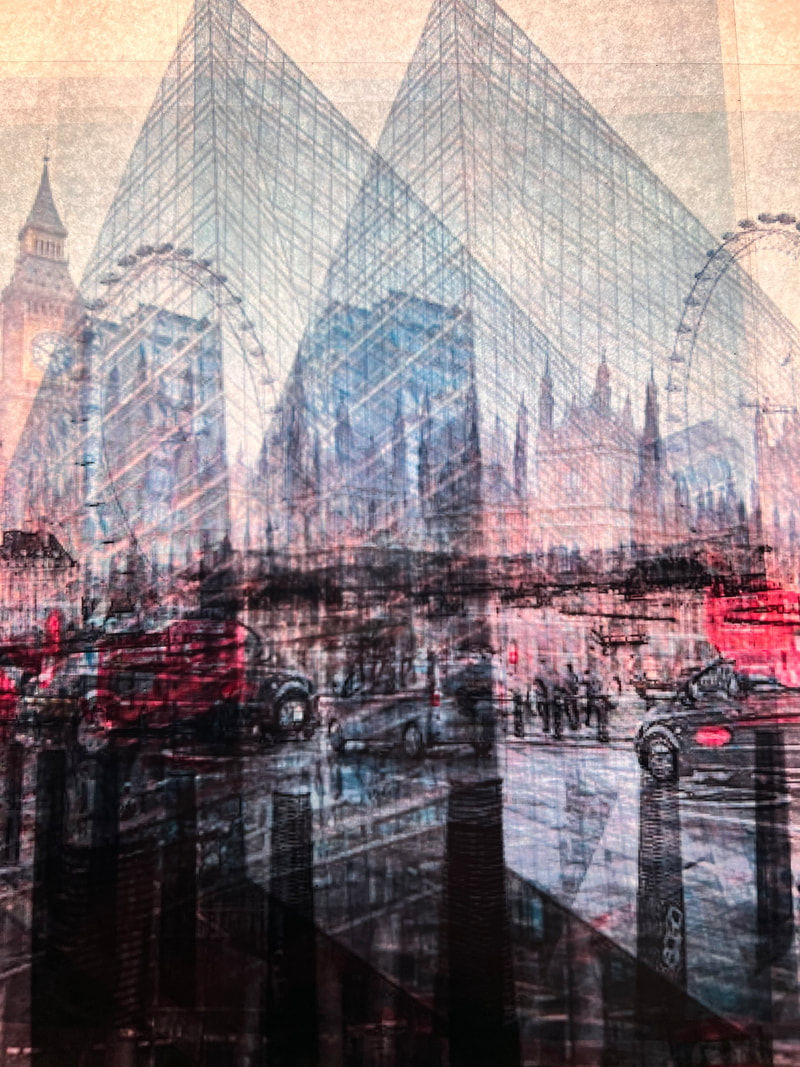
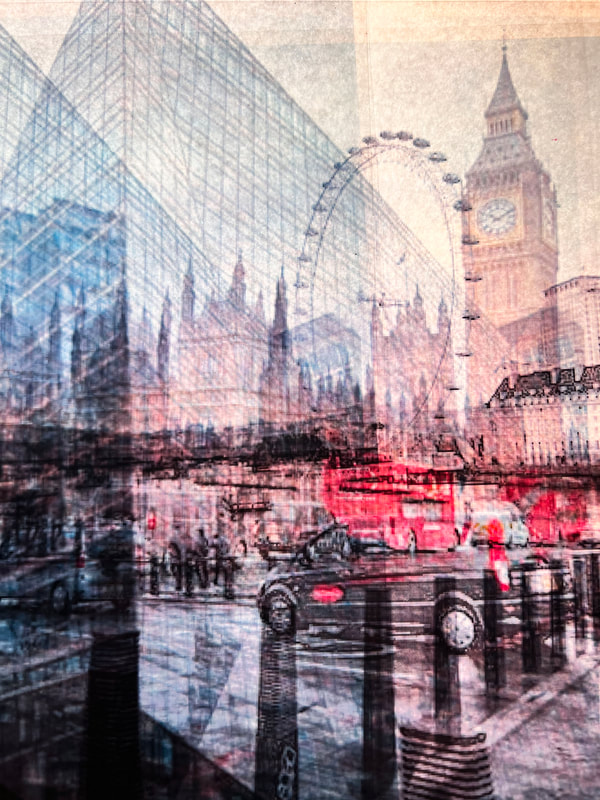
Second Edit-
Analysis of my work-In this response I liked how I used around 6 or 7 copys of the image layered on top of one another. I think it gives the photo greater depth and gives the photograph the effect that it is moving. I again used the smudge tool on photoshop to achieve a more seamless result by blending the layered images together instead of having sharp lines and edges in my photograph.
In my next response I would like to experiment with englargement of the photographs in photoshop. |
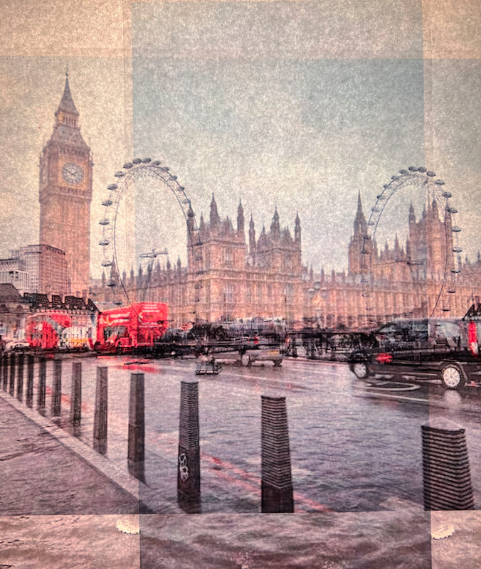
Third Edit-

Analysis of my work-I like how in this response I changed the sizes of the objects in the images and I like how one of the layers I enlarged cuts off the top of the London eye. I used the smudge tool to blend the layers together to make the image look more seamless. I could have changed the brightness of my image as it looks bit dull.
In my next response I would like to combine multiple different images and layer them on top of one another. |
|
Fourth Edit-

Analysis of my work-In this response I just layered different images on top of each other and changed the opacity.
In the next response, I will use the same images but transform them and change the sizes and positions of the photographs. |
Fifth Edit-
Analysis of my work- In this response I layered different images on top of each other, changed the opacity and enlarged and transformed the images as well.I think my response would have been better if I used less condensed images, like images with more negative space. I think it would have been more successful with landscape images as the portrait images look quite busy and cramped.
In my next response, I would like to combine all of these different responses and then change the brightness and contrast of my photos to make them look black and white and like they were taken at night. |
Second Shoot-
|
|
|
First Edit-
|
Second Edit-
|
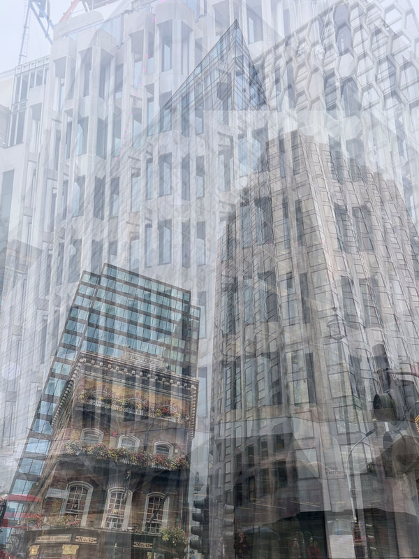
Analysis of my work- In this response, I went around Central London at night. I prefer these images to my first response, as they have more going on in the images, especially the first image.I prefer any first edit to my second, this is due to the bright vibrant lights in the photograph in comparison to the second edit where it is dull. Overall, I prefer the Night photography compared to the Day photography response, this will lead to my next response of the photographer John Virtue.
Next Shoot-In a further shoot I would like to go into London and photograph from the same spot for 5 mins and then layer those photographs on top of each other.
I will achieve this by going to multiple different locations and photographing there still with a tripod.
Next Shoot-In a further shoot I would like to go into London and photograph from the same spot for 5 mins and then layer those photographs on top of each other.
I will achieve this by going to multiple different locations and photographing there still with a tripod.
Development 5
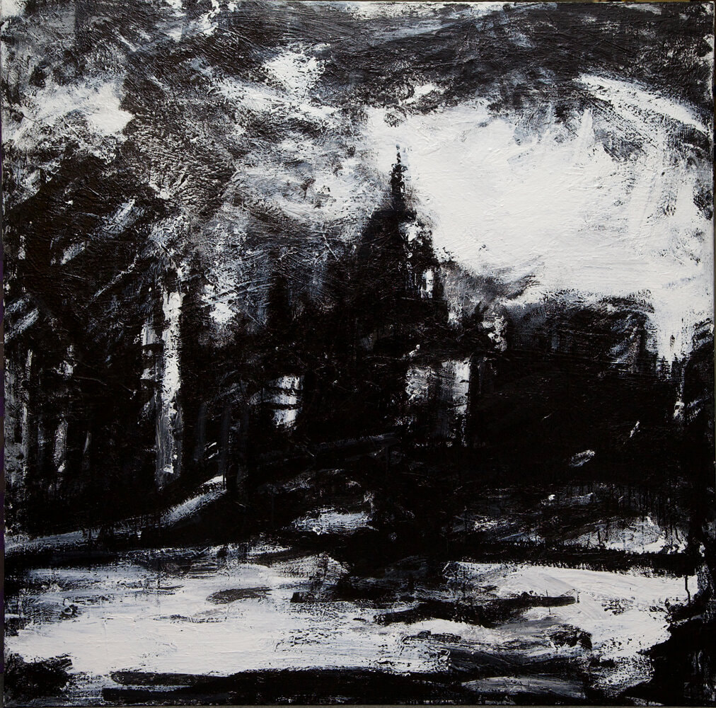
John Virtue-
John Virtue is a contemporary British artist best known for his monochromatic drawings and paintings of London, Venice, and the seascapes around Norfolk in Great Britain. He often using a mixture of shellac and ink, Virtue creates expressive marks and luminous passages of negative space. The artist has cited J.M.W. Turner, and Abstract Expressionists, particularly Franz Kline, as major influences on his work. “Virtue's blacks and whites aren't polarised absolutes: they drip and smear each other with gleeful impurity, much of the white flecked with a kind of metropolitan ashiness that gives the paint guts and substance, much of the black, streaky and loose, like road tar that refuses to set,”
Born in 1947 in Lancashire, United Kingdom, he studied at the Slade School of Fine Art in London before working as a postman in his hometown until 1985. He was then financially stable enough to devote himself completely to art. The artist’s works are in the collections of the Tate Gallery in London, the Walker Art Center in Minneapolis, and the Yale Center for British Art in New Haven among others. Virtue lives and works in North Norfolk, United Kingdom.
Born in 1947 in Lancashire, United Kingdom, he studied at the Slade School of Fine Art in London before working as a postman in his hometown until 1985. He was then financially stable enough to devote himself completely to art. The artist’s works are in the collections of the Tate Gallery in London, the Walker Art Center in Minneapolis, and the Yale Center for British Art in New Haven among others. Virtue lives and works in North Norfolk, United Kingdom.
|
|
|
First Response-

|

|

|

|

|

|

|
|

|

|

|
Analysis of my work-In this response, I printed out my photographs onto card and paineted on them. To start off with I just painted the sky and either painted the sky as if it was daytime or if it was nighttime. I was able to create the daylight sky by using blue and white acrylic paints, I was able to create the night sky by mixing blue and black acrylic paints.
I think to further respond to John virtue I should not only paint the sky but also use black and white paint on the buildings as well to give it a greater effect that its a painting.
I think to further respond to John virtue I should not only paint the sky but also use black and white paint on the buildings as well to give it a greater effect that its a painting.
First shoot-
|
|
|
|
|
|
In this response I would like to combine the artwork of John Virtue with Pep Ventosa's photographic techniques. Using my images of London in the day printed on assertate I will layer the physical images on top of one another to create a double exposure effect. Then in a further response I would like to paint on the acetate to mix different mediums and create different effects.
First Response-

|

|

|

|

|

|

|

|

|

|

|

|

|

|
Analysis of my work-In my response I layered different landscape and portrait photographs, which were printed on assertate, on top of one another. I used a Lightbox and a sheer sheet of white paper to create my background to the assertate photos. I liked how there sheer paper gave it a grainy and older looking effect, almost like it was taken on a film camera of old London.
Second Response-
|
|
|
|
|
|
|

|
|
Edits-
|
|
|
Second Shoot-
|
|
|
In this response I would like to incorporate my night photos printed on asatate.
First Response-

|

|

|

|

|

|

|

|

|

|

|

|

|

|

|

|

|

|

|

|
Second Response-
|
|
|
|
|
|

|

|

|
|
|
|
|

|
|

|
|
|
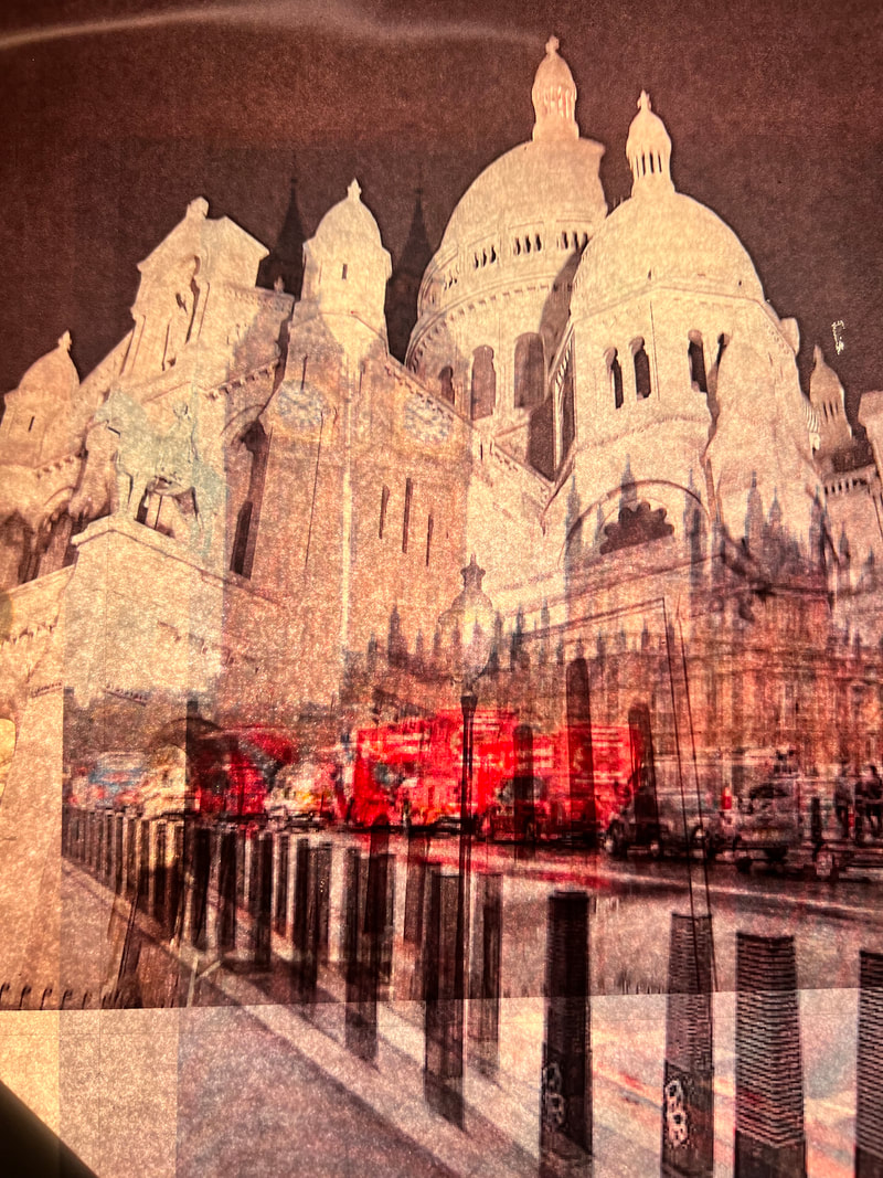
Analysis of my work-In this response, I printed my night photography onto asertate as well as my day photography. I then layered the night and day photography on top of one another and placed it on the light box . I love the effect this created as it made the responses very vibrant colours and it enhanced the day photography. The light box passed light through the asertate which amplified the colours in the images and made them more animated and created a blend of colours which otherwise wouldn't have been seen
Development 7
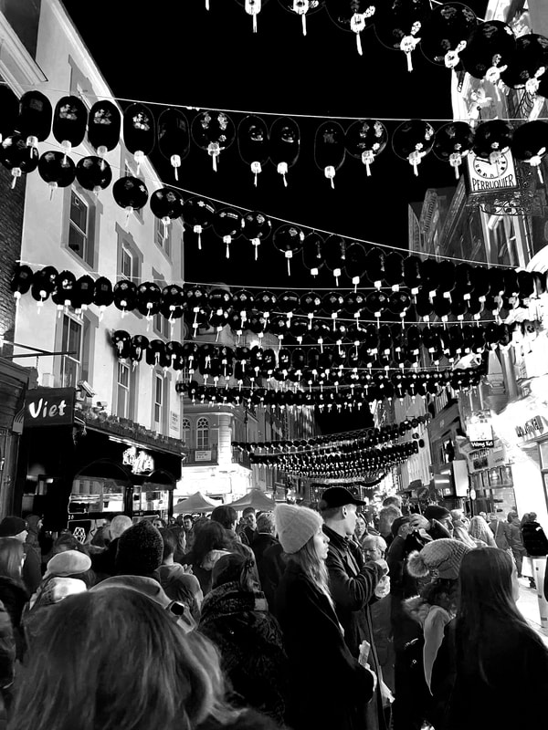
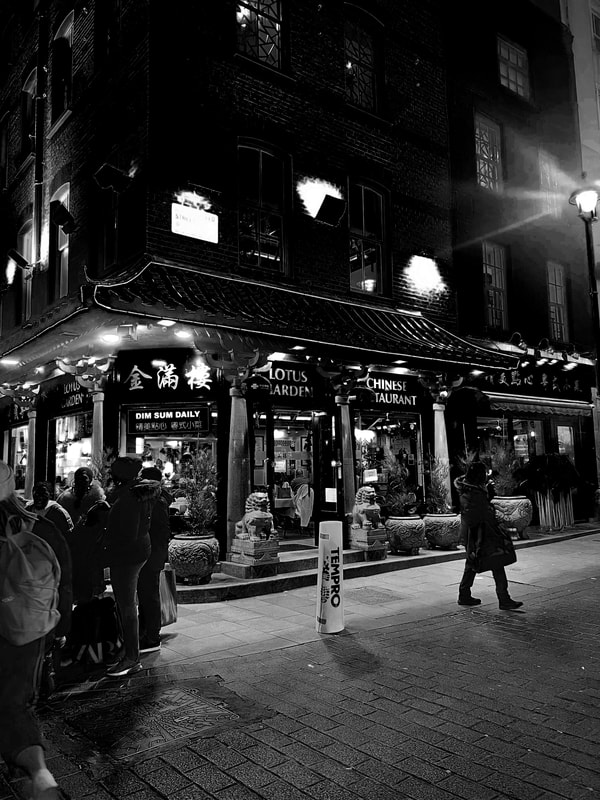
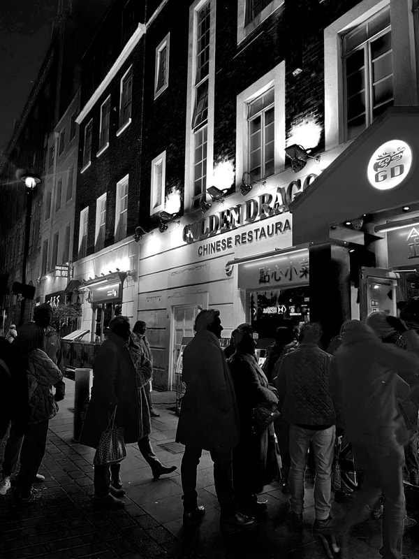
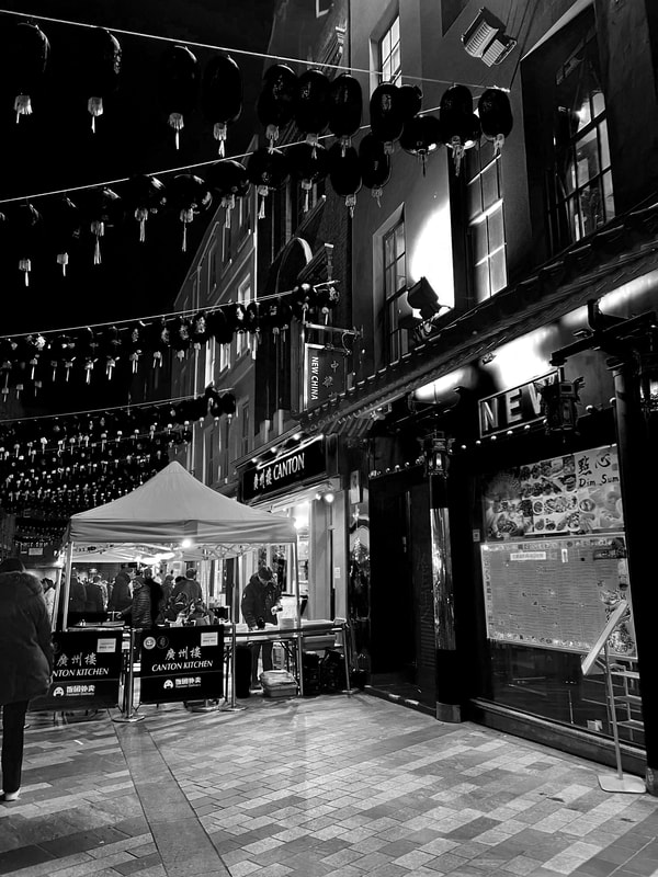
Niklas Porter - Chinatown NYC
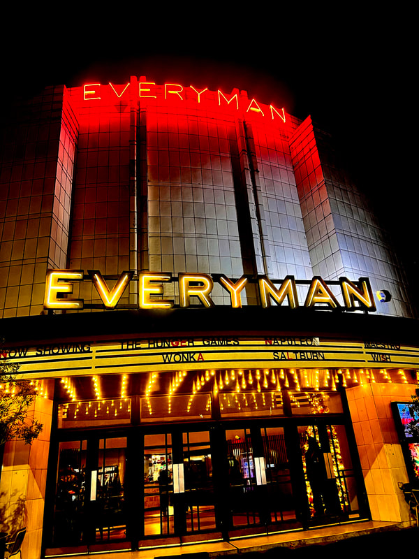
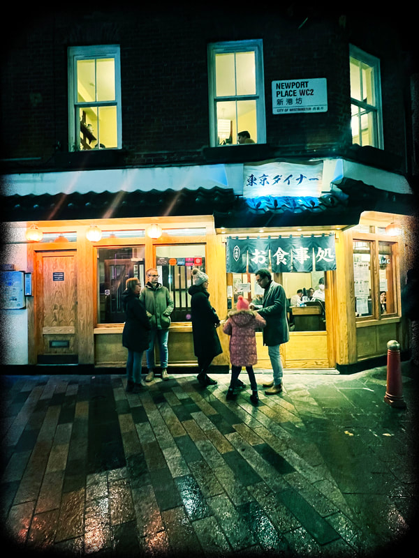
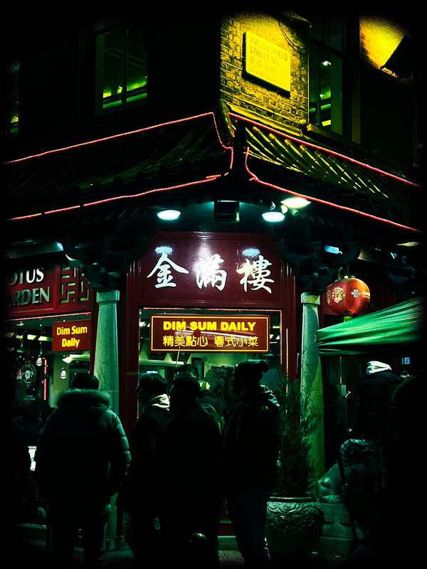
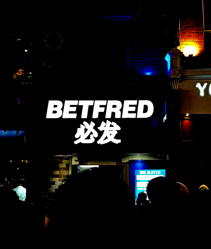
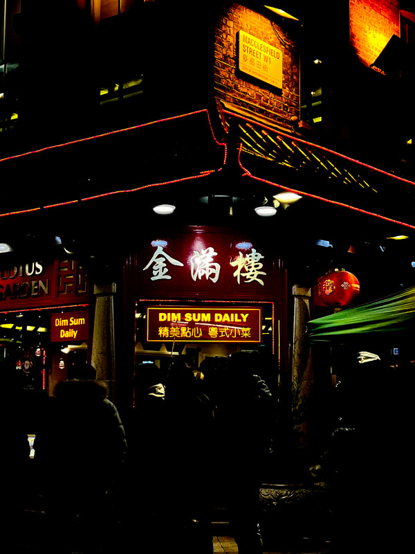
Niklas Porter is a photographer based in Stockholm Sweden, described as a " modest observer who finds beauty in even the most casual of scenarios, moments others would pass by without a second glance". With a liking for analogue film, he walks about — preferably at dusk or dawn, when everything seems to go a little bit slower — capturing images that, as he puts it, reflect his feelings of the time and place. His interest in photography developed after he sought an emotional outlet for his creativity and emotions. This is exactly what Niklas strives to capture in his photography: true feeling. However, if you ask the photographer himself, the meaning of art really resides in the viewer. Each individual interpreting it in their own way. Reading about Niklas' ideas really resonated with me; I would agree with his notion that images are subjective, and can mean whatever the viewer interprets their true significance or meaning to be. In an interview, upon being asked about his inspirations, Porter revealed "For me, inspiration can come from feelings, memories, daydreaming or simple thoughts. It can come from other photographers, writers, musicians, artists and so on. To be honest, I try not to think too much about it. I don't want it to feel forced. Inspiration comes when it comes". What's significant about this, is that I really think his inspirations are reflected in his images. They have a specific gentle tone about them, a poetic and nostalgic feel that is projected upon looking through his work. They don't feel staged or forced, just perfectly captured at the right place and right time. I think throughout these developments, I have found that I am drawn to bodies of work that feel honest and candid, and even if they are staged, the viewer wouldn't know. The specific series I will be responding to and focusing on is his series of photos taken in Chinatown in New York City, which I have displayed below. Similarly to Nick Turpin, Porter creates a dream like haze within his images, depicting different shopfronts, streets and restaurants. A lot of his images are taken while its raining or snowing, again adding to this dream like effect.


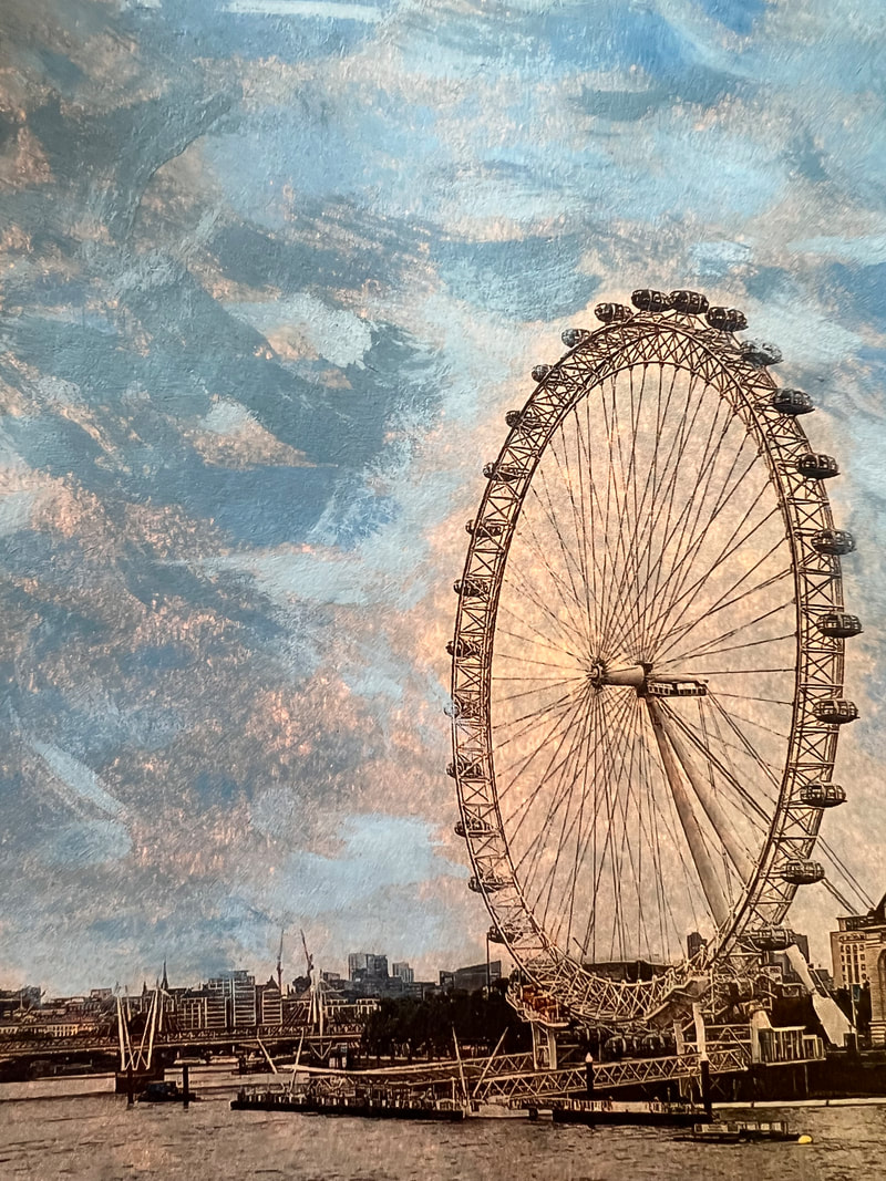
Aims-I would like to respond to Porter by going around London and taking photos of the LED lights at night in the city- contrasting light v dark, which allows the LED lights to pop.
In my response to Pep Ventosa and John Virtue, it made me realise that I enjoy vibrant colours within photography and the contrast of these colours with the dark night sky.
In my response to Pep Ventosa and John Virtue, it made me realise that I enjoy vibrant colours within photography and the contrast of these colours with the dark night sky.
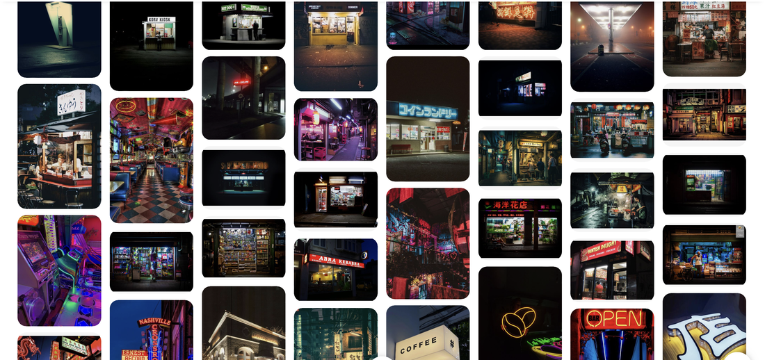
Pinterest Inspiration-
First Response, Muswell Hill -
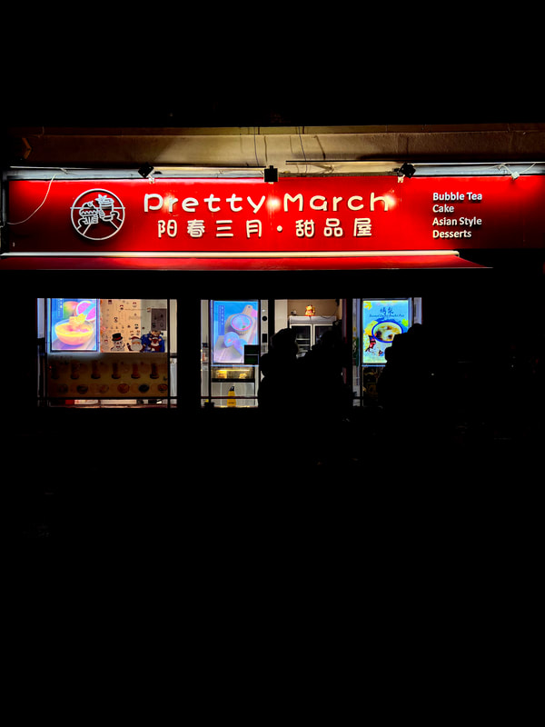
In this response I took pictures around my local area. I mainly focused on shops and restaurants with bright LED lights, which allowed for the biggest contrast of the dark night sky compared to the lights.


Edited Images 1-
|
|
|
In this response, I took photos of my local area at night and used an editing style like Porter to create this almost film like effect.
I have edited these images in order to take more influence from the style of Porter. His images have interesting blue tones and low contrast, and therefore I decided to edit mine in the style of his images.
Editing Process:
-Firstly I pulled my original image into photoshop
-The I went onto the colour balance tool and upped the cyan nearly all the way
-I then pulled down the contrast again nearly all the way
-I then created a new layer, and used the paintbrush tool to paint around the edges of the image in black
Edited Images 2-
|
|
|
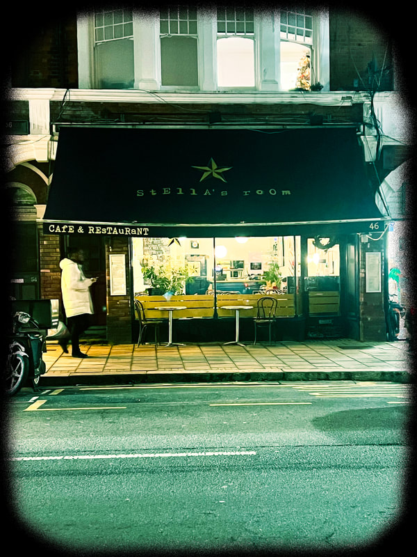
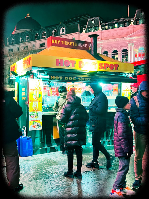
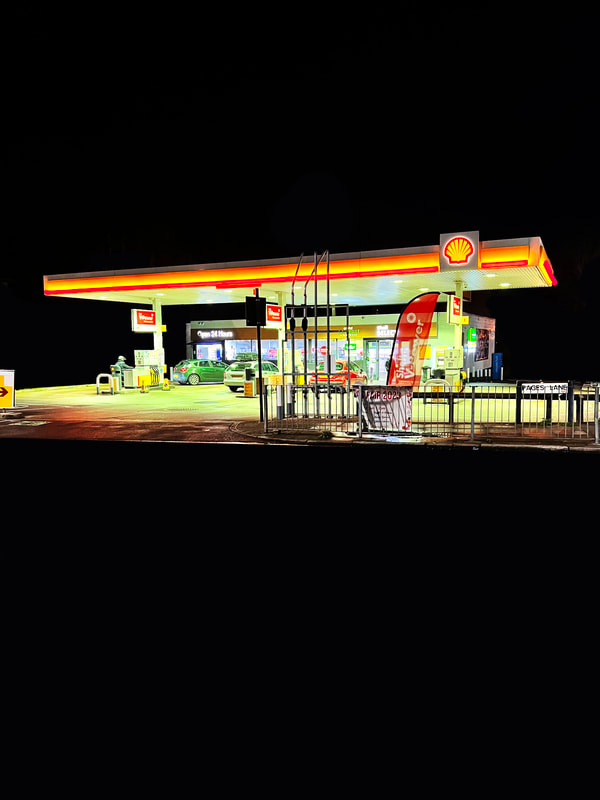
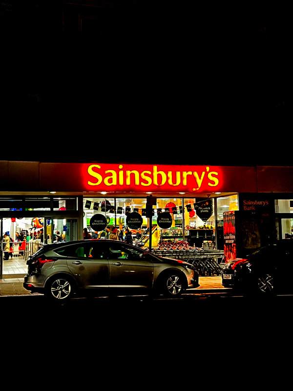
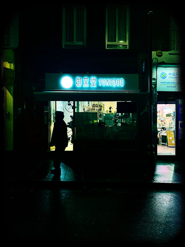
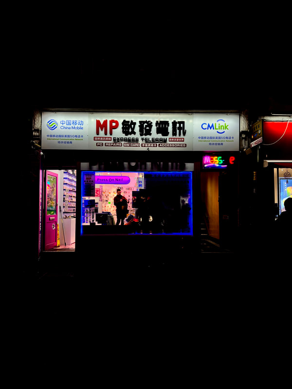
Analysis of my work-In this response to Niklas Porter I took photos of shop fronts with bright LED lights. I used photoshop to darken the area surrounding the LED lights to create a greater contrast between the dark and light, this then enabled the LED lights to be the main focus of the image. I used different Levels, Brightness and Contrast to Edit my photographs. I particularly like my first image, of a petrol station, I like how it looks isolated as if it is the only building in the surrounding area. This allows the viewers sole concentration to be on the Garage and is not distracted by external factors. However in my other edited response I don't think my intentions were fully met. I don't think they gave the effect of isolation and the focus was solely on the lights. I think the quality of the 2nd image could have improved, this is due to me being too far away from the subject I was intending to photograph.
In my next response I am intending to take photographs around china town. To improve on these photographs I am going to photograph closer to ,my subject and use my camera to change the aperture to let less light into my Photograph.
In my next response I am intending to take photographs around china town. To improve on these photographs I am going to photograph closer to ,my subject and use my camera to change the aperture to let less light into my Photograph.
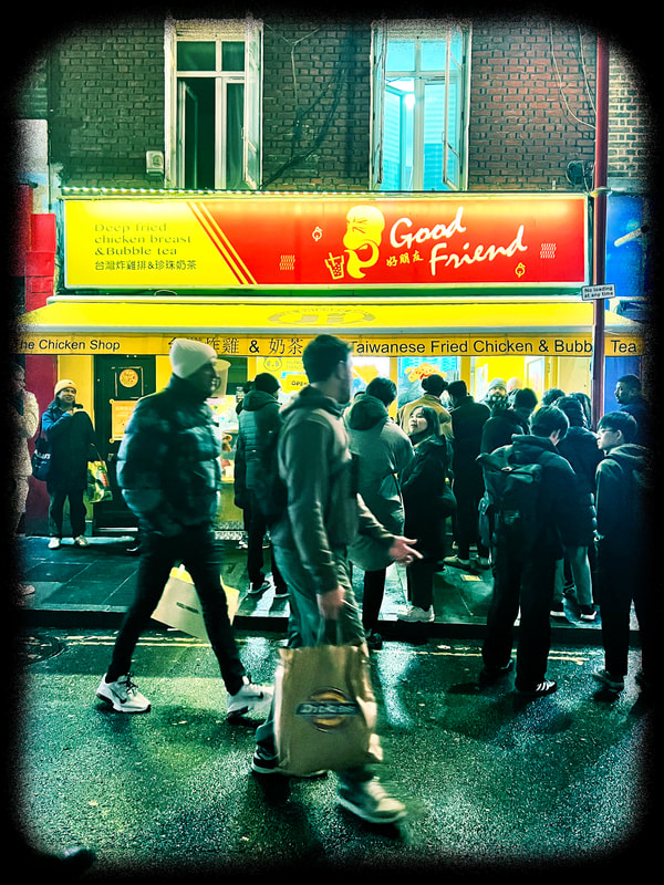
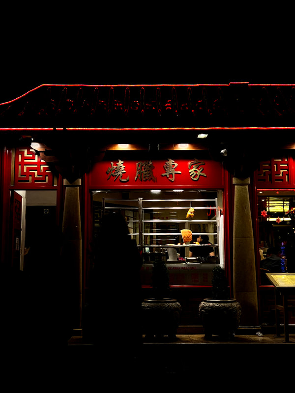
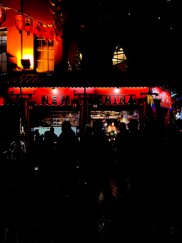
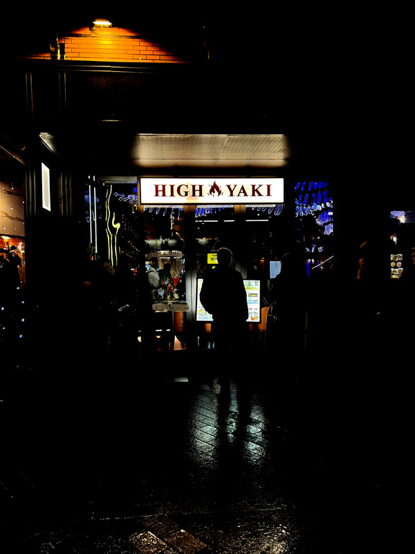
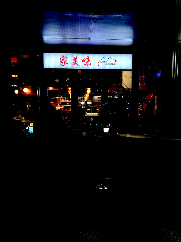
Second Response, China Town-


Edited Images 1-
|
|
|
|
I enjoy this response, as it not only focuses in on the LED lights but the way of editing is effective and links a lot with Porters style of editing which included an underlying blue tone.
I have edited these images in order to take more influence from the style of Porter. His images have interesting blue tones and low contrast, and therefore I decided to edit mine in the style of his images.
Editing Process:
-Firstly I pulled my original image into photoshop
-The I went onto the colour balance tool and upped the cyan nearly all the way
-I then pulled down the contrast again nearly all the way
-I then created a new layer, and used the paintbrush tool to paint around the edges of the image in black
Edited Images 2-
|
|
|
|
|
|
|
|
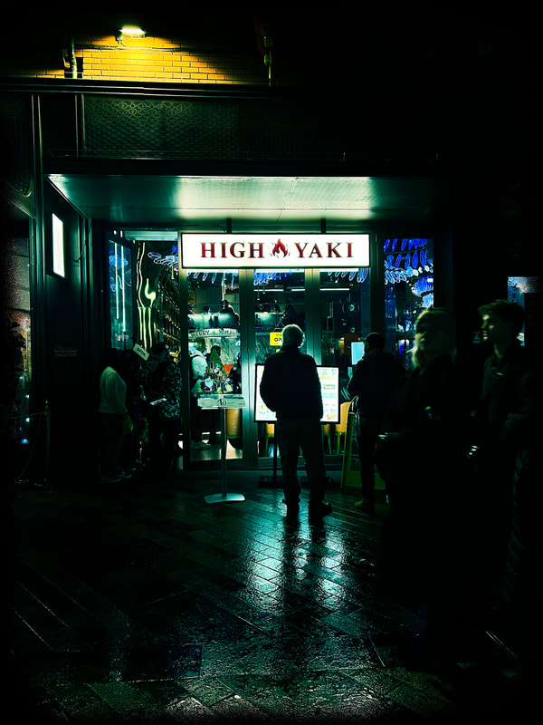
This response I took of China Town is definitely more successful than my response in my local area, I was able to achieve this by going closer to my chosen subject and using my camera settings.
Here are the settings I found to be most effective:
-exposure - 1/5 sec
-F11
-ISO 200
I enjoy how these images not only have the main focus ,which is the LED lights, but also have the online of peoples dark shadow outlines in the images. I think that the shadows are very effective and give the photograph greater depth.
Development 8
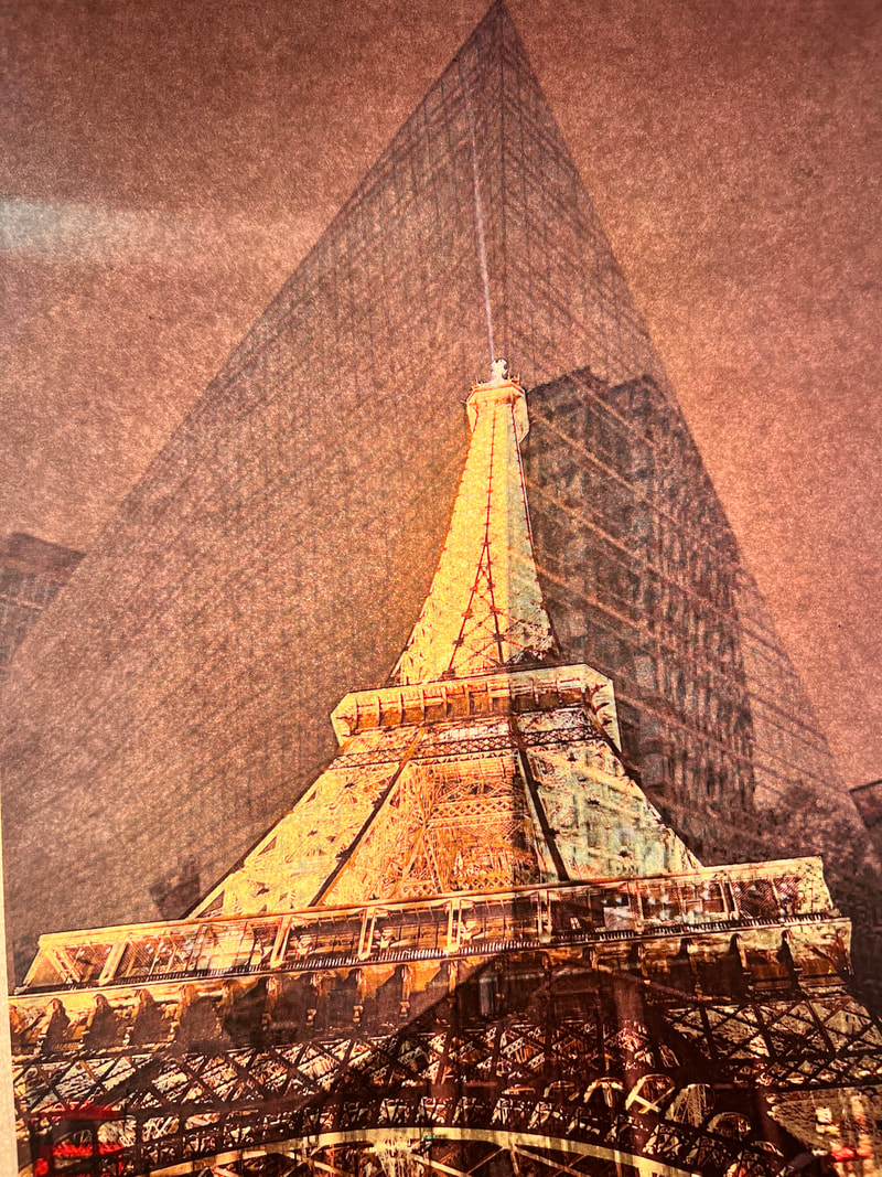
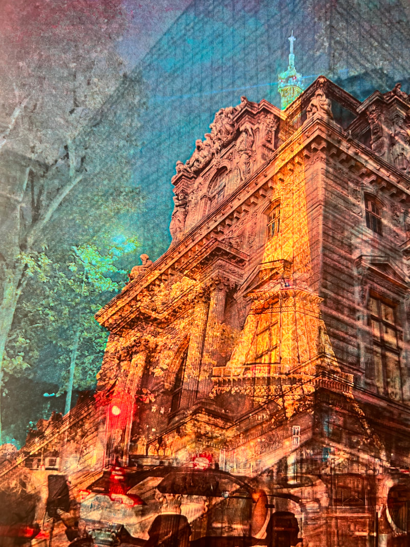
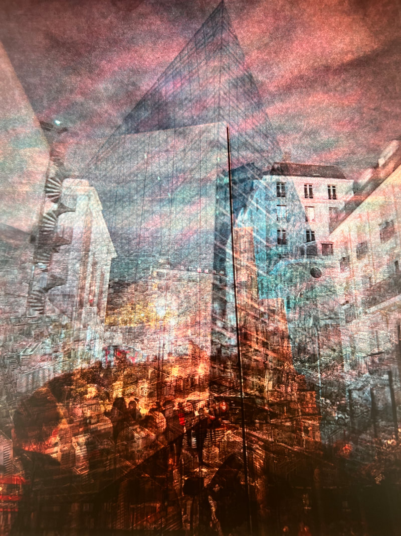
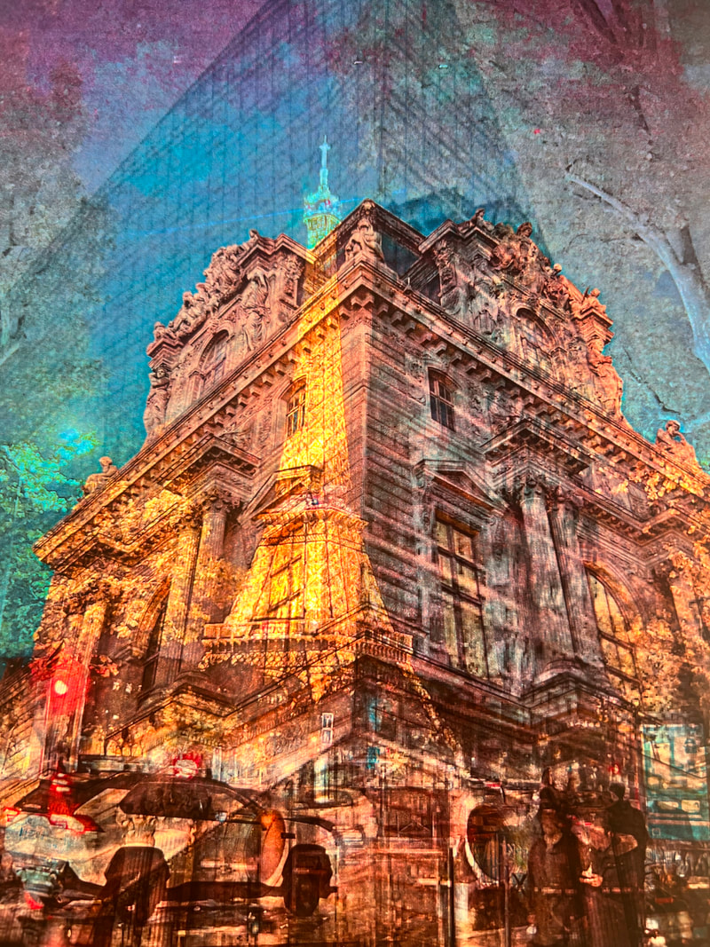
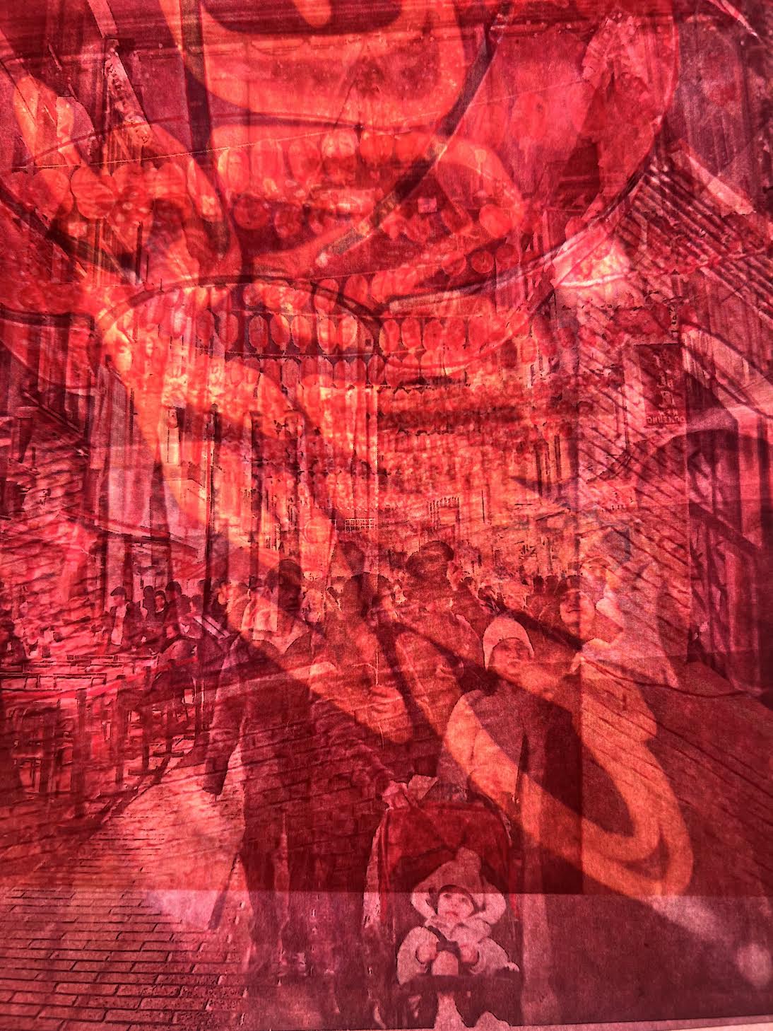
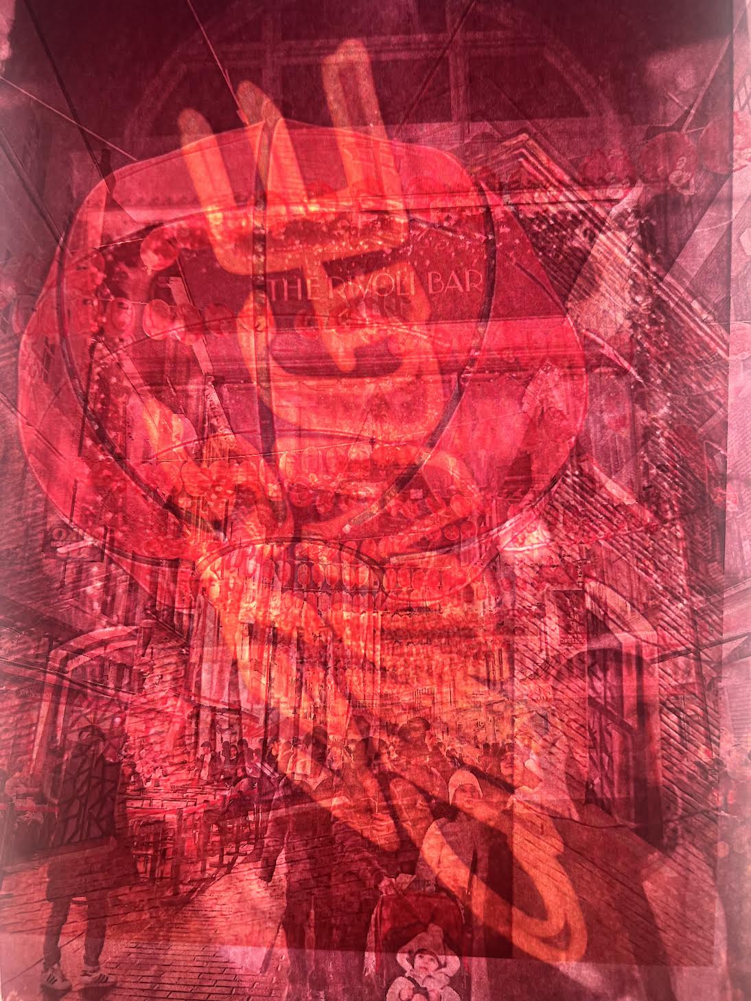
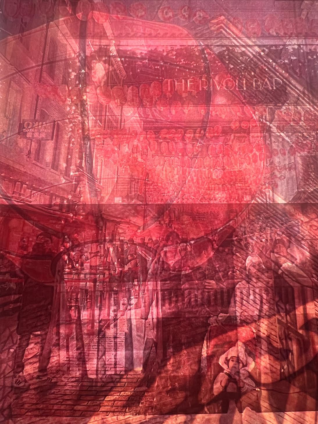
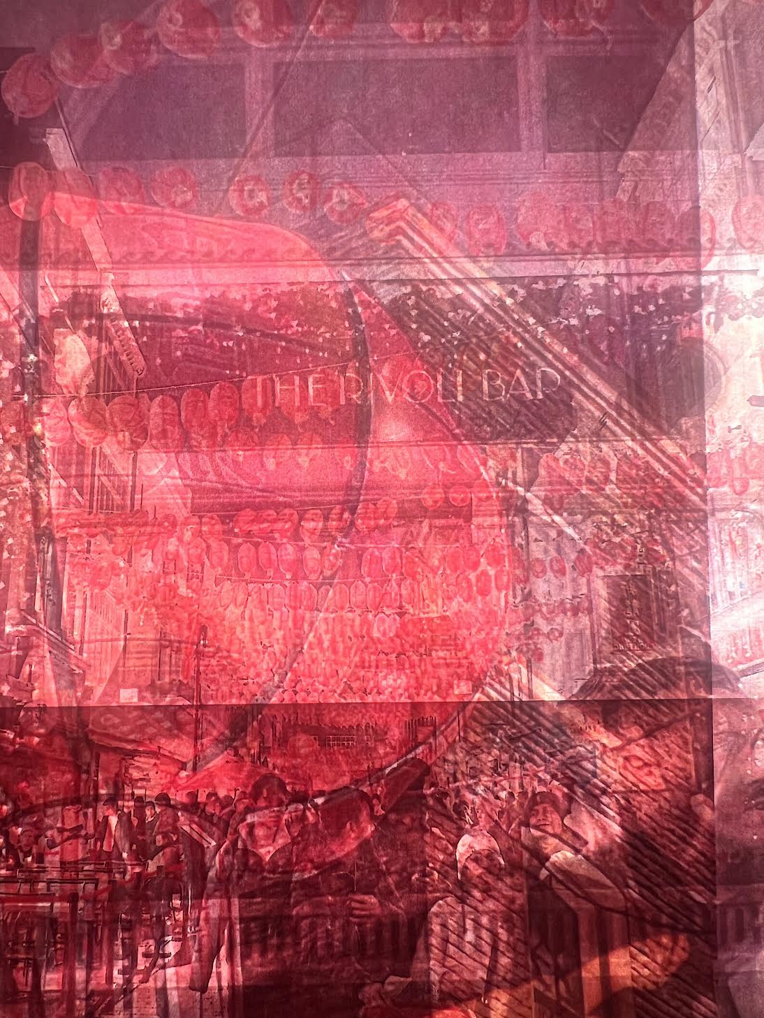
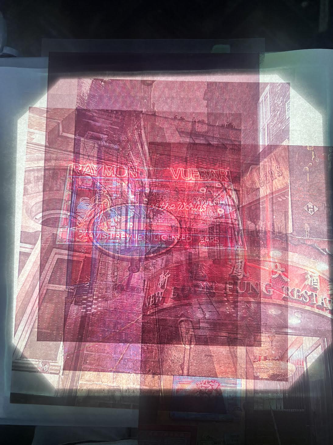
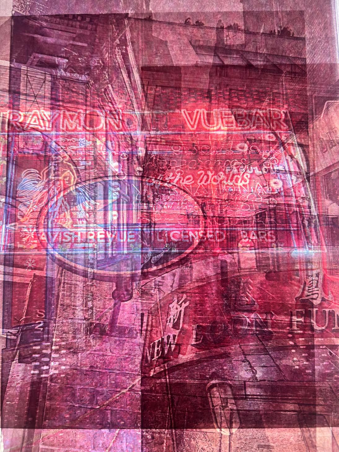
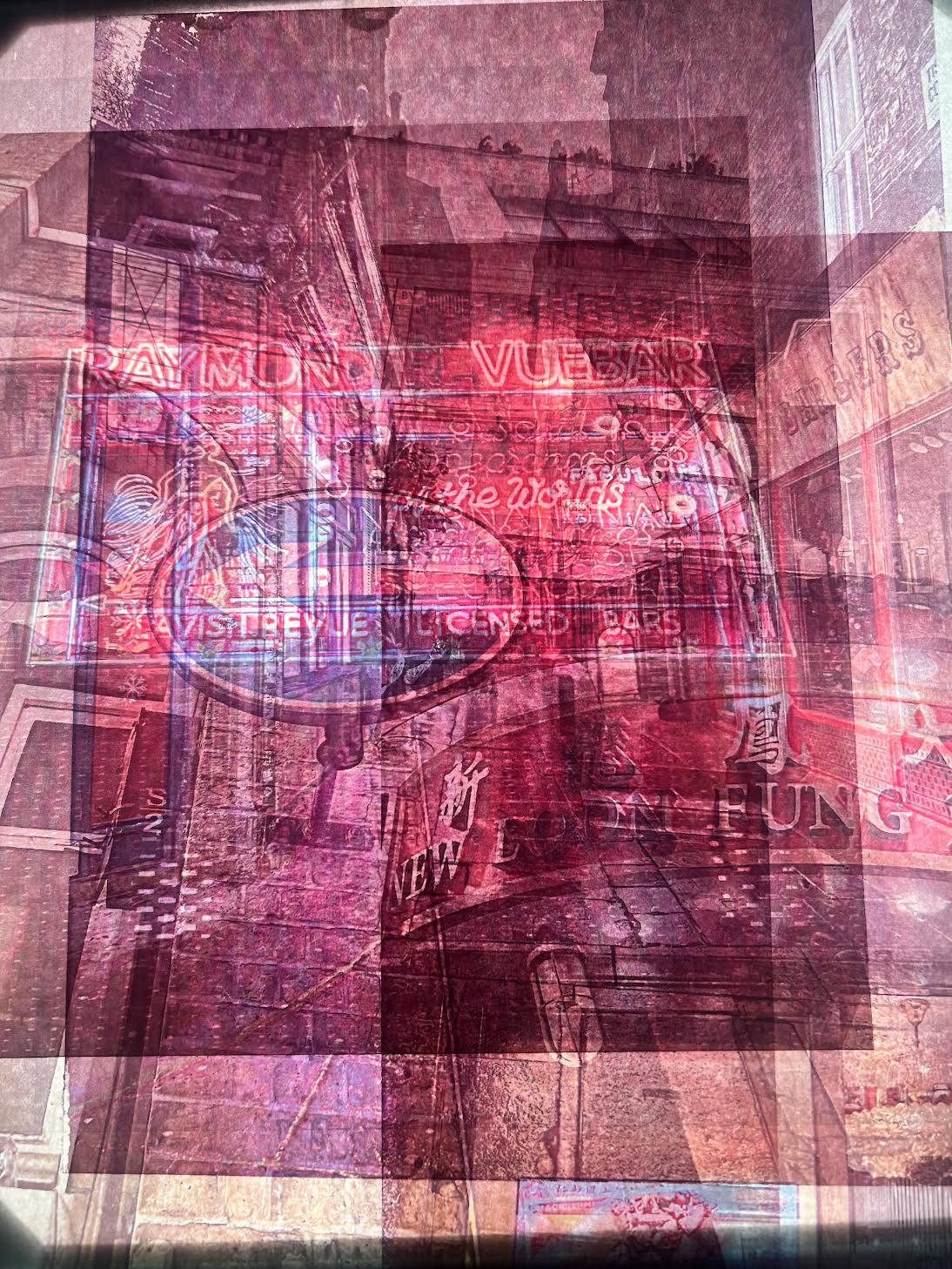
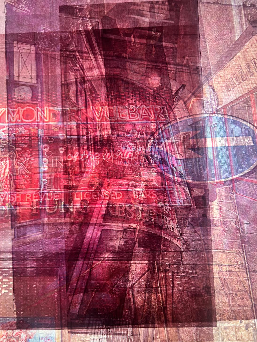
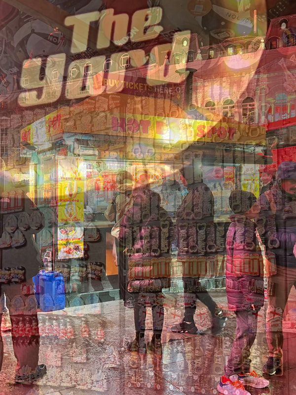
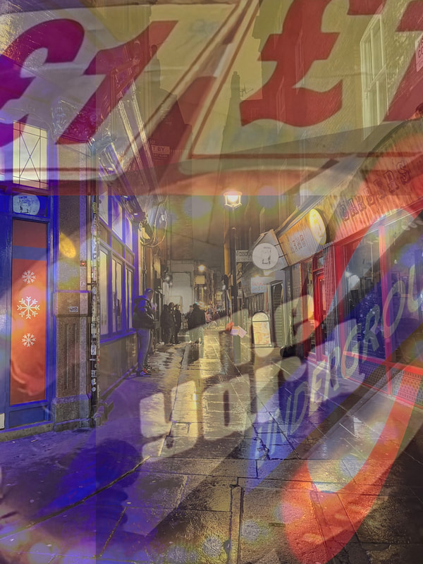
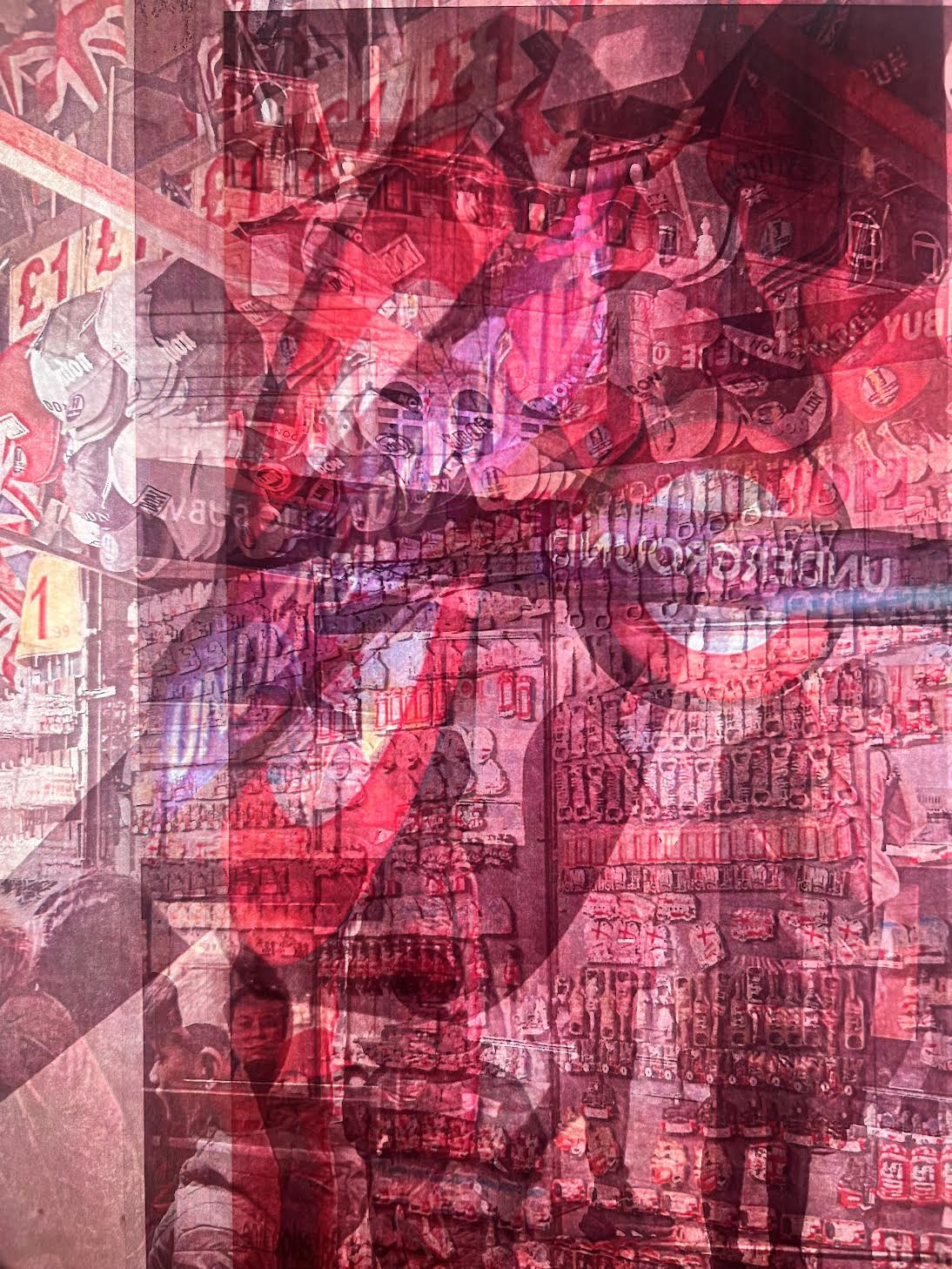
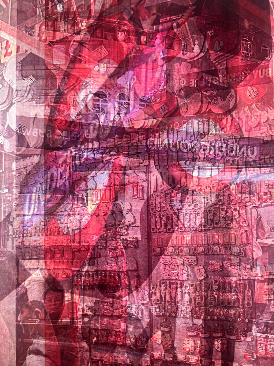
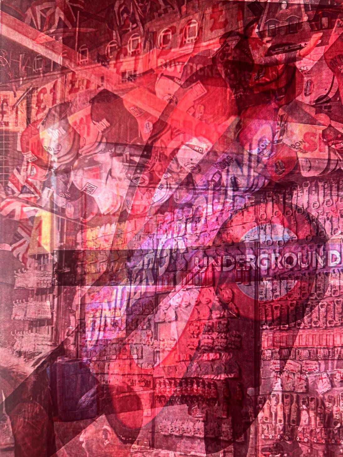
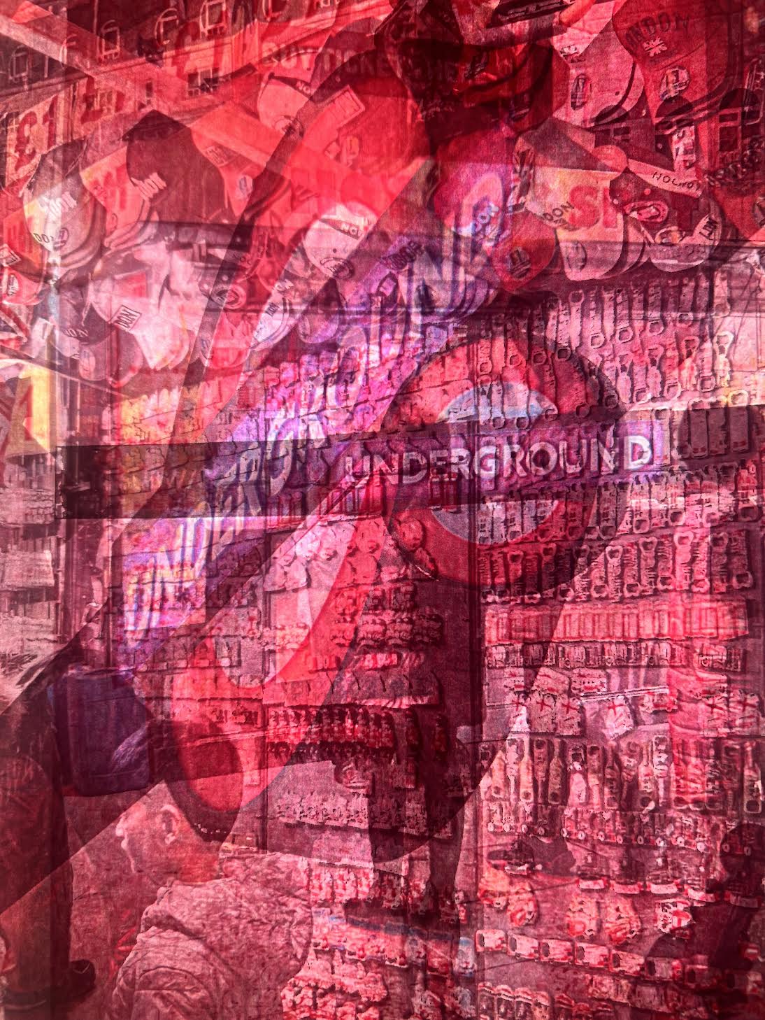
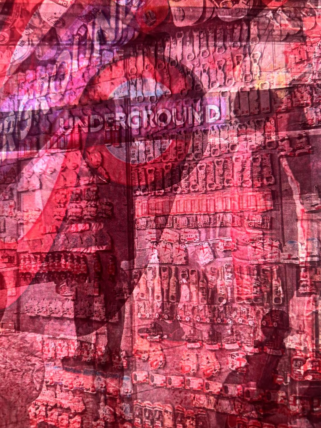
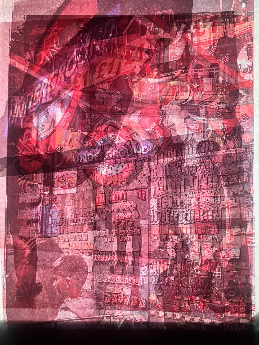
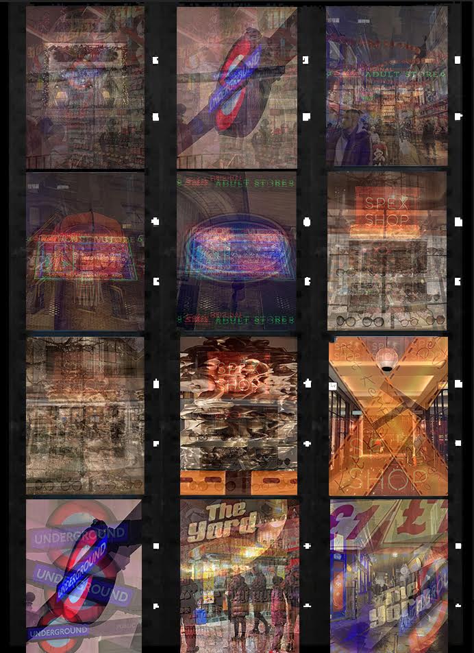
Alessio Trerotoli - Urban Melodies
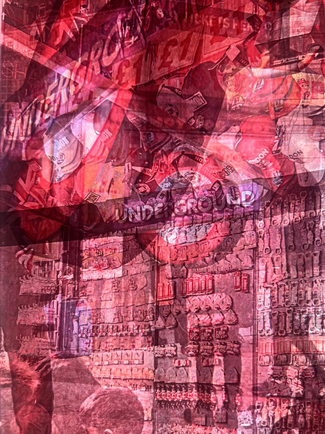
I am inspired by Fine Art Photographer & Street Photographer Alessio Trerotoli, whose style is based on multiple exposures. Through his multiple exposure and urban photography Trerotoli creates, by the superimposition of several pictures, an abstract representation of cityscapes and contemporary life from modern metropolis like Rome, New York, Paris, Berlin and many others. By juxtaposing different images, Trerotoli aims to show an usual image in a conceptual way, where everything is duplicated, the lights and the structures multiply and build a new vision of urban life: “I try to feed my inspiration walking for a while every day like a sort of modern flâneur and taking street photos in my city or in cities that I visit when I’m in travel. In my life I always try to look for something beautiful around me and if in my Urban Melodies you can find something beautiful in a traffic jam or in a building in ruin, maybe it’s possible to find beauty everywhere. Once I read a quote that is perfect: Though we travel the world over to find the beautiful, we must carry it with us or we find it not”. After graduating from art and cinema school in 2009, Trerotoli travelled around the United States and Europe, taking pictures and capturing memories, as well as building an impressive portfolio. It was during this time that he captured these images, which you see layered on top of one another in this beautiful series. In an interview he shared that his Urban Melodies series takes inspiration from the interesting works of a Turkish photographer named Jak Baruh, who works also with multi layered images. Trerotoli shares, "I tried to put my style and my sensibility in this project, that I see like melodic images: similar to the musical notes in a melody, each picture can stand by itself, but layered with the other pictures, the new image expresses a richer meaning. All of them, if linked to one another and concatenated in a bigger context, can create something different and, most importantly, something unique. They can reach a different meaning and become part of the melody: this is why my project is named “Urban Melodies”. I really like the use of colour in his images, the artificial lights, the reds and the blues, the colours that make up the setting he is conveying.
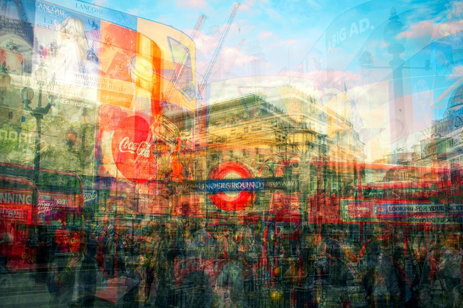
Piccadilly Circus, London
|
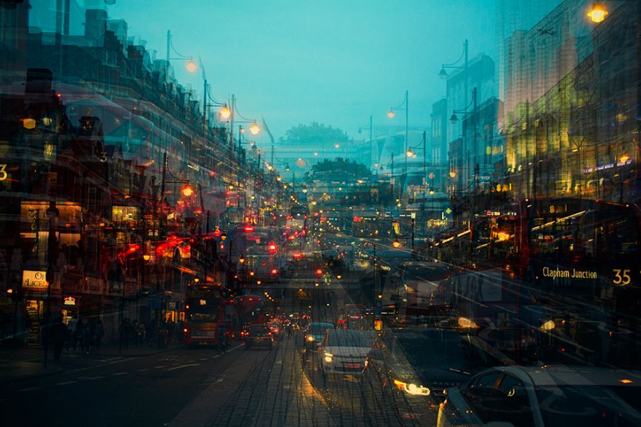
Brixton, London
|
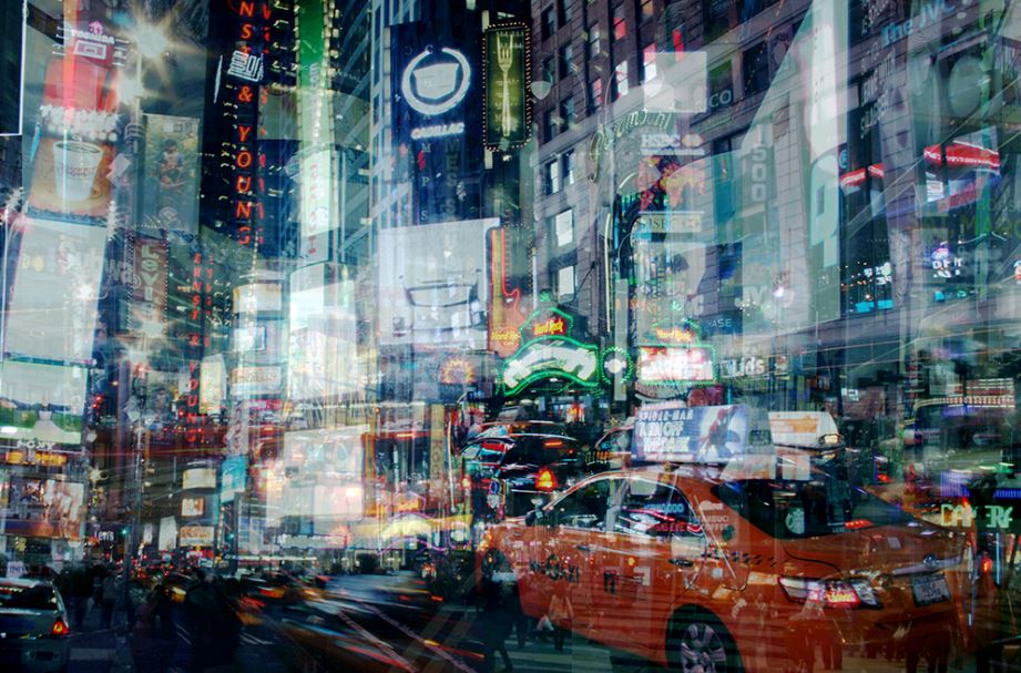
Time Square, New York
|
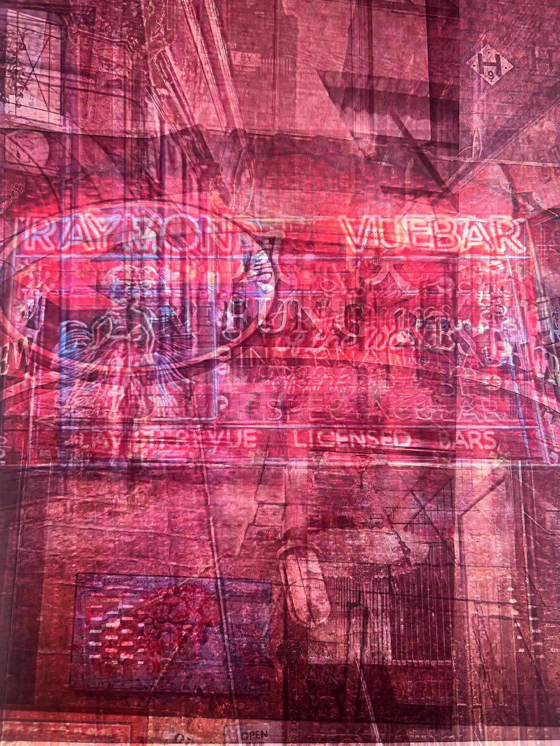
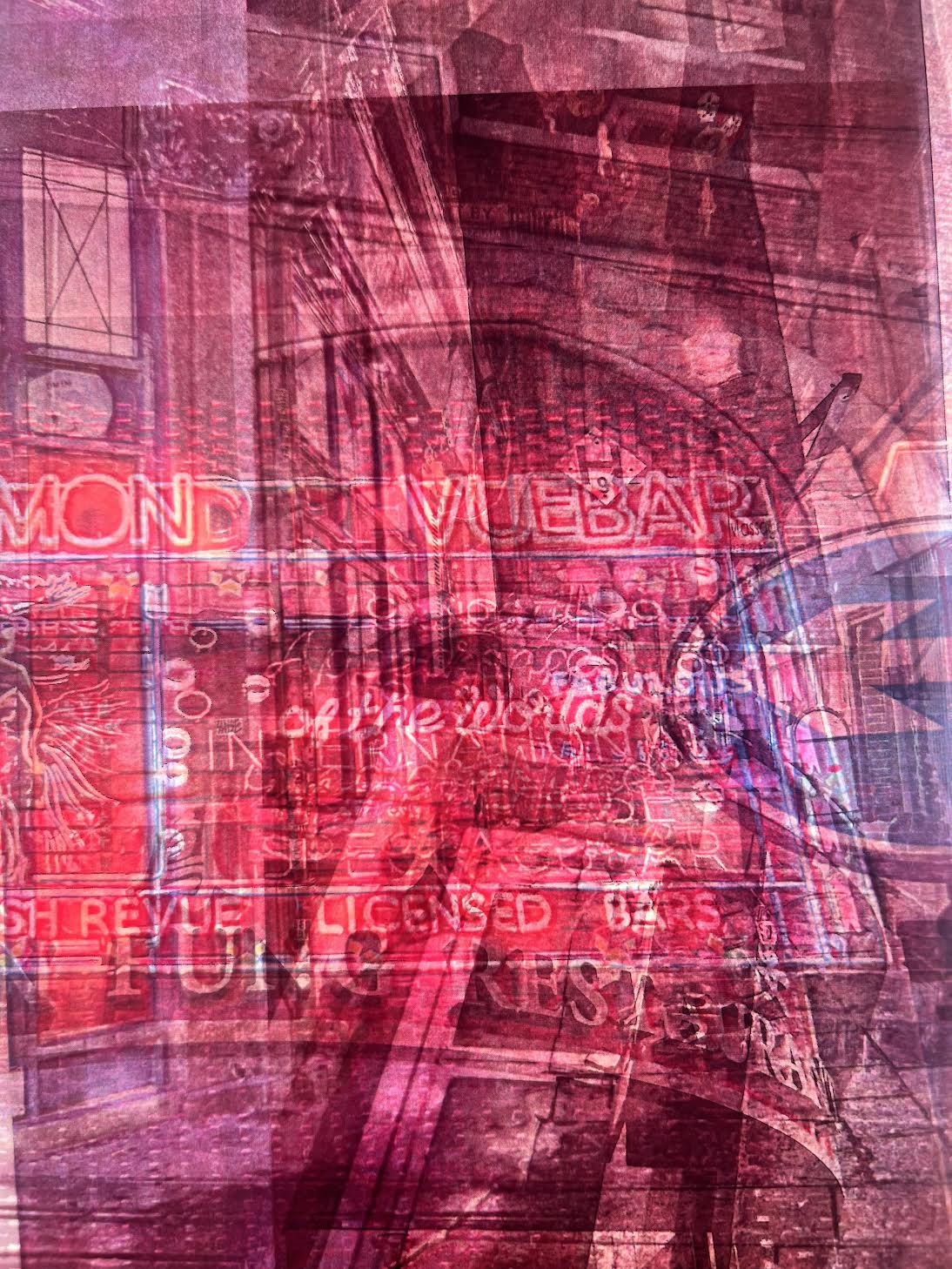
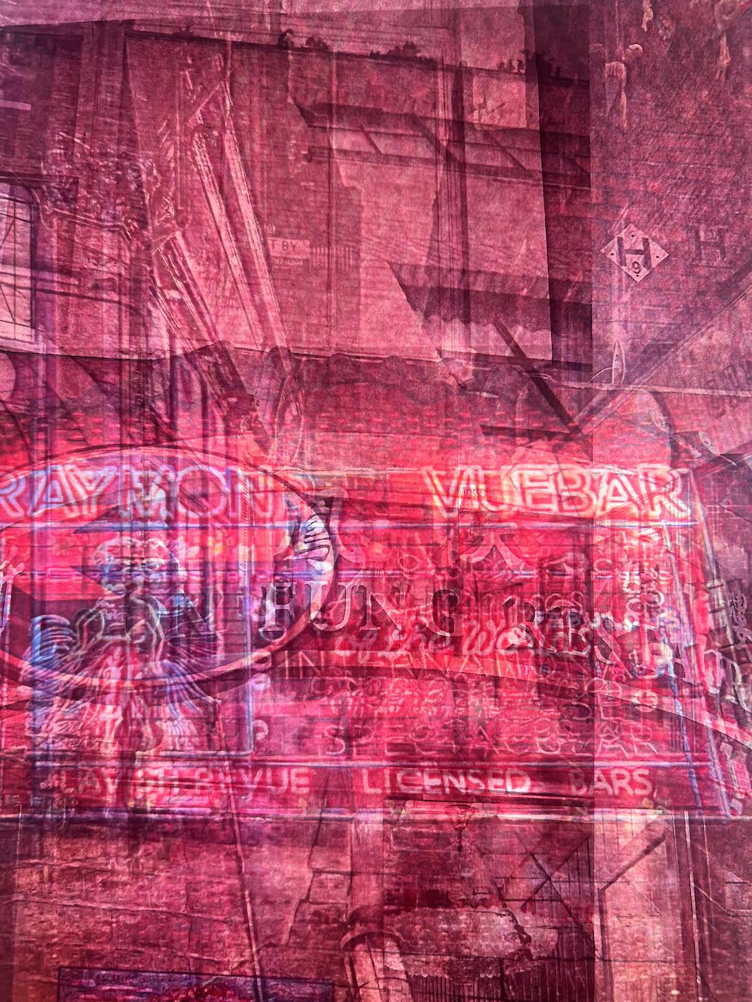
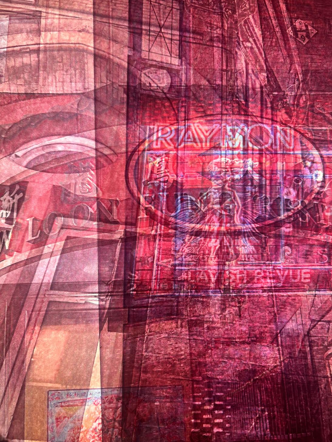
China Town-


Physical Response-

|
|
|
|

|

|
|
|
Analysis of my work-In this response I used physical layering, I was able to do this by layering my images, which were printed on asertate, on the light box. This allowed the colours in the image to pop and a red tone to come out. The style of physical layering also allows me to have increase variation in my images.
Soho-


My Digital Response-
|
|
Analysis of my work-In this response, I went around soho and took photos of the surrounding area which incorporated buildings, people and LED lights. I liked how the bright LED lights were almost the focus of the images and how they shone through. Although I thought the layering of the images was effective and gave the effect I was looking for, I believe the photographs would've looked better if I not only layered the images but also enlarged some.
Next Response- I would like to enlarge some of the images and duplicate some of the layers to create a moving double exposure effect
Next Response- I would like to enlarge some of the images and duplicate some of the layers to create a moving double exposure effect
Second Response-
|
Process-
|
Edit-
|
Physical Response-
|
|

|
|

|
|
|
|

|
|
|
|
Analysis of my work-I think this response is the ore successful than the digital response. This is due to the increased variation of the layering and also how the light box underneath the images makes the colours in the image so vibrant. The vibrant colours allow the images to pop and make them have more character.
The Ham Yard-


My Digital Response-
|
|
Second Response-
|
|
Piccadilly Circus-


My Process-
My Digital Response-
|
|
Analysis of my work-In this response I went around Piccadilly Circus, London and took photos of the surrounding area. I then uploaded these photos onto photoshop. One by One I layered the photographs on top of each other. I then selected each image and changes the Opacity on them so you can see the layer underneath.
Second Response-
|
|
|
My Physical Response-

|
|

|
|

|
|
|
|

|

|
|
|
Analysis of my work-In this response I used asertate and a light box to create this effect. I layered different asertate images on top of one another. The light box made the images light up and make the colours very vibrant and red which brings out the colours from the LED lights. I think my physical response is better than my previous digital response as there is more variation and the colours have come out better.
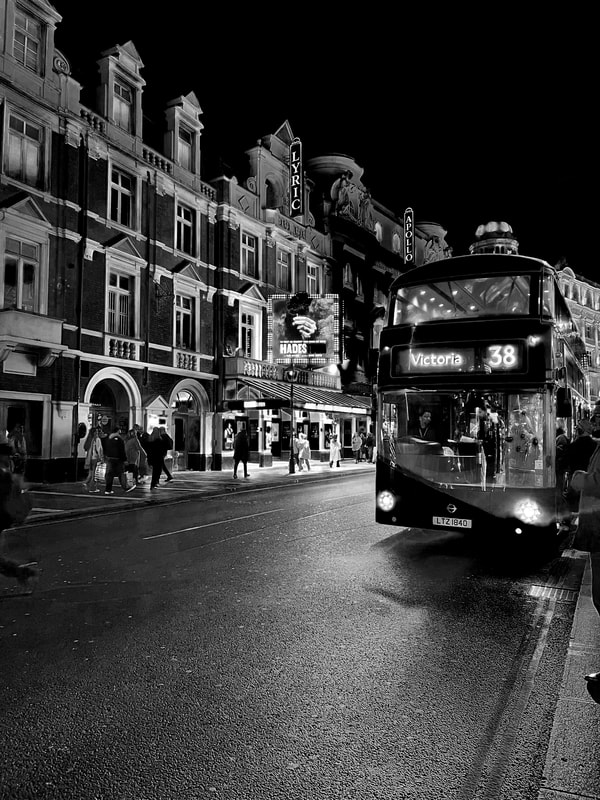
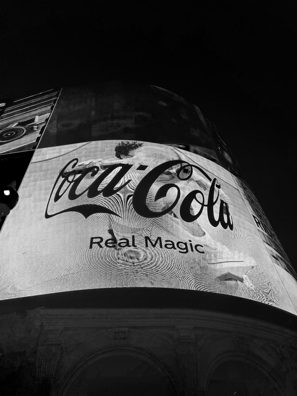
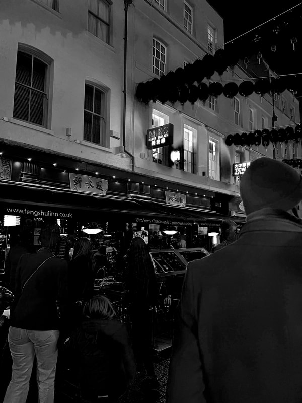
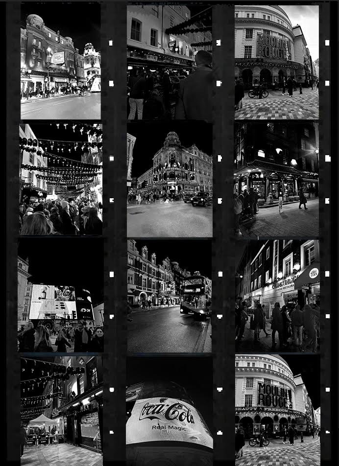
FINAL PIECE
I first drew inspiration from Daido Moriyama when I saw his photography at PARIS PHOTO Art and Photography exhibition in Paris.
I was initially drawn to his Photography due to his use of depth and almost double exposure images with the use Black and white photography. Although the images are black and white, I enjoyed the contrast of the extremely bright lights compared to the stark darkness of the images.
I thought this tied in Perfectly with my Development and shows the journey of my Night V Day photography and the process of how it has led to me repsonding to Akio for my Final Piece.
I then visited Daido Moriyama again, this time in London at the Photographers Gallery, which was the first public Gallery solely designated to Photography. This time again I was inspired by his use of simply only black and white photographs but I also really liked the pictures of all of his images as they are shown on film. In my previous response to artists I responded using Digital and Physical process for my photographs, this inspired me to create a didgital, film scroll like piece digitally for my final piece. With the incorporation of previous projects and the theme of Day v Night/ Dark v Light, I combined both my previous projects and in the style of Daido.
I responded to Daido using my new London Photographs as well as using my edited photographs from Development 8.
Paris Photo-

|

|
London Photographers gallery-

Tokyo 1969- From accident, premeditated or not
|

New York 1971
|


Tokyo 1969
|
London Images-


B+W Edits-
|
|
|
|
|
|
|
|
|
|
|
|
Final Edits-
|
|
